General Elegance in cube card selection


vs


This is IMO a very important consideration for cubes, with a lot of space for different opinions, which depend a lot on the playing group's familiarity with the deep pool of MtG cards. Despite that, I have never seen anything written about it here or in other forums.

I personally tend to go for the simpler cards, as MtG (and in particular cube drafting) already is strategically deep enough that adding large text boxes is not a net positive. How far do you go? I wouldn't go as far as replacing Smash to Smithereens with Shatter, but I'm on the fence about Echoing Truth vs Disperse and Welkin Tern vs Rattlechains. Glimpse the Unthinkable over Breaking // Entering and Watchwolf over Fleecemane Lion are not even close to me.
 
Loving this. This means a lot to me also, from my perspective because comprehension density can really throw off newer players. I definitely know that it can be hard enough to glean everything I need even with swaths of experience, but playing the game mostly casually? "Lemme just pass this one-paragraph essay and take the day of judgment with three words."

Speaking of that:
->
How many creatures actually can regenerate in our cubes? And as long as you don't run golgari charm, I see no functional difference usually.

->
So much easier to comprehend in reading and in usage. And easier to cast! Newer players undervalue land, so why have blaze rot in their hand on bad mana?

In short: I love elegance in cube design! And I feel like it applies well towards being inclusive to newer players.
 

Eric Chan

Hyalopterous Lemure
Staff member
Though I do this here and there with my cards, I've never explicitly thought of it as 'elegance', but more as having some simpler, easier-to-process 'vanilla' cards that just do what they say. Especially when the edge cases are likely to come up less than 5% of the time, I try and go with the more straightforward option.

over Tarfire, Galvanic Blast
over Incinerate
over Stoic Rebuttal
over Dawnbringer Charioteers

Truth be told, these opportunities are few and far between. I'll still take Utopia Sprawl and its confusing memory issues any day over a similar but weaker analogue, and Condescend is never going to become Clash of Wills.
 

Aoret

Developer
Excellent thread. This is something people should be making conscious choices about, and I think that decision isn't immediately obvious when sitting down to make a cube for the first time.

That said, despite having a very casual playgroup, I've opted to never sacrifice my intended design (not a good term) in order to get more elegance (a very good term). If I have two options that both suit my design needs, I'll always choose the more elegant option. I've chosen to omit certain keywords in my cube because I feel the design works fine or better without them, and I gain a lot in elegance. When I have broken this rule in order to gain on the design side, I'm always keenly aware of how gross it is. The best example of this is Experiment One - the only thing in my entire 360 that can regenerate, and one of the clunkiest implementations of regeneration in all of magic. If X1 didn't do a lot of good things for me on the design side, I'd cut him for being a hipster who is difficult for new players to understand.
 
I don't think elegance is probably the right word. Elegance to me mostly implies having less card text (and making sense),as opposed to actually being easy to tell its power level and how it actually works. One with nothing, for example, is elegant, but may appear useless to beginners(they are probably correct). Same with Life from the Loam.
Just a thought.
Eh, its probably fine
 

Grillo_Parlante

Contributor
Yeah, inelegant cards for me are cards that have trinket text, or text that suggests the existance of decks that aren't really there.

Mardu woe reaper is an inelegant card for me, because while its independently fine, the warrior text on it suggests the existance of a tribal theme that dosen't exist.
 
This seems to tie into the concepts of depth and complexity, where depth is the actual amount of interesting gameplay that come from a card and complexity is how hard a card is to comprehend at a base level. Looking at high and low levels of each, you can make a 2x2 grid. Examples of each:

Low complexity, low depth:


Low complexity, high depth:


High complexity, low depth:


(most of the rest of Ice Age, heh)

High complexity, high depth:


You can debate about these individual card choices, but in general I think most people could agree that each card can roughly be placed in one of these four quadrants, even if they don't agree 100% on which one they go into.

My goal as a cube designer is to maximize the number of low complexity, high depth cards while minimizing the number of high complexity, low depth cards. Even the high complexity, high depth quadrant is one I want to use sparingly - mostly for pet cards or ones that bolster specific decks or archetypes I want to promote. I think Wizards feels similarly, which is part of what drove NWO and the move away from mechanics like intimidate, protection, and landwalk that essentially weren't worth the rules overhead to keep as evergreen.
 

Chris Taylor

Contributor
Probably one of the points being communicated is edge cases. Dang that's a spirit for my rend flesh, declaration in stone hosed my opponents Dragon fodder - - > hordeling outburst draw when his turn 3 could easily have been man-o'-war instead, etc.

I mean I run custom cards, and enough of them that I'm only vaguely aware of what's a human, what's a Zombie, etc, and I love these situations.
Murder would be a more elegant card than doom blade if they cost the same, and I've done that, but the draft format is a little worse off for it.
 
I'm looking more at this from reduction of unneeded baggage that's supposedly providing some fringe advantage to a clean version that pulls it's own weight. The example I've though of right away is:

Ichor slick is a neat card, but so many pieces jammed together! Grasp does its job simply and cleanly. This can apply to cards and their corner cases, but doesn't have to I think.

Elegance in a deeper meaning comes out in a gestalt fashion, imo. Simple pieces that lead to a rich and vibrant whole. One example on my mind is one of my drafters using his flickerwisp to flicker a stormblood berserker after dealing damage with the plain 1/1, getting the counters. That was COOL. And on two straightforward to read and grok pieces.

I think flickerwisp is a home run example for this thread by the way. The "simple but deep" cards.
 
I actually tend towards high depth cards even if it means more complexity. DoJ over WoG, Searing Spear over an essay on dealing damage, sure. But I want Lion over Watchwolf and Ichor Slick over a vanilla kill spell. I want games with large decision trees and all sorts of interactions and don't want to sacrifice that for simple cards.

Flavor text that disguises itself as rules text is something I really dislike seeing though.
 
Another example I thought of for elegance in utility:

This little gem reads easily, but is a valuable blue tool if your format promotes recursive agro, value reanimation, or is GY based in general. Lots of neat little format balancing done in one little clash of wills+

Also I think its important to think of this as just another variable in slot-building. The sort of "does this one slot really need to be this wordy, or can I make some Magic happen with a simpler tool?", added onto all the rest of the variables of decision-making. This is the sort of question I think can easily be asked about stuff like removal. Does it really have to be Ruinous Path, or just the to-the-point Heroes Downfall? Removal is already skill-testing in its usage, so do I need little bits of flair tacked on to every piece?
 
Is there a point at which you don't want the format to be more skill testing? Does too skill testing exist? If it does, I think I either haven't reached it or didn't notice it awhile back. :rolleyes:
That's entirely dependent on playgroup. And designer, imo. I know about 2/3 of the drafters who frequent sessions with me would definitely be irked after a while if the format was too intense. It's something I've put some thought into, but could still improve upon.

I think this cap might not apply to the majority of cube playgroups, but I also still think there's a point where you start getting diminishing returns on play value. People sometimes just want things to work the way they expect, end of story, not have to put multilayer decisions into every little nook and cranny.
 
My group is a tad hardcore, probably moreso than most. We like to play very tight Magic and games can come down to the smallest missteps.

I have had new players draft who only sort of know the game though. They've all gotten stomped and had trouble seeing all the lines of play and strats but the biggest concern has been reading comprehension of cards because that seems to hurt their fun a lot more than just not playing well. Noticing that there were a bunch of lines they missed just makes them appreciate the game's skill component and maybe be intimidated idk. The replay rate of really inexperienced players is basically 0% so maybe there's an issue there but maybe that's just a sign that this isn't a cube dedicated to simplicity.
 
Eh, not really my cup of tea. My drafters have all been playing for a long while now, they enjoy playing with powerful cards, and making the experience more akin to Limited isn't something I'd be interested it. I love the complexity and decision-making when there are various effects on the field or cards to play around. It adds a lot of excitement to the game. I love seeing corner cases being exploited and doing something that I hadn't thought of initially. Like I had a player Gifts Ungiven for Primeval Titan and Avenger of Zendikar like three drafts ago, then Bring To Light for a Living Death. It was so sweet.
 
"Limited" and "simplistic" aren't necessarily synonyms. Just look at triple Innistrad draft! That was depth if ever there will be.

Again, I think the pinnacle of "elegance" comes from deep decks and formats even with the inclusion of simple pieces. Look at young pyromancer. That card reads simply, but is virtually singlehandedly the figurehead of a cool and intricate UR archetype in the form of spells-matter.
 
That might be the least elegant card from that cycle. It's flavorful if someone spells out to you that each mode represents a season, but otherwise it's just a strong toolbox card with lots of text.
 
I've been thinking about this a fair bit recently. I personally come down on the higher depth, more interaction side of things, but some of the players I play with aren't as familiar with the cards and I can see this alienating them to some extent. At the moment, I'm playing Ruinous Path over Hero's Demise, but is that 'right' for instance?

I like that Path gives you more power the later the game goes on, and I like the keyword ability, and I even like it being a sorcery to some extent, but Demise is cleaner and simpler. I think it's probably a case of picking your battles, or in narrow cases going for the more elegant version to give you more cognitive burden elsewhere.


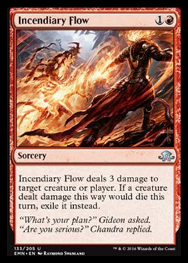
perfect example of this concept. Clean burn spell with simple upside that adds a lot of incidental depth and interaction. Sweetness. Much like pillar of flame, but I'm such a fan of the 3 damage
 
Just wanted to say I put together a mini-cube for 4 people (180 cards) focusing on simple cards and drafted it this week. Man, was it fun. And that's despite being an unbalanced mess.

I intended to use it for teaching people to play, but turns out MtG already is a pretty complex game with simple cards. No plethora of triggers, no taking 30s to explain what each card does to your opponent who's not familiar with that cube.

Totally recommend you guys to give this a try.
 
Top