
You are using an out of date browser. It may not display this or other websites correctly.
You should upgrade or use an alternative browser.
You should upgrade or use an alternative browser.
Site News [Forum] Card tooltips
- Thread starter Eric Chan
- Start date
Yes, absolutely! I almost didn't release this tonight, because I badly wanted that exact functionality incorporated. Unfortunately, the mouseover tooltips that I'm pulling from deckbox.org don't work properly on card images - they only work on text links. So I suppose I'll have to roll up my sleeves and open the hood on that component, which up until now I'd been perfectly happy to use directly out of the box.
For now, you can still click on any partial card image to have it open up in a new tab. Not ideal, but better than nothing.
For now, you can still click on any partial card image to have it open up in a new tab. Not ideal, but better than nothing.
Rob Dennis
Developer
MUST.. LOOK.. MORE.. LIKE.. MTGO SCREENSHOT...
yeah, I'm not believing you when you talk down about your development prowess*. This is something I just don't know how to do, and wanted http://cuesbey.com to get to _eventually_
Assuming this code is in the forum template, I may snap this up for repurposing
* the best developer in the world who hasn't made anything is worse than the anyone who has made anything.
Woah, looks pretty impressive! You are doing a great job here, Eric!
Some nitpicks:
• It feels unnecessary to have 4+ duplicated images of the same card. Would it be possible to have something like a 4x marker near the card name? It's not absurdly important, just thought it might be neat if you have the time in your hands to try it out.
• Could the title of the decks be enclosed inside a title box like the one in the quote and code boxes?
Next step would be exporting the list to MSW, Cockatrice, MTGO or whatever (definitelly unnecessary, but cool nonetheless)
Also, looking at the images I thought about a functionality that might come as unnecessary but would probably be the most awesomest feature a Cube forum would have: Booster tags! How would they work? Well, pretty much like the cubedeck tag but with the possibility to have the spoiler tag combined. Here is my idea exemplified:

Imagine that this spoiler is to the right of card images.
Code for this could be something like this:
Tagging the card as a pick could actually be anything and might not even be required (as in the person just showing a booster off and asking people about their picks). In that case, there would be no "my pick" spoiler box. (Maybe hav)
Some nitpicks:
• It feels unnecessary to have 4+ duplicated images of the same card. Would it be possible to have something like a 4x marker near the card name? It's not absurdly important, just thought it might be neat if you have the time in your hands to try it out.
• Could the title of the decks be enclosed inside a title box like the one in the quote and code boxes?
Next step would be exporting the list to MSW, Cockatrice, MTGO or whatever
(definitelly unnecessary, but cool nonetheless)Also, looking at the images I thought about a functionality that might come as unnecessary but would probably be the most awesomest feature a Cube forum would have: Booster tags! How would they work? Well, pretty much like the cubedeck tag but with the possibility to have the spoiler tag combined. Here is my idea exemplified:
P1P1
| | | |
Imagine that this spoiler is to the right of card images.
Code for this could be something like this:
Code:
[booster=P1P1]1 Ancestral Recall
1 Black Lotus
1 Time Walk
1 Mind Twist
1 Wurmcoil Engine
2 Armageddon
1 Sol Ring
1 Sword of Fire and Ice
1 Jace, the Mind Sculptor
1 Maze of Ith
*1 Mountain Goat
1 Grave Titan
1 Sword of Feast and Famine
1 Mountain[/cubedeck]
Tagging the card as a pick could actually be anything and might not even be required (as in the person just showing a booster off and asking people about their picks). In that case, there would be no "my pick" spoiler box. (Maybe hav)
Rob Dennis
Developer
Woah, looks pretty impressive! You are doing a great job here, Eric!
Some nitpicks:
• It feels unnecessary to have 4+ duplicated images of the same card. Would it be possible to have something like a 4x marker near the card name? It's not absurdly important, just thought it might be neat if you have the time in your hands to try it out.
• Could the title of the decks be enclosed inside a title box like the one in the quote and code boxes?
I disagree with the first bullet for a draft deck; it's really important to see a visually representation of a curve and having a peak hidden due to a 4x as unhelpful imo. Agree for land though
edit, for the follow-along draft stuff, I always though raredraft.com had a great workflow
I disagree with the first bullet for a draft deck; it's really important to see a visually representation of a curve and having a peak hidden due to a 4x as unhelpful imo. Agree for land though
edit, for the follow-along draft stuff, I always though raredraft.com had a great workflow
Yeah, I was thinking mostly about lands. Even in cubes with duplicate, I imagined it is quite hard to have 4+ of any single nonbasic land card. Anyway, if the grouping is restricted to basic lands only and duplicates are show to regular cards, I'm okay with it.
I just looked at raredraft.com and it does have a great workflow. It does depend on a very specific file format to have it shown and I'm not so sure how well it would integrate inside a forum discussion, though. Having diferent outlines and/or a glow around the picked card would be nice.
Thanks for the great feedback, guys. Rob, the PHP code for this isn't in the templates on the development forum, but I can ship you the source. (Or maybe it's time I finally started using source control and GitHub...)
I like Vince and Rob's ideas to just show numerically the number of lands, and perhaps have this apply only to basic lands. Truth be told, I tried this pretty early on, and.. well, it looked like crap. There just wasn't a good place to fit a numeral in without shoving all the columns askew. But I think it's worth revisiting.
Haven't heard of raredraft.com, but I'll take some time on the weekend to check it out. Unless I'm busy cubing. Priorities!
Booster pack tags are a pretty neat idea, and I'll shove that one into the backlog. At the moment, you can kind of replicate that functionality with [ci] and [spoiler] tags, so it's not high on my list, especially since this forum isn't as keen on "What would you pick?" threads as most other cube places. But I'll keep it on the back burner.
I agree that you should see multiples of drafted cards, but not necessarily multiples of basic lands. Frankly I'd be okay with the basic lands just being text at the bottom.
4 Island
3 Mountain
3 Plains
4 Island
3 Mountain
3 Plains
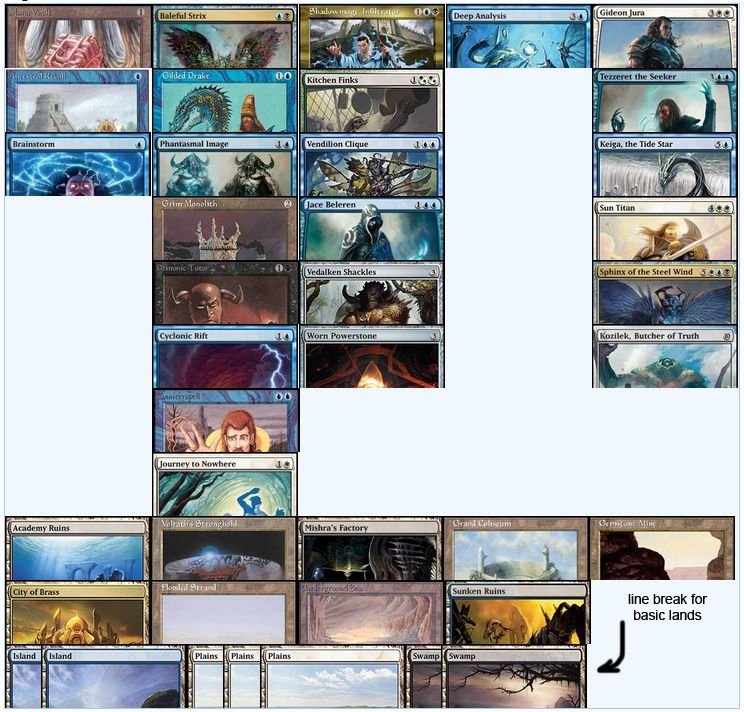
Grixis Control
Trying something out. Basic lands beyond the first one automatically tuck behind now, as long as you're listing all your basics at the end. If the whole tucked train of cards won't fit on a line, then it'll wrap.
It's not what I would call Robustly Tested, but then, that's what you guys are for. (Huzzah! Free QA!) As before, post ideas, suggestions, and bugs here.
You could try putting the nonbasics on a separate column. Also, let the right-most one be closer to the viewer...looks more natural
Could you post a mock up? I'm not sure I follow entirely what you mean.
I could put all the basics on a far right column, and stack them vertically, like with the spells. But then it would probably stretch the height of the whole deckbox. I'm kinda loathe to waste space like that, but I haven't really played around to see which one would look better.
I could put all the basics on a far right column, and stack them vertically, like with the spells. But then it would probably stretch the height of the whole deckbox. I'm kinda loathe to waste space like that, but I haven't really played around to see which one would look better.
There you go:
(I said column when I meant line. Second point was also rather confusing after re-reading it. Sorry)
(I said column when I meant line. Second point was also rather confusing after re-reading it. Sorry
)
I don't know if it would help, but my eye wants a bit of white space between spells, nonbasics and basics.
When you make the "button" for doing these, make sure you have some boilerplate example pop up. Much easier to edit an existing template than have to type all the "Ones Lands etc." headers.
Also, in terms of the card image tagging
will cause an error, but
works. This is a little clunky and I often have to fiddle with it after the fact. e.g.
Also, in terms of the card image tagging
Code:
[ci]
Cardname
[/ci]
Code:
[ci]Cardname[/ci]