General Good cards you don't run because they are ugly

I can't be the only one who doesn't like certain cards because they are ugly. For example, there are many reasons to run Chromatic Star over Chromatic Sphere. But I don't because the former is ugly:


Gurmag Angler would normally be a clear win for my cube. It ties in with graveyard strategies, it's a simple card and it supports BR Wildfire. But the art is just ugly and I don't like it.


Fortunately, there are not a lot of them because we have gotten new art. I would not run Land Tax if the new art weren't as great. And there's a great deal of staples that have rather poor art in most of its variants, like Counterspell or Brainstorm.

What about you? Any cards you avoid because you don't like their art?
 
I don't have any of those, but I have other aesthetic concerns that might make me avoid a card: Commander trinket text, DFC, white borders, old wording, some trinket text, weird card frame, only rarely does card art come into play, unless I'm theorizing a specific gimmick cube (like desert).
 
This is an interesting topic.

How many of you have decided to skip a card for economical reasons?

I am on board with CaptnIrony and the Commander trinket text. I just cannot see myself putting one of those into my cube.

And the keyword ‘Will of the Council’ that makes both players vote and it is never a fair vote because both players have to agree on a vote before the non-regular outcome will happen.
 
I don't have any of those, but I have other aesthetic concerns that might make me avoid a card: Commander trinket text, DFC, white borders, old wording, some trinket text, weird card frame, only rarely does card art come into play, unless I'm theorizing a specific gimmick cube (like desert).
Yeah these are also good reasons. Trinket text and old wordings also impact the play experience for those who don't play Magic as much or who aren't as knowledgeable about it. It's more text to read, more things to keep in mind and a larger barrier of entry.

I'm actually a bit thorn between printints of Goblin Welder for a similar reason. The original rules text is easy to understand, while the newer one is long and seems redundant at first glance.
 
Kind of different but a little similar, I've been interested in testing Sensory Deprivation but the art bothers me so much that I can't. I don't have a problem with it, it just makes me feel super uncomfortable. Maybe I could try getting one altered?

More on topic, I have a strong preference for pre 8th edition frames and post m15 frames. I was fine with the post 8th edition frames until the m15 frames came out.
 
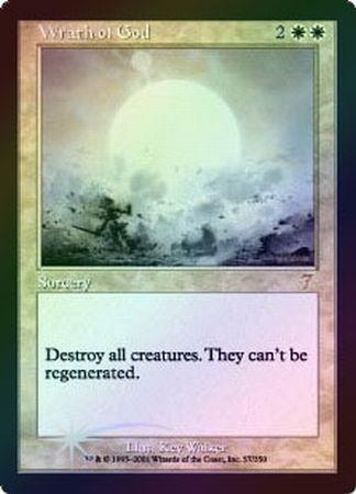
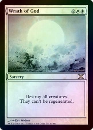
Hmm I can't think of a strong card that I haven't run because of the art, but for each card I try to run the version I find most aesthetically pleasing from a art and border/frame perspective. I'm a huge fan of the old frames and the shooting star, I'll often look for versions of cards in that frame unless a newer version has superior art. I'm actually a bit of a stickler for that, the most recent card I can think of that I've had this issue with was Wrath of God.

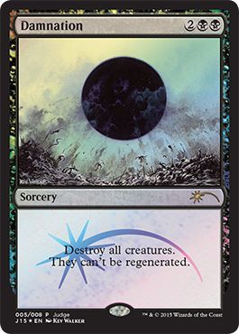
I had wanted a 7th Edition Foil copy for a long time because I love the set symbol (oh that's another one, some set symbols are really ugly to me like MM15 or some CMDR sets) for 7th Edition and it had old foiling done on it. The problem is that that copy does not have centered text which I want to mirror the Damnation I have in cube:

390503.jpg
vs.
384175.jpg
alongside
1072364.jpg


If I had had the Planar Chaos version of Damnation, with uncentered text, I would have gone for 7th but alas that was not the case. Also there's just something nice about that formatting tbh. Clean and clear presentation.
 
I hate the current rare/mythic frame a lot. You would not pass a design class at university with that. So I try to make a high quality proxy version of cards, that are only available in that frame.

Link render Kopie.jpg Dragonslayer render Kopie.jpg Network render Kopie.jpg Drake Haven Kopie.jpg

PS: House rule is that you have to shout "FUS RO DAH' when you flip the Dragonslayer.
 
I hate the current rare/mythic frame a lot. You would not pass a design class at university with that. So I try to make a high quality proxy version of cards, that are only available in that frame.

View attachment 2435 View attachment 2436 View attachment 2437 View attachment 2438

PS: House rule is that you have to shout "FUS RO DAH' when you flip the Dragonslayer.

Rare/Mythic...frame?

I think Ravnic is referring to the little foil stamp on the bottom of rares and mythics:
 
I don't mind the stamp, but the bottom border bothers me so much whenever it catches my eye. It's just completely asymmetrical with the top black border.

On that note, I don't understand the appeal of miscuts either. Some of the ugliest things I've ever seen cardwise.
 

Onderzeeboot

Ecstatic Orb
Better card frame/border, better art, and the flavor text is way sweeter.

Disagree (I love the new frame), honestly a wash for me (Seb McKinnon would have been a better fit for an abstract concept like an incarnation, I feel), and very much agree (the new ft is so generic).
 
Haha I love this. Three totally different opinions and here comes a fourth.

I prefer the old art, flavor text and tomb symbol in the upper left corner.
I prefer the new frame.

I wish they would print a third Genesis with new frame but old flavor and then have an artist try and redo the original Genesis artwork but with modern technology and quality.

Aaaand maybe let it have an upkeep cost of 2 mana.. but then it is an entirely new card.
 
Rare/Mythic...frame?

Yeah, I'm not a fan of the recent frame in general. There are just sp many differently shaped roundings, it is really not coherent. But I can live with it on commons/uncommons. But when you cut another hole in the text box just to put another different shape around that card, it just gets too much. I really really tried to get used to and accept it, but whenever I see those frames, my whole body just rejects any form of contact.
 

Onderzeeboot

Ecstatic Orb
Yeah, I'm not a fan of the recent frame in general. There are just sp many differently shaped roundings, it is really not coherent. But I can live with it on commons/uncommons. But when you cut another hole in the text box just to put another different shape around that card, it just gets too much. I really really tried to get used to and accept it, but whenever I see those frames, my whole body just rejects any form of contact.

Oh boy, my whole cube is full of those revulsive borders! :')
 
I..

I....

I totally forgot that thing existed. I believe I still own a Judge foil one actually. Maybe.

It is missing the Judgment set logo but I think we still have a winner. Thank you, Shamizy!
 
I've only run into this with newer or alternate versions of cards like
Maelstrom Wanderer|EMA vs. Maelstrom Wanderer|PCA
or
Dromoka, the Eternal|C17 vs. Dromoka, the Eternal|CP3
(The ones on the right are what I prefer)

I try to stay within modern borders and older cards don't irk me too much when next to new cards, but I DESPISE the new flavor text gap, not even because it's new I can see that the gap is useful for players, I just hate that all my pre-dominaria cards now look out of place without them. I think it's mostly that the gap makes new cards slightly different so my brain thinks it can easily fix them, but since the frames are so different between say tortured existence and phyrexian scriptures I find that fine.
 
Off topic: Have you had success with Tortured Existence? It's new in my draft pool and hasn't seen play yet, but I'm exited to see what it can do in different decks. Also, ontopic, TE just looks like a magic card should look from head to toe.
 
TE is a super cool card, I like how it's both useful in a midrange deck (ex: discard a 2-drop late game to get back your 5-drop) and in the obvious reanimator decks. Definitely needs a slower environment, but I find it fun to play with and against.

Back on topic, I have a sweet spot for all vintage card frame cubes, but I tend to not like the play environment they have (there was a custom vintage border cube that had some newer cards made to look old that I'm trying to find)

EDIT: Found it https://www.reddit.com/r/mtgcube/comments/8ko0z8/bohemian_cube_a_mixture_of_modern_and_old_school/
 
Top