Today, Mark Rosewater announced the first real details and teaser cards for the upcoming (un) set, Unfinity, due out April 1st. Unlike the previous (un) sets, this one will not be silver-bordered, and presents some interesting opportunities for us Cube curators and theorizers. But before that, the spaaaaace part is more than worth sharing:






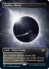


They're gorgeous. I personally wish they had frames and looked more like Magic cards (not sure where the love of the extended art comes from), but that's a personal gripe that's not new to this expansion. It's certainly not enough to stop me from considering swapping out a couple of my current shocks with these, but it'll be tough to do some and not others from an aesthetics standpoint...a standpoint I've already failed at with other cycles.
The big news here is that, in addition to being 100% black-bordered (a huge aesthetic win in general) over half of the cards will are playable in eternal formats. The ones that aren't, that go too un-set-y, will have an acorn foil symbol in the bottom, expressing their "silver-border" in a way that's much less visually off-putting than even the best attempts of WotC in the past. Sure, it'll be easy to mix them up at a glance, but for nearly all practical uses, (un) cards are totally fine. (This will also make these cards easier to play in EDH without people being weird about it, a welcome change considering the casual roots of the format and the great culture fit of (un) cards in that environment).
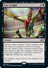
So now, we'll see new designs like this, which feel like Battlebond+ or Conspiracy+, an exciting and unexplored middle-ground of design space:
We've previously had great discussions about Silver Bordered cards and Playtest cards, both which offer unique and compelling Magic cards that flesh out the Cube experience for a great many of us on these boards. I feel like with this decision from WotC, we'll get more cube-worthy cards from Unfinity than ever before, and I couldn't be more excited.
THE GOOD:
 More interesting, bizarre, and wacky cards and effects will be formatted in a more sensible, rules vetted way, a previous issue with attempting to implement silver-bordered design into black-bordered Magic.
 SPACE (in a way that makes sense for Magic)
 Aesthetic improvement for un-cards. Urza, Academy Headmaster is my last silver-bordered card, largely for this reason.
 There will be less eye-rolling at including the sillier cards in cube, as their signifier will be much more subtle than a gross border.
THE BAD:
 I worry this will draw out the worst excesses in modern design, especially in the commander-motivated space.
 I am personally uninterested in the retro space setting as well as the idea of a space theme park / carnival / circus. Space is cool though.


They're gorgeous. I personally wish they had frames and looked more like Magic cards (not sure where the love of the extended art comes from), but that's a personal gripe that's not new to this expansion. It's certainly not enough to stop me from considering swapping out a couple of my current shocks with these, but it'll be tough to do some and not others from an aesthetics standpoint...a standpoint I've already failed at with other cycles.
The big news here is that, in addition to being 100% black-bordered (a huge aesthetic win in general) over half of the cards will are playable in eternal formats. The ones that aren't, that go too un-set-y, will have an acorn foil symbol in the bottom, expressing their "silver-border" in a way that's much less visually off-putting than even the best attempts of WotC in the past. Sure, it'll be easy to mix them up at a glance, but for nearly all practical uses, (un) cards are totally fine. (This will also make these cards easier to play in EDH without people being weird about it, a welcome change considering the casual roots of the format and the great culture fit of (un) cards in that environment).
So now, we'll see new designs like this, which feel like Battlebond+ or Conspiracy+, an exciting and unexplored middle-ground of design space:

We've previously had great discussions about Silver Bordered cards and Playtest cards, both which offer unique and compelling Magic cards that flesh out the Cube experience for a great many of us on these boards. I feel like with this decision from WotC, we'll get more cube-worthy cards from Unfinity than ever before, and I couldn't be more excited.
THE GOOD:
 More interesting, bizarre, and wacky cards and effects will be formatted in a more sensible, rules vetted way, a previous issue with attempting to implement silver-bordered design into black-bordered Magic.
 SPACE (in a way that makes sense for Magic)
 Aesthetic improvement for un-cards. Urza, Academy Headmaster is my last silver-bordered card, largely for this reason.
 There will be less eye-rolling at including the sillier cards in cube, as their signifier will be much more subtle than a gross border.
THE BAD:
 I worry this will draw out the worst excesses in modern design, especially in the commander-motivated space.
 I am personally uninterested in the retro space setting as well as the idea of a space theme park / carnival / circus. Space is cool though.
