You are using an out of date browser. It may not display this or other websites correctly.
You should upgrade or use an alternative browser.
You should upgrade or use an alternative browser.
General CBS
- Thread starter James Stevenson
- Start date
I think the others are mostly fine, but Boseiju being able to reduce down to a single green pip with only a single legendary creature is absurd. It's the most powerful effect of the cycle AND the cheapest for whatever reason. In the worst case scenario it's an untapped green source that comes into play, in the best it's an uncounterable Assassin's Trophy like variant that can also be recurred from the grave with Wrenn and Six. This is one of the most powerful utility cards we've ever seen. I can't see a reason to not include it in any deck featuring green in any format that it's legal in, it's just THAT good.
I was surprised to see the black one costing so much ($) because the channel costs so much (mana).I don't agree with this assessment after having played with these cards over the weekend. Most of these cards are expensive enough to channel, even with cost reduction, that they can be a bit clunky to use as anything other than lands.
I don't think it will be problematic, necessarily, but I also don't think we'll see decks that suffer against Boseiju break out in standard. Which may have been warranted. I'm not sure if there's some crazy artifact or enchantment deck that needed a predator in the format, as I pay very little attention to standard.I think people are excited about Boseiju, Who Endures in particular because it's reasonably costed maindeckable artifact and enchantment hate, not because anything it does is broken.
These cards will absolutely see a lot of play, but I don't think they're problematic.
This is the unfortunate part. There's almost never a reason to not run one copy.I can't see a reason to not include it in any deck featuring green in any format that it's legal in, it's just THAT good.
Will see play in EDH
Not this makes the card weak by any stretch, but just for anyone who may not have noticed: the opponent can search out nonbasics (shockland etc), and their land doesn't come in tapped.
For cube I can't see it being problematic. It's still a draft slot. Seems like a naturalize that actually has a good main deck percentage.
I think of these as very good single sided MDFCs, and those are far from problematic; they are quite healthy for a deck and format.
For cube I can't see it being problematic. It's still a draft slot. Seems like a naturalize that actually has a good main deck percentage.
I think of these as very good single sided MDFCs, and those are far from problematic; they are quite healthy for a deck and format.
I laughed out loud reading thisI was surprised to see the black one costing so much ($) because the channel costs so much (mana).
i think the black one is better than it looks because it can rebuy a walker at instant speed
I think the fact that they're design mistakes is lessened by their legendary status -- Valakut was a menace for what, a decade? It's a cool card, but it's so hard to interact with lands in modern Magic that I don't like this kind of importance being put on their non-mana abilities unless it's a situation like the Zendikar Rising MDFCs where you do get that ability to interact with them like a normal card. Even more than that, Channel is a pernicious mechanic on lands or otherwise because of its limited areas of interaction. You can't (easily) copy it, you can't (easily) counter it, you can't (easily) redirect it.
As much as I'd like this to finally be Squelch's time to shine, that's not a broad enough ability for any format (though I still run it in every Blue EDH deck I make).
Between the very specific wording of Magecraft for copying effects, pushed copy spells like Galvanic Iteration in recent sets, and Channel, I'm surprised we haven't gotten more spells that redirect abilities in red, as was Mark Rosewater's original vision. I'd still kill to have hyper-aggressive cards that change the target of a spell or ability in red, and a greater design focus on "target player draws two cards", even if it's clear that's not the direction the Arena-focused design and development teams have been going. But I am hopeful that they'll make cards that can better interact with Channel in follow-up sets, or else my poor Mirrorshell Crab is going to be a lone hater of activated abilities in my cube for a while.
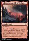
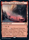
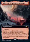
Also, on the note of the lands, I love Sokenzan, Crucible of Defiance, but I think the standard art 1) looks way better and 2) actually looks like something that would tap for red mana BUT as I discussed in another thread, I hate hate hate the whole "make the extended version of the art the 'real' one and just crop it for the standard edition" thing WotC art direction has gone for and the 'crucible' in question is part of what's cropped in the art! Losing the rocky details of the mountains to the left and right trashes the framing of the city and makes it lose its sense of scale.
This is one of my favorite pieces of art from the set and also one of the most egregious cases of destroying the artwork with sloppy cropping. The art direction for these extended cards needs to find a better balance of "here's the standard card size, make sure all the proper elements work here first, and then add flourishes" instead of unceremoniously chopping off key details.
Onderzeeboot
Ecstatic Orb
Be sure to @ MaRo on Blogatog or Twitter or something, because you're not wrong. It's literally trivial to frame this card in a better way. I'm not even zooming in here or using the full artwork available. It just the art from this article fit to frame.I think the fact that they're design mistakes is lessened by their legendary status -- Valakut was a menace for what, a decade? It's a cool card, but it's so hard to interact with lands in modern Magic that I don't like this kind of importance being put on their non-mana abilities unless it's a situation like the Zendikar Rising MDFCs where you do get that ability to interact with them like a normal card. Even more than that, Channel is a pernicious mechanic on lands or otherwise because of its limited areas of interaction. You can't (easily) copy it, you can't (easily) counter it, you can't (easily) redirect it.
As much as I'd like this to finally be Squelch's time to shine, that's not a broad enough ability for any format (though I still run it in every Blue EDH deck I make).
Between the very specific wording of Magecraft for copying effects, pushed copy spells like Galvanic Iteration in recent sets, and Channel, I'm surprised we haven't gotten more spells that redirect abilities in red, as was Mark Rosewater's original vision. I'd still kill to have hyper-aggressive cards that change the target of a spell or ability in red, and a greater design focus on "target player draws two cards", even if it's clear that's not the direction the Arena-focused design and development teams have been going. But I am hopeful that they'll make cards that can better interact with Channel in follow-up sets, or else my poor Mirrorshell Crab is going to be a lone hater of activated abilities in my cube for a while.
Also, on the note of the lands, I love Sokenzan, Crucible of Defiance, but I think the standard art 1) looks way better and 2) actually looks like something that would tap for red mana BUT as I discussed in another thread, I hate hate hate the whole "make the extended version of the art the 'real' one and just crop it for the standard edition" thing WotC art direction has gone for and the 'crucible' in question is part of what's cropped in the art! Losing the rocky details of the mountains to the left and right trashes the framing of the city and makes it lose its sense of scale.
This is one of my favorite pieces of art from the set and also one of the most egregious cases of destroying the artwork with sloppy cropping. The art direction for these extended cards needs to find a better balance of "here's the standard card size, make sure all the proper elements work here first, and then add flourishes" instead of unceremoniously chopping off key details.

For those of us worried about a proliferation of uncounterable abilities, shoutout to my boy for being a surprisingly relevant "counterspell," especially if you're running/supporting Captain Sisay in your GW section or the new Yoshimaru, Ever Faithful.

Honestly, this is a good card for my list -- it hits more spells than Negate as a hard counter! Going to have to find room for it, especially since I do run both of the cards you listed.For those of us worried about a proliferation of uncounterable abilities, shoutout to my boy for being a surprisingly relevant "counterspell," especially if you're running/supporting Captain Sisay in your GW section or the new Yoshimaru, Ever Faithful.

Reminder that this counters abilities too:

Yep, it's definitely earning a spot in my cube, very excited to play with that little crab guy.
Cry.
JK I put it in a photo-editing tool to resize the image and then try again. imageresizer.com is pretty spiffy and works on desktop or mobile.
JK I put it in a photo-editing tool to resize the image and then try again. imageresizer.com is pretty spiffy and works on desktop or mobile.
This is normally me. But here I actually don't understand your point of view.Also, on the note of the lands, I love Sokenzan, Crucible of Defiance, but I think the standard art 1) looks way better and 2) actually looks like something that would tap for red mana BUT as I discussed in another thread, I hate hate hate the whole "make the extended version of the art the 'real' one and just crop it for the standard edition" thing WotC art direction has gone for and the 'crucible' in question is part of what's cropped in the art! Losing the rocky details of the mountains to the left and right trashes the framing of the city and makes it lose its sense of scale.
This is one of my favorite pieces of art from the set and also one of the most egregious cases of destroying the artwork with sloppy cropping. The art direction for these extended cards needs to find a better balance of "here's the standard card size, make sure all the proper elements work here first, and then add flourishes" instead of unceremoniously chopping off key details.
Do you think you could elaborate on why you don't like the the extended art? I personally like that we get more art on some of the Magic cards than we did before Kaldheim.
This is normally me. But here I actually don't understand your point of view.
Do you think you could elaborate on why you don't like the the extended art? I personally like that we get more art on some of the Magic cards than we did before Kaldheim.
It's just an aesthetic preference. It looks messy, and makes the cards look inconsistent in the cube. I don't need extreme uniformity, but breaking beyond the established frame of the card doesn't have any benefit to me to justify its extreme differentiation. More real estate for art is good for sure, and I like it when they shrink the text box on them, but the frame of cards is important to frame everything.
I like the extra art. It's just more than we had a few years ago. By now I have quite a big % of my cube that has an extended art so each of them no longer looks out of place. The only time I do not get the extended art (on Kaldheim or later when they fixed the extended art frame) is when it cuts of flavor text or when I need the card for my starter set where I want reminder text.It's just an aesthetic preference. It looks messy, and makes the cards look inconsistent in the cube. I don't need extreme uniformity, but breaking beyond the established frame of the card doesn't have any benefit to me to justify its extreme differentiation. More real estate for art is good for sure, and I like it when they shrink the text box on them, but the frame of cards is important to frame everything.
i was about to argue this but then i realized ALL my customs and proxies are deliberately made in old border lol
here’s to the japanese archive format being used often in the future
Sadly it looks like their policy is to never reuse frames.here’s to the japanese archive format being used often in the future
thankfully, i don’t have such a policy


