General Aesthetics Debate Club: Optimizing Art in Cube (Daily!)

I try to make the best Cube experience possible for my playgroup, but since the curation of any Cube involves making over five dozen decisions even on days where the Cube in question is not being played/actively updated, that means that I have to go with my own preferences/gut decision over what's best. Yes, one could say "what's good for the goose" and the like, but one of the many actively fun and practical elements of engaging with you all here is being able to outsource feedback on some of these many narrow decisions.

One of the most challenging decisions I face with cube is: which version of a card should I use? I have my own heuristics, sure. An old border is typically preferred, as I'm no stickler for consistency and the aesthetic is unmatched. A card's original printing has a special resonance to it that captures the history of a card, contributing to the sense of "Museum of Magic" that many of our Cubes tend to and/or try to emulate. There are now dozens and dozens of card styles, each with their own relative popularity, making the iconic Magic card "look" become more tentative in a more significant way than when sleeves started to obscure the backs of cards in nearly all play situations.

But even with all of those elements considered, the artwork itself is the most fundamental. I think this is true for most of us, even those who keep to a strict aesthetic in one way or another at the expense of optimizing for art.

With Lord of the Rings bringing delightful Middle Earth versions of some of our favorite cards in the Commander reprints, I thought it as good a time as any to start something fun here: a daily poll to see where the Riptide Lab community lands on classic Cube cards! I'll be embedding a poll each day here (probably in the AM UK time). Please argue in the comments, and let me know if you have any ideas for how to improve this!
 
Day 1: INFERNO TITAN

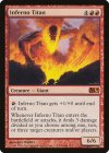
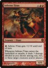
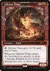
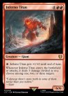
m11-146-inferno-titan.jpgpdp12-3-inferno-titan.jpgsld-224-inferno-titan.jpgltc-223-inferno-titan.jpg

Vote here and leave your comments below: https://www.surveylegend.com/s/53hr

(I couldn't get it to embed in here, if anyone knows if these forums support inserting an iframe, please lemme know how to it because it should be easy and I've done it before but have had no luck today)

Personally, the original printing is iconic, and seems like a great representative as red's "big bad". But it looks somewhat generic at the same time and blends into the other red cards in my cube, and most importantly, doesn't look like a 6/6 the way the Lord of the Ring version does, which captures the massive scale of a "giant" with the best representation of the "inferno" part of it, seeming entirely otherworldly and terrifying.

While the frame is not supposed to be the main discussion here, I certainly prefer not to have the Universes Beyond frame for cards if I can, but right now, I'm stuck between the original and the LTC one because we all have over a decade of memories with the M11 rendition and it remains impressive .
 
My vote goes to the Lord of the Rings

M11 is a story-less set and plane-less. It doesn’t bring back any memories of anything from Magic within the lore and it doesn’t show off any location in the multiverse.

The Duel of the Planeswalkers promo is an abomination because of its set logo :p

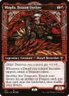
The Kaldheim one is an abomination because it used the ‘Legendary creature’ frame from Kaldheim but it isn’t even a legendary creature and it doesn’t have any story on Kaldheim :p

The LOTR wins for me even though it shouldn’t also be on Middle Earth but for me the art is superior.

I have cut Inferno Titan from my cube even though my cube is several thousand cards and have cards on all power levels because I feel like it doesn’t contribute to anything.
 

Onderzeeboot

Ecstatic Orb
The only artwork that communicates hurting multiple small things is the Kaldheim one, so ignoring border I voted for that one. I actually like the LotR version the least, because the titan itself takes up such a small part of the artwork. Sure, the mountains provide some size comparison, but focus on the giant please! The original artwork would be my second choice, and actually the one I would pick for my own cube if I were to include it. See, I like consistent frames, and I prefer the newest regular frame to the older and the special frames. The New Capenna Commander version would do nicely.
 

Onderzeeboot

Ecstatic Orb
The Kaldheim one is an abomination because it used the ‘Legendary creature’ frame from Kaldheim but it isn’t even a legendary creature and it doesn’t have any story on Kaldheim :p
It doesn't though!

khm-312-magda-brazen-outlaw.jpgsld-224-inferno-titan.jpg
The legendaries actually have a legendary "crown" that is not present on the Inferno Titan frame! :)
 
OG and it's not particularly close to me, it captures how menacing the card is in practice. Colors are great, composition feels dynamic. Iconic, for whatever it's worth.
Really don't like the duels one. Art is very dark, feels pretty flat.
I like Kaldheim one as an art piece, I don't like it as the art of a magic card.
Lotr I'm a bit mixed on. I think it works pretty well as card art, and the art itself is quite good. It gives me Fel Reaver in Hellfire Peninsula vibes, which is a good thing. On the other hand, I can't shake the feeling that it belongs on an uncommon, it doesn't have the oomph I want of a splashy card like Inferno Titan, it doesn't feel powerful. But my second choice for sure.
 

Onderzeeboot

Ecstatic Orb
It's the same frame. (Or very close) And it doesn't have a crown. Do you see that almost everything else on the frame is the same?
You mean similar to how regular frames for legendary and nonlegendary cards are almost the same?


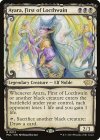
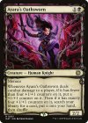
My point is that the Kaldheim frame has a different top border for legendary and non-legendary cards. It's not a crown, which is why I had "crown" in quotes, but it serves the same purpose as the crown on regular frames. Yes they are similar, but that is kind of the point? Compare also, e.g.

mul-13-ayara-first-of-locthwain.jpgmat-61-ayara-s-oathsworn.jpg
The difference in the Eldraine showcase frame is that legendaries have the swirly border run on at the top, while for nonlegendary the swirly frame stops in the top corners. The difference might be really subtle, but as in the Kaldheim frame, there is a difference between the legendary frame and the nonlegendary frame. In short, I said that Inferno Titan does not use the Kaldheim legendary showcase frame, which is true.
 
It’s the same frame though. One has the crown and the other doesn’t. You can consider it an add-on that is either there or missing from the card frame.

The specific card frame we are talking about is called the Kaldheim Showcase card frame and it is created to all the Kaldheim legends to capture their stories.

You can read more about the legendary showcase frame and the stories of the legends of Kaldheim here:

https://magic.wizards.com/en/news/feature/legends-kaldheim-2021-01-21

One of the reasons for the rage when that specific Secret Lair came out is exactly because Wizards decided to suddenly let that frame be used on cards that were both not legendary and also not on Kaldheim. Like a 100 % full flavor fail.
 
1 - Original: I almost always favor the original printing as it tends to be the most iconic. When I think of Inferno Titan there is only one art. It embodies its creature type. It's suppose to be human-like
2 - Secret Lair: The most visually interesting in a vaccum, but not for playing. Feels like an Elemental rather than a Giant
3 - Lord of the Rings: Boring. Also feels like an Elemental
4 - Duels: An abomination
 

Onderzeeboot

Ecstatic Orb
It’s the same frame though. One has the crown and the other doesn’t. You can consider it an add-on that is either there or missing from the card frame.
If your opinion is that Solphim and Capricious Hellraiser use the same frame, then yes, the Secret Lair version of Inferno Titan uses the same frame as the Kaldheim legends in the showcase frame.

The specific card frame we are talking about is called the Kaldheim Showcase card frame and it is created to all the Kaldheim legends to capture their stories.
Personally I disagree with this point of view. They create a showcase frame to capture the essence of the set. In Kaldheim's case this essence is the Viking-esque aesthetic. They chose to use this frame only for legendary cards, but just like Eldraine's showcase frame was originally only used for adventure cards, that doesn't mean the frame can (or indeed should) only be used for a particular subset of cards. The Kalheim showcase frame is fair game for nonlegendary cards, in my opinion.

One of the reasons for the rage when that specific Secret Lair came out is exactly because Wizards decided to suddenly let that frame be used on cards that were both not legendary and also not on Kaldheim. Like a 100 % full flavor fail.
I will note that giants are an element of Norse mythology, but I do agree that using the Kaldheim showcase frame for a non-Kaldheim card feels a bit weird. It's still my favorite Inferno Titan art of the bunch though, and the Kaldheim frame is one of the prettiest showcase frames out there, so there's that :)
 
Yeah it’s not an opinion but a fact. The frame is made for the legendary cards on Kaldheim that had a story to tell. If you want to read more about it you can click on the link.

I am giving minus points to Wizards when they later break this by printing cards like non-legendary, non-Kaldheim cards with this frame or when they print a non-Adventure card with the Adventure frame. Or when they print Ragavan which is a living, organic Monkey with the Invention Masterpiece frame. For that reason it is an abomination and should not have existed. It delutes the game and the purpose of the card frames.
 
They chose to use this frame only for legendary cards, but just like Eldraine's showcase frame was originally only used for adventure cards, that doesn't mean the frame can (or indeed should) only be used for a particular subset of cards.
When it comes to the Eldraine frame it really should only be used for that particular subset of cards, the fold looks much worse on cards without a split text box.
 
Day 1: INFERNO TITAN

View attachment 8517View attachment 8519View attachment 8520View attachment 8521

Vote here and leave your comments below: https://www.surveylegend.com/s/53hr

(I couldn't get it to embed in here, if anyone knows if these forums support inserting an iframe, please lemme know how to it because it should be easy and I've done it before but have had no luck today)

Personally, the original printing is iconic, and seems like a great representative as red's "big bad". But it looks somewhat generic at the same time and blends into the other red cards in my cube, and most importantly, doesn't look like a 6/6 the way the Lord of the Ring version does, which captures the massive scale of a "giant" with the best representation of the "inferno" part of it, seeming entirely otherworldly and terrifying.

While the frame is not supposed to be the main discussion here, I certainly prefer not to have the Universes Beyond frame for cards if I can, but right now, I'm stuck between the original and the LTC one because we all have over a decade of memories with the M11 rendition and it remains impressive .
Can I vote for don’t play Inferno Titan?
 

landofMordor

Administrator
I like the KHM showcase, but… my man Kev Walker needs my vote. His command of depth, shading, color, and volume is just incredible.
 
I did actually look into this for an article I'm working on about the titans and most of us don't run many of them, so this is a bit of a selfish start to the thread, in all fairness
Makes sense that most people don't run the Titans anymore; they're expensive and swingy!

that is to say: no!!! you can still have art opinions
Ok. Kev Walker. Super hot take, I know lol.
 

Day 1: Inferno Titan | Results

M11 | Kev Walker: 15 votes (75%)
Secret Lair (Kaldheim) | Dibujante Nocturno: 5 votes (25%)
All others - 0%

These results reflect @Velrun and myself changing our votes after being convinced in the thread.


Very happy to get so much conversation going on this topic so quickly!


Day 2: Arcane Denial | Survey


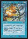
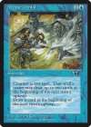
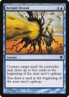
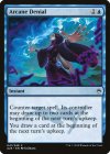
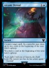
all-22a-arcane-denial.jpgall-22b-arcane-denial.jpgc13-28-arcane-denial.jpga25-41-arcane-denial.jpgltc-184-arcane-denial.jpg

:wagg: Link to survey here:wagg:

Iconic card with dual iconic pieces of art on its initial outing in Alliances by the justifiably-popular Richard Kane Fergeson. Is this going to be a competition between the two first printings or do the later renditions hold up?

Personally, I am unabashedly part of the RKF fanclub and have been delighted he's been used as a selling point in the high-cost product, representing his cache with MtG's most enfranchised audience. Personally, the more red version of the art is my top pick.

That said, I do respect Daarken's take on Sauron denying something in an arcane fashion quite a lot. As a long-time fan of the Tolkeinverse (I'm kidding with the name), I would have been delighted to have that art on pretty much any other counterspell. Ah, champagne problems!
 
Last edited:

Onderzeeboot

Ecstatic Orb
It’s Kane with a K :) But yeah, really easy pick here, as the newer arts all pale in comparison to RKF’s two pieces, of which I like the one with the fire & frost version the best by a fair margin.

(PS Mark Zug has illustrated some amazing artworks for Magic, but this one ain’t it :oops: it’s the worst one by a mile!)
 

Jason Waddell

Administrator
Staff member
Is it possible to write a bot that will vote for me "original art every time (unless there's a mystical archive option I really like)".
 
Top