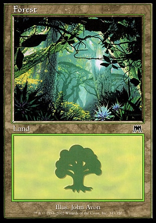
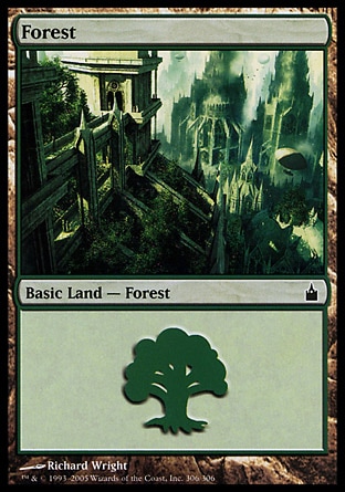
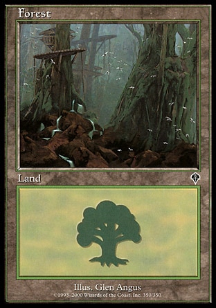
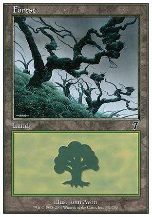
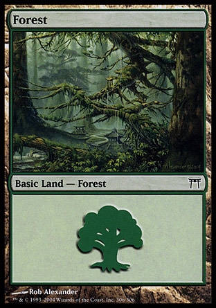
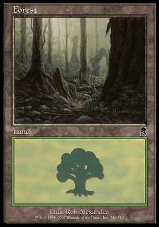
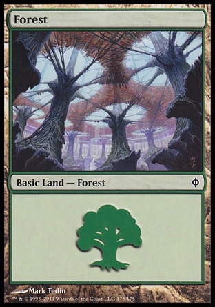
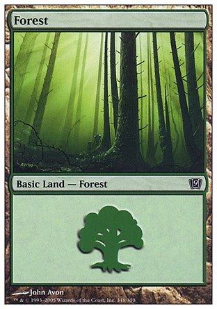
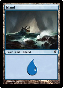
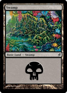
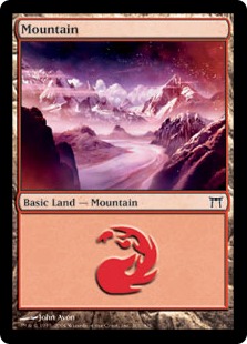
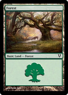
May I ask, why you guys only play a single version for each basic land? Is it simply the uniformity?
I'm a huge sucker for great art, and if I can get 165 pieces of art into my cube, that sounds more appealing than only 5. Because I would cry if I had to cut any of, like, any of these for example
But to each their own, i actually only wanted to show off some nice forests I run. Yeah.
At the moment I have a mixture of all different styles so each drafter can take the one they like, but then someone will take the ones I like before I get a chance and I have to cancel the draft and go home. I'd like to avoid that situation which is why I think I might get uniform basics.
I do go for a diversity of arts, but I really aim for the uniformity in style. All full art lands is nice looking as far as I'm concerned, and they are also easy to sort out of decks at the end of the day.
I hope they decide to do the "one full art, the rest regular" again to help improve the depth of full-land-arts, beyond a majority of them having some floating object(s) and a Hedron hidden somewhere in frame.
I like the uniformity of diversity, meaning every card should look good on it's own, and not like all the others. I like having old frame and new frame and post modern frame and maybe a few PC framed ones. Then have some full arts and alters and promo and foil versions. Have black, white and silver borders. Uniformity is just boooooring. After all, cube is a format, which represents the whole history of MtG. I like seeing a Douglas Schuler Serra Angel art next to Trueheart Duelist.
In the nonland section I 100% agree with this sentiment. My Cubetutor list is a rainbow of "upgraded" versions (alters etc), and I enjoy a variety of printings besides. I think the only thing I really have strayed away from is foreign and textless. I like my drafters to be able to read the cards .
Lands I like having the same aesthetic for the functional reason I mention. My cycling lands are differentiated in the same manner by all being the original versions, so the older card design stands out when taking a deck apart.
Oh man, speaking of Guays, I just picked up 12 of each of the Showdown foils to make up my draft kit. They are incredibly pretty and I'm a fan of the entire cycle:
They are breathtaking IRL, especially the Swamp which is one of my favorite land arts in a while.
I'm a bit of a stickler for consistency across my basic lands in all formats. I make sure to have matching basics whenever I play constructed, use a handful of Unhinged or Unglued full arts for whenever I actually do. I also have like 8 commander decks and use try to use specific basics for each of them with zero overlap. I just really dig the chance to show of your style or preferences with basics, it's just really neat. I love seeing whatever basics other people are rocking.
I posted about a Tribal Cube a friend and I were theorycrafting like a year ago, might get around to building it up physically in the near future after fixing it up a bit. For that, I'm planning on using a set of Lorwyn basics a friend gifted me a while ago. I just love land art so much.
A couple of times I have thought about using the basics as trophies for people who won. They can write their name and their deck and draw something cool on a basic and throw it in the box, so they will forever be remembered as the winner that draft. I always forget about this or try and make it more complicated by me trying to think of something cool to draw and never actually going through with it.
Does anyone else think this is a novel idea?
Also, I have a preference for lorwyn basics, for some reason, as they always look nice and pretty, but I have a certain lands that have become inside jokes in our community: The Haystack, Poor Boat, Too Much Colour, Purple Snow, Bambi
I use mostly beta basics, but also the '96 Arena cycle, the APACs, the Euros, and one Arabian Nights Mountain. I have spent way too much money on basics.
I'm increasingly disappointed that we took two pages taking about our basic lands in an era where most internet folks have smartphone and cameras, and nobody posted pictures yet. Gimme 5 minutes and I'll fix this!
My bad! I didn't count links with external images. You get a Riptide Point* for my oversight!
*Riptide Points are worthless and not endorsed by the Riptide Lab staff. Consult your doctor to see if Riptide Points are a good fit for your lifestyle.
I took the challenge of taking pictures of sleeved cards, an boy, did I flunk this thing! Double sleeving probably made it twice as hard (I don't have the math to prove it, so don't quote me on that), and resizing them, cropping and tinyfying the resulting PNGs managed to make the pictures even worse! But here are crappy pictures of pretty pieces of cardboard:
In any case, this setup allows me to have a large quantity of arts to choose from in case any of the players wants to keep a certain degree of consistency, but also allows for some variety. I also enjoyed the collectability aspect of trying to catch 'em all™ in foil, and I'm both looking forward to the next full art lands in this frame, and not looking forward to picking favorites.
I couldn't get myself to waste any more money on foil Wastes, but I still dream of finishing this set. I've been trading and buying these since the first Zendikar set. The destroyed landscape of the Hour of Devastation lands didn't speak to me enough to make me get those (though I'm currently reconsidering). The full-art judge foils would be an awesome addition here if they didn't cost as much as I probably payed/traded for all the other lands combined.
I made a project of putting some basics together that I like for my beginner cube. I only chose basics with modern borders and went for variety.
This is a set of 21 of each, but I couldn't help myself and collected a bunch more beyond this. When you don't buy the old, expensive ones, nice basics are an affordable luxury. But they're a bit of a pain to look up and get into your cart from the online stores. There's a ton of good art on basic lands.
I put together scans from Scryfall rather than photographing the sleeved cards. Here's what I came up with!
Since I'm going to whiteborder all my basic lands (which are all old frame btw) to find them easier after cubing, I made some minor changes to which art I'm going to include, since I don't want to whiteborder Euro Lands (sadly I can't use the Schwarzwald forest and the Highlands plains, but there are other great basics in old frame with the big mana symbol, and they're a lot cheaper).
Honorable mentions:
- the other three Onslaught islands (nice colours, but not the best art, but I still like them lol - spoiler below)
- euro lands (spoiler below)
- old frame basics without the big mana symbol I'd add if it wasn't against my sense for aestethics (spoiler below)
- a lot of art that can only be found in modern/m15 frame (which is clearly inferior for lands)