Bro...Hey bro, let's play BRO, bruh.
You are using an out of date browser. It may not display this or other websites correctly.
You should upgrade or use an alternative browser.
You should upgrade or use an alternative browser.
General (BRO) The Brother's War Spoilers
- Thread starter TrainmasterGT
- Start date
Onderzeeboot
Ecstatic Orb
Bro!Bro...
MaRo confirms Brother's War will be a good set.
Random Question said:Urza and mishra are the stars of the set. Why spoil them both so early?
MaRo said:That’s how good the set is. We can spoil those two cards and still have lots of cool designs left to show you. : )
Chris Taylor
Contributor
Well now it has to be true XD
MaRo has just confirmed Surveil and Landfall are becoming deciduous!


So that's 18 new Surveil cards! This is a big deal, because there 6 "surveil matters" cards in Guilds of Ravnica that just became significantly more well-supported than they were previously.


I think the big winner here is Blood Operative. This card always seemed like it was on the cusp of being good enough for Cube inclusion, but was just undersupported. A recursive 3/1 lifelink with built-in graveyard hate seems pretty good, but when you could only really surveil with Sinister Sabotage, Discovery // Dispersal, Doom Whisperer, Dream Eater, and Nightveil Sprite, it was not consistently triggerable. This errata has given us Consider, Curate, Eat to Extinction, Grim Flayer, and Search for Azcanta, in addition to the fantastic Dragon's Rage Channeler, Foul Watcher, Master of Death, and Sinister Starfish we got in Modern Horizon's 2!
question 1 said:Mark... gatherer had a weird update this morning. Are surveil and landfall becoming evergreen?
question 2 said:Hi Mark! I just saw that a bunch of cards in Gatherer got errata’d to use Surveil rather than the spelled out wording. Whats happening there?
Importantly, these cards are being errataed to have surveil!MaRo said:They are both becoming deciduous.
We’ve decided to make surveil deciduous, so we’re errataing old cards with the exact text to be surveil (as there are cards that mechanically care about it).
So that's 18 new Surveil cards! This is a big deal, because there 6 "surveil matters" cards in Guilds of Ravnica that just became significantly more well-supported than they were previously.
I think the big winner here is Blood Operative. This card always seemed like it was on the cusp of being good enough for Cube inclusion, but was just undersupported. A recursive 3/1 lifelink with built-in graveyard hate seems pretty good, but when you could only really surveil with Sinister Sabotage, Discovery // Dispersal, Doom Whisperer, Dream Eater, and Nightveil Sprite, it was not consistently triggerable. This errata has given us Consider, Curate, Eat to Extinction, Grim Flayer, and Search for Azcanta, in addition to the fantastic Dragon's Rage Channeler, Foul Watcher, Master of Death, and Sinister Starfish we got in Modern Horizon's 2!
If only Surveilance was playable in Pauper
landofMordor
Administrator
Coming soon: Secret Lair superdrop, "Updated Rules Text: burn, landfall, and surveil"MaRo has just confirmed Surveil and Landfall are becoming deciduous!
Importantly, these cards are being errataed to have surveil!
I really do wish they'd use the Secret Lair "technology" to solve some of these common (and reasonable!) gripes from the most enfranchised players. Getting updated wording on cards makes games play better with newer players, too.Coming soon: Secret Lair superdrop, "Updated Rules Text: burn, landfall, and surveil"
Are we combining the threads for the commander sets with their corresponding expansions from now on? I remember there being discussion of that (and I support it) and there's a cool card from the commander expansion I'd like to discuss.
Wait, what rule text update did burn get?Coming soon: Secret Lair superdrop, "Updated Rules Text: burn, landfall, and surveil"
Onderzeeboot
Ecstatic Orb
I'm all for it, but I don't think there was consensus on this issue yet. I know that in the past people expressed the wish to keep them split, but when I brought it up recently, nobody seemed to mind a merger.Are we combining the threads for the commander sets with their corresponding expansions from now on? I remember there being discussion of that (and I support it) and there's a cool card from the commander expansion I'd like to discuss.
Planeswalker redirection rule eventually made it so cards pre-ruling that say "creature or player [which can then be redirected to a walker]" now say "any target".Wait, what rule text update did burn get?
We went from this to that to this:
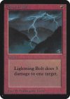
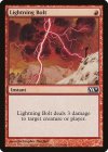
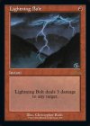
The majority of burn spells still say "target creature or player" -- at least the ones in my cube do!
Yeah, in 2018 with the release of Dominaria. But most of my burn spells precede that, such as:


Onderzeeboot
Ecstatic Orb
I like how two of those read "any target" 
...point very well takenI like how two of those read "any target"
I use the old border frame ones with sick art so
Original set logo is so so so important to me, I get that. I'm trying to replicate my cube on CubeCobra with the original set expansion just so I can run proper analysis on my cube and its representation of Magic history but I make the task harder on myself by 1) replacing every card I humanly can with the old frame version they've done a lot recently for Timespiral Remastered and MH2 and 2) changing my giant cube more frequently than I bother to update the second list.
I generally don't prefer the fancy border styles, but they can be pretty cool. I find it's rarely a situation where the art and the frame are the ones I'd want most, so I'm always compromising somewhere. I can just feel you all out there, breathing heavily about proxies and custom versions, and you're right, but I'm not going to acknowledge your correctness with my actions.
My priority order for what version of a card is:
0. Reminder Text / Clarity of Effect
1. Art
2. Frame
3. Updated Wording
4. Non-Foil Preference
I will reject a card from cube if they can't meet option 0 there (i.e. will never put in a card with a set-specific mechanic that's not explained on the card unless it's in abundance in the cube or extremely important), and will infrequently cut cards for bad art. One of those examples is the one I accidentally showed above!
I would simply not use this card in cube if it only had this art:

Even though I'd rather it not be foil, I love this art:
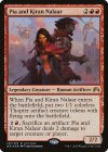
So I get to play with a neat, cross-archetype, story-relevant card! Hooray!
I generally don't prefer the fancy border styles, but they can be pretty cool. I find it's rarely a situation where the art and the frame are the ones I'd want most, so I'm always compromising somewhere. I can just feel you all out there, breathing heavily about proxies and custom versions, and you're right, but I'm not going to acknowledge your correctness with my actions.
My priority order for what version of a card is:
0. Reminder Text / Clarity of Effect
1. Art
2. Frame
3. Updated Wording
4. Non-Foil Preference
I will reject a card from cube if they can't meet option 0 there (i.e. will never put in a card with a set-specific mechanic that's not explained on the card unless it's in abundance in the cube or extremely important), and will infrequently cut cards for bad art. One of those examples is the one I accidentally showed above!
I would simply not use this card in cube if it only had this art:
Even though I'd rather it not be foil, I love this art:

So I get to play with a neat, cross-archetype, story-relevant card! Hooray!
Wanting all of these all the time means I am seriously considering an all proxy cube.0. Reminder Text / Clarity of Effect
1. Art
2. Frame
3. Updated Wording
4. Non-Foil Preference
YEEEEESSSSSSSSWanting all of these all the time means I am seriously considering an all proxy cube.
Chris Taylor
Contributor
Okay: Is this kiara nightly or is it just me?Even though I'd rather it not be foil, I love this art:

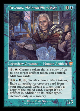
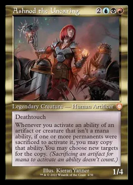
These are super cool, bro!
Only now, in this moment, at lunch, have I finally noticed, internalized, and been amused/puzzled by, the fact that Food is an artifact.
The *thing* with artifacts used to be that they were inorganic!

