General CBS

As said by many: number of words does not equal complexity. This holds true not only for reminder text but for abilities as a whole.

Thing is: having many different keywords/abilities does require more capacity, but one can have a cube with 6 wordy abilities and avoiding any other and be fine.

On the other hand, some abilities are much harder to grok than the number of words in the reminder text would lead to believe.

Not to be a buzzkill but what do we gain with continuing with this?
 
Not to be a buzzkill but what do we gain with continuing with this?
Personally, it’s the first time I’ve seen my list sorted like this. It makes me reevaluate some slots. Is Glimpe the Impossible (top 3 in Red for me) really worth it when it isn’t a crucial card but high on the wordiness scale?

Plus this is cube. I’m going to over analyze my list with any amount of metrics!
 
Yeah, wordiness isn't equal complexity exactly, but definitely is a factor. I also didn't think of specifically Glimpse the Impossible in that way for example.
 
As said by many: number of words does not equal complexity. This holds true not only for reminder text but for abilities as a whole.

Thing is: having many different keywords/abilities does require more capacity, but one can have a cube with 6 wordy abilities and avoiding any other and be fine.

On the other hand, some abilities are much harder to grok than the number of words in the reminder text would lead to believe.

Not to be a buzzkill but what do we gain with continuing with this?
I think it's just another helpful datapoint. I'm really pleased to be able to see my Cube organized in this way, and looking at the top few cards in each color side-by-side made my eyes gloss over in a way that I'm sure happens even more for my comparatively much less engaged playgroup.

I'm not going to just auto-cut the top 5% of wordy cards, but I try to be more thoughtful about what I include/keep in my list based on this element if only to make it so that newer players don't have to spend 5 minutes reading their P1P1 before even considering the cards.
 
Not too surprising, mostly the remaining DFCs as expected:


If I go non-DFC for Jeskai colors I get:


Word count is definitely something I'm cognizant of when building out my cube. It's easier to make an allowance for classic cards or those that have greater familiarity with my players, but tougher to do that for something brand new that some people may have never played with before. It also comes down to how simple mechanics are to understand as well, the language being deployed, if it's a variation of other familiar mechanics, etc. So if we were to look at something like UB cards I've included:


Mawloc is more or less just a weird kicker variant; pay more and you get to draw a card otherwise it's a fight creature with exile upside. We've seen fight creatures time and time again over various Limited formats. Alpha Deathclaw is just two potential shots of a Vindicate. Caesar is much more complex than these two, but all of these effects are pretty common and not too difficult to understand. Choosing where to use your "complexity points" in a cube's design is very important in crafting something that doesn't feel overwhelming to players who might be less engaged with Magic as a whole.
 
As said by many: number of words does not equal complexity. This holds true not only for reminder text but for abilities as a whole.
That is true in terms of mechanical complexity, but having 15 cards that all have full paragraphs of text still adds a lot of mental overhead. I like playing cards that are both mechanically "tight" and pretty economic on the text box, I think it plays better.
 
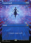
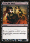
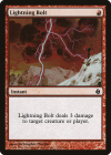
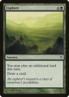
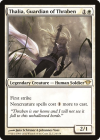
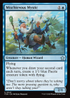
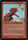
If we look at the flipside of this, sorting by the least wordy cards, it's interesting to see what pops up for creature and non-creature in each color:

1746654584321.png 1746654597659.png 1746654607597.png1746654615306.png 1746654623560.png

No real surprises here for me with noncreatures; just some good clean card design. Simple and iconic.

1746654780260.png 1746654795828.png 1746654804258.png1746654812906.png 1746654828440.png

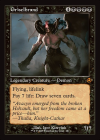
This is far more interesting to me. I never really thought about Griselbrand falling among the least complicated designs, but it really is just that aesthetically pleasing all around. Powerful effects all around, very simple templating to explain what they all do.

Sorting through lists and seeing where the "cutoff" point for wordiness (and to a lesser extent complexity) starts to creep up is pretty interesting. It also really puts into perspective just how absurdly packed modern card design is on average with almost every big offender.
 
Top