General [DMR] Dominaria Remastered Spoilers

Remastered set, $6 packs, designed to be drafted.
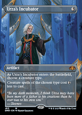
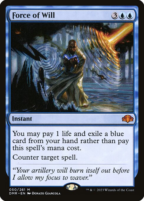
urzasincubatorp.jpg
89f612d6-7c59-4a7b-a87d-45f789e88ba5.jpg
496849a5-4b24-4eae-8bfb-d46f645d85ea.jpg


More at 12.
 

Onderzeeboot

Ecstatic Orb
I am pumped. This set looks super sweet for drafting so far. Looks like a good set to wash away the bitter aftertaste of operation $1K proxies with.
 
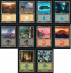
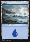
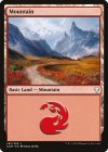
I've got a full essay I want to (and might) write about this, but wow do I have a lot of feelings about the basic land choices here.

basics dom remastered v2.png

1. These look great. I love the old border as a rule, but on basic lands that's even more true. While I've seen some complain about the BRC basics having far too dark a frame (a fair accusation), the print job on those decks was deeply saturated throughout, and shouldn't be used as a point of reference necessarily. The digital expressions of these still seem a touch dark for sure, but not nearly so much.

2. Great choices across the board, from an art quality perspective.The portal lands here are some of my all-time favorite swamps and mountains respectively, and the Onslaught forest is a perennial pick in draft boxes for a reason. The Lightning Plains with an absurd foil ratio is also included, and I'll contend that people aren't wrong to love it as much as they do, even if my own feelings are more temperate. THAT SAID: my biggest gripe with this selection is that all but two of these arts have been printed in the classic frame before (the Richard Wright Island is from Time Spiral and Titus Lunter's Swamp was in Dominaria, for those of you keeping score at home).

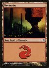
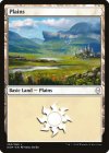
Now, to be fair, only four sets included in Dominaria Remastered were printed in the new border, and only two of them had basic lands included, so we technically get one land from each. BUT I would've killed to have some of these in the old border for the first time ever:


tsp-295-mountain.jpgdom-250-plains.jpgdom-254-island.jpgdom-262-mountain.jpg

Small quibble to be sure. It's a very personal contention I've nearly talked myself out of writing this down. But I felt it deep in my bones, so you get to read it here.

3. Not sure why it's only two lands per type. It's not as though they'd have to pay royalties for these pure reprints, and there's a basic land slot in each pack so they'll have plenty of availability no matter what. I get doing this with Unfinity (also the expectation isn't that people open quite as many of these types of packs) but here it seems weird. Oh well!
 
The Eric Peterson Plains makes me so happy - That's exactly the plains I'm slowly hunting down copies of for my cube, and at the rate I'm going it'll be faster to swap to this printing than continue with the Odyssey version. The Richard Wright island is also a favourite of mine, but it's currently the modern frame land option for the plebian players who hate brown, so hey.

Small silver lining: Less variety means more consistency, so you'll have an easier time getting the ones you want from piles of draft chaff!
 
There are a lot of retro frame cards that already had a retro frame, which on one hand feels like a waste, but it's cool that they get more copies into the world of these.
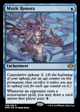
 
This has potential to be one of my favourite expansions ever, a remastered set with cards in old border? With Vampiric Tutor? Maze of Ith? Mystic Remora? Love it
 
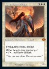
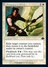
I'm really enjoying these old-bordered reprints. Some stuff that I'm going to nab for sure:

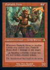
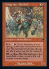
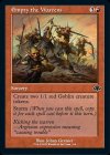
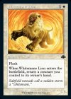
Lyra-Dawnbringer-retro-DMR-672.jpgMomentary-Blink-retro-DMR-672.jpgPashalik-Mons-retro-DMR-672.jpgMogg-War-Marshal-retro-DMR-672.jpgEmpty-the-Warrens-retro-DMR-672.jpgWhitemane-Lion-retro-DMR-672.jpgSevinnes-Reclamation-retro-DMR-672.jpg

Particularly excited about Sevinne's Reclamation here, but also for what Pashalik Mons represents. I thought they would be sticklers about the expansions that took place on Dominaria instead of just what cards took place there, but between the reprints of MH1 Urza and Yagmoth and now this, it's clear it's not an exception for the brothers! I've always wanted to get Mons out of the on-deck binder, maybe this will finally convince me.

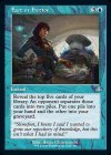
Fact-or-Fiction-retro-DMR-672.jpg

This is probably my favorite Fact or Fiction art to date, happy to swap out Jace for this. And it manages to capture some of the silliness of the original printing!

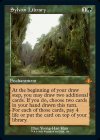
Sylvan-Library-retro-DMR-672.jpg

Here's my biggest personal controversy of the set so far (besides the basics). I adore nothing more than the original Sylvan Library art, but my #1 goal in my cube's card selection is comprehension: no foreign cards, no textless cards, reminder text is a huge plus, the most updated wording wherever possible, etc. I currently run the 4th edition Sylvan, because the original printing is hard to come by and quite expensive (currently just shy of $200, about 4-5x the price of my version). It's been a cube white whale for me for some time, since I do strongly prefer black borders and the "vibes" of original printings.

This one gets me 1) updated text that's much easier to grok, 2) a black border, 3) maintains the old frame. It's nice art too, to boot. As the great poet Billy Ray Cyrus said: much to think about.
 

Onderzeeboot

Ecstatic Orb
I'm legitimately surprised that this wasn't Magic 30 — "hey, let's celebrate Magic's history by drafting Dominaria's greatest hits" would have gone over really well.
For sure! This is the greatest hits celebration of the plane where most of Magic's history has played out. I'm still baffled that they thought printing $1000 proxys was somehow not going to not sit well with 99% of their player base.
 
There are a lot of retro frame cards that already had a retro frame, which on one hand feels like a waste, but it's cool that they get more copies into the world of these.
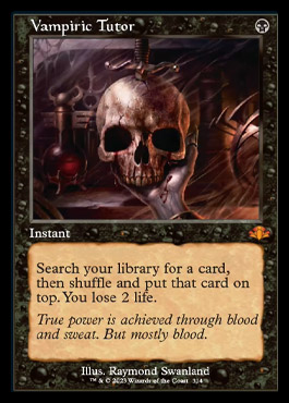
I was also a bit conflicted about these when they first were revealed, but the more I've thought about them the more I like them. It's cool to get old cards in the original border with updated rules text and occasionally new art!

mysticremora.jpg
vampirictutorp.jpg
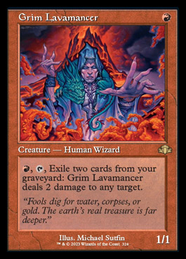
grimlavamancerp.jpg
 
Full spoiler is up, very happy about these joining the ranks of the classic border:

en_63bb0788de.pngen_6c877cdf61.pngen_396241fb70.png

Also, nice to have this in a non-pringled readable edition:
en_fdef161089.png

Cool set!
 
As the opposite of all you old-border lovers, I get this:
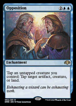
opposition.jpg


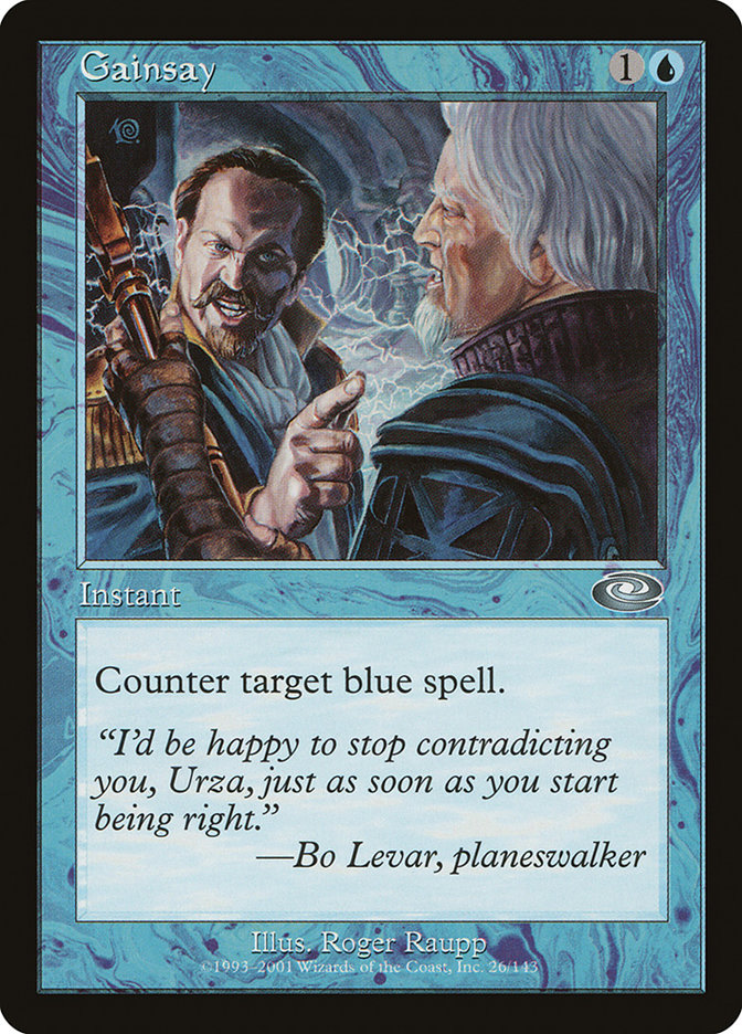
For the first time in new border* and it's with the original art! (the 7th flavor text that they reused is less good than Barrin just trash talking Urza, but we can't have everything in life)

*Amonkhet Invocations are not "new border" fight me
 
Only bad thing aesthetically (at least for me) is the expansion symbol that is a bit too much convoluted for my tastes

Also, since a lot of my friends play only with cards in italian, this is a great opportunity to get some new prints (I surely saw high tide, but I guess there are more)
 
Sadly, the only aesthetic upgrade I can apply directly for my cube is Tatyova, Benthic Druid, which is very nice, but it was spoiled like a month ago, so a little let down here. That being said, the only other DOM card I cube is Benalish Marshal and since they didn't use DMU or BRO cards, there wasn't much to hit here.

However, still a very sweet set that makes both, classic frame and new frame fans happy, adds great reprints and looks like a blast to draft. Kudos, wizards, nothing to complain here.
 
Top