Rob Dennis
Developer
So, this is a hard problem, and not because it's a technical challenge, but because it's about human interaction design and usability.
Too often, you're looking at entering a bunch of card names into a text area (or text file) and bulk upload, or perhaps in a text entry box and you'll get some suggestions, but it usually gets added to a big list, or somewhere else entirely and that's lame.
So we want to start editing a cube, but it's a pain to edit cards in a giant text file and it sucks having to make a google doc with a bunch of formatting that's not actually enforced or used to simplify things

Couple of things we can see:

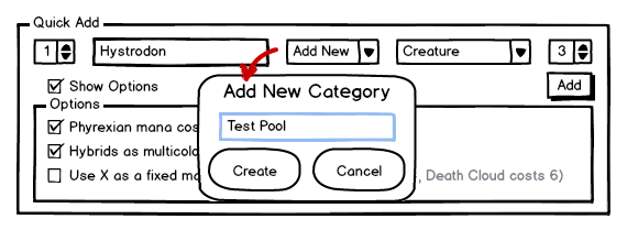
Kind of looks acts like a spreadsheet? That's kind of on purpose, this is borrowing a bit from a spreadsheet since:
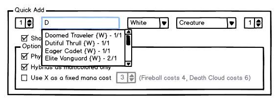
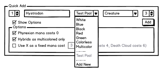
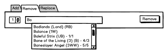
Maybe a user could start typing in a card name, and "potential" cards are in a dropdown. In this screenshot, you're in the white 1-drop creature slot, so it's showing you cards that fit that criteria. In the dropdown, there could be some reminder/clue what a particular card is, and that could help the user make the right choice for them.
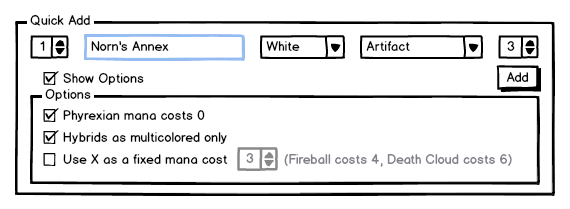
And let's make our selection:

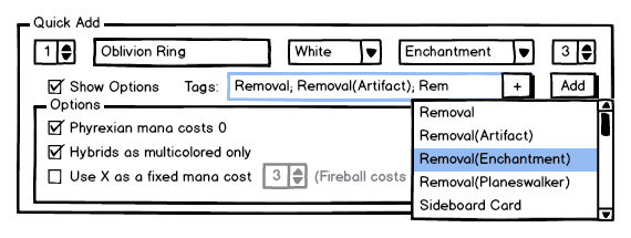
an extra row to allow entering another white 1 drop, and the count increments to help the user get a quick sense of what's in the pool.
I dunno, is this on the right track for people? Feedback is basically priceless since I think we can be doing this better.
This is from https://github.com/rdennis463/lambic/wiki/Mockups
Too often, you're looking at entering a bunch of card names into a text area (or text file) and bulk upload, or perhaps in a text entry box and you'll get some suggestions, but it usually gets added to a big list, or somewhere else entirely and that's lame.
So we want to start editing a cube, but it's a pain to edit cards in a giant text file and it sucks having to make a google doc with a bunch of formatting that's not actually enforced or used to simplify things
Couple of things we can see:
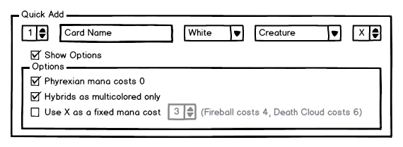
- This is trying to emphasize getting something usable as quickly as possible, instead throwing people into all the complexity right away (using presets, having some opinionated defaults)
- What switches we do have, I kind of do want to hide away; let's keep the focus on entering cards
- No matter how easy we can make this process, folks are still going to want to get their stuff in and out of a particular tool, so import/export is good.
Kind of looks acts like a spreadsheet? That's kind of on purpose, this is borrowing a bit from a spreadsheet since:
- the grid lets you get the visual mana curve when it's all laid out
- people expect that they can enter things in a cell
- people also understand that a column on a spreadsheet might be used to group a alike things
Maybe a user could start typing in a card name, and "potential" cards are in a dropdown. In this screenshot, you're in the white 1-drop creature slot, so it's showing you cards that fit that criteria. In the dropdown, there could be some reminder/clue what a particular card is, and that could help the user make the right choice for them.
And let's make our selection:
an extra row to allow entering another white 1 drop, and the count increments to help the user get a quick sense of what's in the pool.
I dunno, is this on the right track for people? Feedback is basically priceless since I think we can be doing this better.
This is from https://github.com/rdennis463/lambic/wiki/Mockups