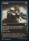
So today, the Innistrad: Double Feature card gallery dropped. Although some had predicted it before, it looks like we're just getting...greyscale versions of every single card between both expansions. Considering (reasonable) hopes for new artwork, even if it wasn't done in the exciting movie poster style of the upcoming Secret Lair expansions, this is a big disappointment, with the huge amount of Cube staples in Midnight Hunt that could've seen interesting new editions. I hadn't been exactly a huge fan of the "Eternal Night" style cards, but I always will prefer getting a choice of additional artwork to a simple art extension, which are now being drawn at the expense of the standard version instead of bastardizing the original art to fit the wider aspect ratio...this is all to say that the variant versions of cards are still more trouble than they're worth.
Let's take a look at Jadar, one of the most-discussed cards from this most recent return to Innistrad:
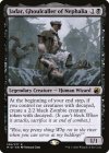
While this card does not have too much color on it to begin with, the art is clearly intended to have been presented in color -- beyond simply drawing your eye with color, it makes the blue-grayness of the backdrop and foreground feel devoid of life, in a way that the new greyscale edition almost reverses. The white text is a plus for readability, at least where the name is concerned, but the purple frame doesn't do enough to immediately identify it as a "Black" card, even if it does do so better than the Eternal Night version.
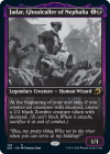
The Eternal Night version is clearly drawn to be displayed exclusively in black and white, and the composition benefits from that in addition to the extended frame, but even if it had the reminder text for "Decayed" I'd still prefer the original version for its greater coherence in subject and my own style preferences.
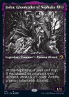
But the newest edition, the Double Feature version, does not allow for the same difference in preferences or perspectives -- it's worse on all counts, neither respecting the original intent and vision of the artwork or providing additional style or clarity beyond being "different". Looking at compelling cube inclusions in other colors, it's a similar situation across the board, with less legibility, clarity, and charm than their original versions:
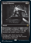
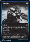
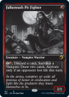
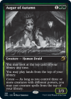
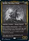
While the cards outside of white, black, and gold do fine at communicating their color identity (particularly the creatures, with a splash of color for their stat boxes), I can't imagine anyone preferring these to the original printing, with a single exception. The art is muddied, clearly not made with a greyscale version in mind for a single one, and details fade into the shadows. Some of the starkness looks slick, but more often, it obscures the focus of the picture for a background element, like the moon in the Pit Fighter.
The only place I'd give pause here is the Augur of Autumn, and that's simply because my version of the card was printed far too dark for QC reasons, and this version is ironically more legible....but I can't imagine ordering this and having the same printing error occur again with WotC's recent track record.
Overall, I'm typically not a fan of the style of alternative art cards that WotC has been favoring, with the exceptions for things like basic lands, or the Godzilla and Dracula takeovers that very much do not feel Magic but have high-quality art, thus escaping the "uncanny valley" of official promos that ride a line with popular fan altered aesthetics. That said, this could've been a cool chance to see some favorite cards done up like these, that are novel and fun, even if they do impact clarity:
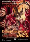
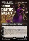
A dude can dream, I guess!
Beyond the aesthetics, I'm disappointed to lose what I was hoping would be an excellent Limited environment. As I've discussed here, playing a lot of retail limited is my favorite way of discovering new cards for Cube, and although VOW is unimpressive generally speaking, giving key cards a second chance to shine with the boost from MID was a compelling opportunity for reevaluation. Based on their language before, it was reasonable to expect this to be a curated draft set combining interesting elements of both expansions in new ways, but it turns out that's not the case, opting instead to retread the full lists with a double dose of Rare cards and an extra Uncommon per booster, at the expense of the commons that held together Midnight Hunt. Between being unable to easily digest the color of cards at a glance and this top-heavy format with too many rares (which are already too disruptive in VOW), I'm now firmly going to avoid playing this set, a far cry from the feverish excitement I had for it previously.
I'm disappointed as a cube manager from both an aesthetic and gameplay perspective that this bonus set -- that I should really view as bonus and not something to actually be excited about -- is leaving so much potential on the table. While not every set and every opportunity needs to be excellent to keep the game going strong, I feel like the poor strategy displayed here from WotC speaks to many reoccurring missteps they've been making, even as they continue to release A+ expansions like MID or MH2 and A+ specialty products like Time Spiral Remastered. Thanks for reading, and let me know what you think of this set too!
Let's take a look at Jadar, one of the most-discussed cards from this most recent return to Innistrad:


While this card does not have too much color on it to begin with, the art is clearly intended to have been presented in color -- beyond simply drawing your eye with color, it makes the blue-grayness of the backdrop and foreground feel devoid of life, in a way that the new greyscale edition almost reverses. The white text is a plus for readability, at least where the name is concerned, but the purple frame doesn't do enough to immediately identify it as a "Black" card, even if it does do so better than the Eternal Night version.
The Eternal Night version is clearly drawn to be displayed exclusively in black and white, and the composition benefits from that in addition to the extended frame, but even if it had the reminder text for "Decayed" I'd still prefer the original version for its greater coherence in subject and my own style preferences.
But the newest edition, the Double Feature version, does not allow for the same difference in preferences or perspectives -- it's worse on all counts, neither respecting the original intent and vision of the artwork or providing additional style or clarity beyond being "different". Looking at compelling cube inclusions in other colors, it's a similar situation across the board, with less legibility, clarity, and charm than their original versions:


While the cards outside of white, black, and gold do fine at communicating their color identity (particularly the creatures, with a splash of color for their stat boxes), I can't imagine anyone preferring these to the original printing, with a single exception. The art is muddied, clearly not made with a greyscale version in mind for a single one, and details fade into the shadows. Some of the starkness looks slick, but more often, it obscures the focus of the picture for a background element, like the moon in the Pit Fighter.
The only place I'd give pause here is the Augur of Autumn, and that's simply because my version of the card was printed far too dark for QC reasons, and this version is ironically more legible....but I can't imagine ordering this and having the same printing error occur again with WotC's recent track record.
Overall, I'm typically not a fan of the style of alternative art cards that WotC has been favoring, with the exceptions for things like basic lands, or the Godzilla and Dracula takeovers that very much do not feel Magic but have high-quality art, thus escaping the "uncanny valley" of official promos that ride a line with popular fan altered aesthetics. That said, this could've been a cool chance to see some favorite cards done up like these, that are novel and fun, even if they do impact clarity:


A dude can dream, I guess!
Beyond the aesthetics, I'm disappointed to lose what I was hoping would be an excellent Limited environment. As I've discussed here, playing a lot of retail limited is my favorite way of discovering new cards for Cube, and although VOW is unimpressive generally speaking, giving key cards a second chance to shine with the boost from MID was a compelling opportunity for reevaluation. Based on their language before, it was reasonable to expect this to be a curated draft set combining interesting elements of both expansions in new ways, but it turns out that's not the case, opting instead to retread the full lists with a double dose of Rare cards and an extra Uncommon per booster, at the expense of the commons that held together Midnight Hunt. Between being unable to easily digest the color of cards at a glance and this top-heavy format with too many rares (which are already too disruptive in VOW), I'm now firmly going to avoid playing this set, a far cry from the feverish excitement I had for it previously.
I'm disappointed as a cube manager from both an aesthetic and gameplay perspective that this bonus set -- that I should really view as bonus and not something to actually be excited about -- is leaving so much potential on the table. While not every set and every opportunity needs to be excellent to keep the game going strong, I feel like the poor strategy displayed here from WotC speaks to many reoccurring missteps they've been making, even as they continue to release A+ expansions like MID or MH2 and A+ specialty products like Time Spiral Remastered. Thanks for reading, and let me know what you think of this set too!

