You are using an out of date browser. It may not display this or other websites correctly.
You should upgrade or use an alternative browser.
You should upgrade or use an alternative browser.
General [SPM] Marvel's Spider-Man
- Thread starter Seeker
- Start date
Yeah, even if these are like 50% slush art from Duskmourn and New Capenna, these are generally a big improvement in terms of flavor. Like with the Arena-only pieces, the quality of art is a little looser than what usually makes it into a psychical booster pack, but there are some inspired choices here like:
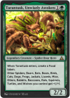
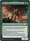
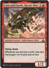
Tarantusk is silly, but I'm in. The Scouring Stormsoul having such good vibes helped push it above the "maybe" list for me. Cam and Farrik really could use some flavor text but is very silly and fun.
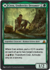
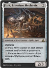
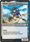
I like these spider-men versions. I've seen complaints about how many of them are just "person plus spider" but that's honestly a much better way to do it that's already been established in the card game, rather than figure out how to make UW-aligned spider-human-hybrids.
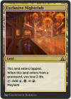
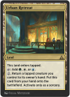
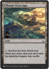
Lands are a big improvement. Much better than Peter Parker's bedroom and Manhattan Island.
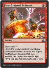
Seeing Koth and Chandra together on a card like this makes me really happy, but also shows off the issue with UB. I'm OK with the art of the original version of this card, but this MOM slush art helps me really appreciate all the fun in-universe stuff Magic has done...and miss it! Again, I'm no anti-UB guy, but I do love the opportunity to add a new Koth card to my Cube in 2025 when he was one of the best Red cards in my list for its first few years of existence.
Yeah, I'm going to work to make nice-looking proxies of these. Only Lady Octopus, Inspired Inventor is a big downgrade. The camera is about as bad as Peter Parker's Camera. It's worth the effort, these make me much happier.


Tarantusk is silly, but I'm in. The Scouring Stormsoul having such good vibes helped push it above the "maybe" list for me. Cam and Farrik really could use some flavor text but is very silly and fun.


I like these spider-men versions. I've seen complaints about how many of them are just "person plus spider" but that's honestly a much better way to do it that's already been established in the card game, rather than figure out how to make UW-aligned spider-human-hybrids.


Lands are a big improvement. Much better than Peter Parker's bedroom and Manhattan Island.

Seeing Koth and Chandra together on a card like this makes me really happy, but also shows off the issue with UB. I'm OK with the art of the original version of this card, but this MOM slush art helps me really appreciate all the fun in-universe stuff Magic has done...and miss it! Again, I'm no anti-UB guy, but I do love the opportunity to add a new Koth card to my Cube in 2025 when he was one of the best Red cards in my list for its first few years of existence.
Yeah, I'm going to work to make nice-looking proxies of these. Only Lady Octopus, Inspired Inventor is a big downgrade. The camera is about as bad as Peter Parker's Camera. It's worth the effort, these make me much happier.
Exclusive Nightclub and Urban Retreat look like they are from The Maestros and The Brokers (Streets of New Capenna) which is cool.
Last edited:
...honestly, I don't think the Arena version of this set has any consistent aesthetic at all and it turns out I want that more than I want "Magic flavor", even if I don't like the aesthetic (looking at you, Aetherdrift, and parts of Duskmourn although I loved other parts)
It's kind of weirding me out to feel this way, though.
It's kind of weirding me out to feel this way, though.
...honestly, I don't think the Arena version of this set has any consistent aesthetic at all and it turns out I want that more than I want "Magic flavor", even if I don't like the aesthetic
But ... cubes usually don't have a consistent aesthetic? And stuff like masters or MH sets or core sets don't have one either?
Chris Taylor
Contributor
I think of my cube aesthetic like a cluster. Some cubes are like mono innistrad, some are anything generally spooky, some are some magic more broadly but eschew say, silver boarder cards and ante, some are anything goes.
The set being top to tails spider man and New York, which is jarring to the rest of magic but at least internally consistent, as opposed to modern horizons which is an internal mishmash of different magic works differently to some people.
To put it another way: who cares about how well the album fits together if you like 4 songs off it.
If the album fits together really well, great. That's a good stand alone thing you can enjoy. The presence or absence of an album (that's I'm not presently listening to) doesn't change how a song sounds when it comes on shuffle.
But I've been a shuffle person ever since I could pick out my own music, and the idea of sitting down to ~30 mins of music that is only good in order, start to finish is alien to me. Obviously it would be best if the music was good both in and out of order, but I know which one is more important to me.
But I've talked with Arlo long enough to know they think the exact opposite way about magic sets. (More about sets than cards).
WotC makes albums, we make playlists.
I think maybe this idea got away from me. Couldn't write a short post, so I wrote a long one
I think it might be a lot of little things, that make the Omenpaths version weird to some (me included).
- they probably didn't have as much time for commissioning all the art than usual
- they probably had a much lower budget for the art than in other sets
- the omenpathization comes with big constraints, everything is a spider, a villain, a hero(?), performer (??) or a citizen and they relied heavily on fitting planes like Duskmourn, Aetherdrift or New Capenna where modern stuff like humans in modern cities would feel better placed
- the heroic spiders don't look very much like heroes (and other types are also invisible on the art)
- this also leads to a pot pourri of things à la March of the Machines (though there it story you could follow through card art)
The arena frame/font is not helping either but that at least can be solved with proxies.
And the green spiders look great!
they do though - like, a Magic style guide, even when it changes through the agesBut ... cubes usually don't have a consistent aesthetic? And stuff like masters or MH sets or core sets don't have one either?
but anyway enough about my dumb opinion let's talk about the new Incite:
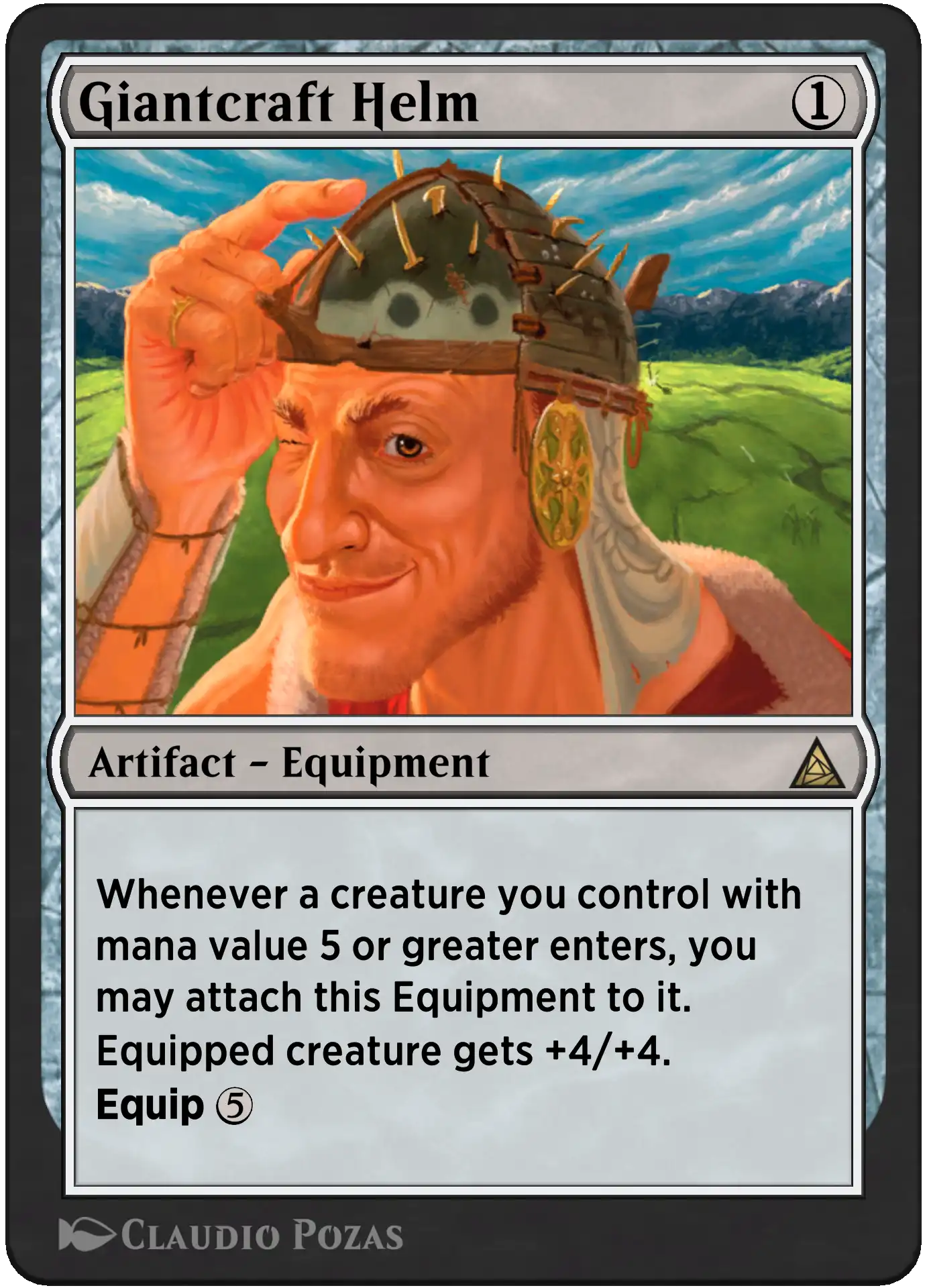
Homelands-ass art - mostly derogatory, partially laudatory - this does look like Fanatical Fever or whatever from back then, in a negative but also in an endearing way. does have a Magic: the Gathering card vibe to me, unlike, say, Makdee and Itla, Skysnarers (whenever this card tag works...)
Emoji whenthey do though - like, a Magic style guide, even when it changes through the ages
but anyway enough about my dumb opinion let's talk about the new Incite:

Homelands-ass art - mostly derogatory, partially laudatory - this does look like Fanatical Fever or whatever from back then, in a negative but also in an endearing way. does have a Magic: the Gathering card vibe to me, unlike, say, Makdee and Itla, Skysnarers (whenever this card tag works...)
I actually spent at least a full minute trying to figure this out!I'm not even convinced that's a giant and not a human zoomed way in...
There's implied scale clues:
the weapons embedded in the helmet are intended to be normal-sized
there's two archers on the ground over his shoulder on the right side, likely intended to be normal humans and not really really far away
therefore, the arrow breaking off his helmet on the right side probably came from one of them, as did the two arrows embedded in it just above them
if those are normal-sized arrows he is a giant
(alternatively, normal guy under attack by Segovian Archers, which honestly? who the heck knows! that would be cool! maybe it's Dreamspoiler Witches all over again)
edit: oh my god, is the front half of the helmet a repurposed boat? is that why it has the pointy thing in the very front?
Onderzeeboot
Ecstatic Orb
There's also a rudder at the back XDedit: oh my god, is the front half of the helmet a repurposed boat? is that why it has the pointy thing in the very front?
haha, so there isThere's also a rudder at the back XD
the more I look at this art the more there is to see (derogatory) (laudatory) (all I'm saying is it has Homelands vibes and I miss that, this is probably my favorite art in the new set now)
So I managed to 3-0 my prerelease with GW Spiders. Too hard to put it in decklist form, so just took a picture of it. The sealed format of this set is... interesting. We haven't had a small set like this to do sealed with in quite some time and it lead to getting a lot of duplicates that I feel we wouldn't usually get otherwise. I ended up with 4 x Grow Extra Arms (pretty good) and 4 x Starling, Aerial Ally (not so good). I saw a lot of other players with multiple 3 of's in their decks which I can't remember happening before.
Spider-Man India is an absolute house of a card if you can get it into play on turn 3. Since you will most likely be playing creatures he ends up being just like a Serra Angel that can share it's flying prowess to other creatures as well.
Nobody respected the multiple Grow Extra Arms, so there were some games where I swung with a flyer, they didn't block then took an extra 8 for only 2 mana and died.
Spectacular Tactics is also a very great split card. Snakeskin Veil has been getting more and more love over the years as green's best protection spell and this is the same thing but adds a Reprise as well which is just fantastic as a modal card.
I don't know how well draft will work with this set considering all the multiple cards but I can't say I was too impressed with the sealed format. Just felt a little off. My deck was pretty boss though so I can't really complain.

Around here prereleases have the lowest attendence since forever. One store was asking around, lowering prices and trying to convice people, because so far, they had only three people registered! Instead of usual being sold out at 36 people easily. And it's not the only store with that problem from what I heard.
But MaRo said the game is going better than ever and everyone likes this!From France, there is a lot of discussion among players for what we could call an "universe beyond weariness". Or a "6 set a year weariness". Even probably a mix of both.
Give me The Soul Stone and then I’m done with the set.
You're missing out if you don't at least try Heroes' Hangout (which, by the way, is honestly probably the better of the two names over Fire-Brained Scheme)Give me The Soul Stone and then I’m done with the set.
You're missing out if you don't at least try Heroes' Hangout (which, by the way, is honestly probably the better of the two names over Fire-Brained Scheme)
Won’t touch it even though I dig Spider-Man movies.
It felt bad opening Magic packs, folks. Can't say I've ever had that happen before. Had a great time overall, though.
We had 25-30 people, which yeah, was much lower than the 60 for FF but not too off from the ~35 from EOE.
I went 2-1 with a bunch of great games. And while the decks were all pretty boring and/or swingy, it is sealed, and the gameplay was excellent. Web-slinging and Mayhem were incredibly cool mechanics and made for interesting, dynamic games. I was UB and battled back from 1 or 2 life multiple times. I would've won round 3 if I wasn't too tired, I misplayed some incredibly tight games due to the incredibly slow tournament org having the round start close to 11 after I had gotten up at 6 and worked a full day, one of which was almost one of my "battle back from 1 life" games that I goofed by not realizing Superior Foes of Spider-Man lets you play the card even after it's dead. Lots of sloppy stuff like that in this set, where it makes dumb feelbad moments by not working like cards typically work these days that are much more egregious:


Damage Control Crew forces you to destroy your own stuff if there aren't legal targets otherwise, they can bounce their own guys to force you to Kraven's Last Hunt your own creatures, Shocker, Unshakable will kill your own guys on an empty board, etc. I like this in concept -- downsides are cool!! -- but here, especially in retail limited, it feels like an oversight. Less an added strategic layer, more a consequence of less-than-normal testing, especially for a set that's supposed to be more basic / new player friendly.
At the end of the day, I opened these 3 cards from the same booster pack, so I knew I'd be in for a good time:
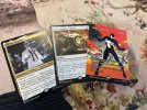
My deck, certainly carried by Gwenom and Mysterio, looked like this prior to realizing I was an idiot and removing the white splash for an extra Pumpkin Bombardment and a C- level 2-drop in blue:
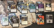
Look, I can't complain about any retail limited where I'm the only one with a Mystic Confluence, right?
Removal is interesting. Most of it can't kill a big dude. Many sets have a "critical toughness" and I think it might be 4 in this set, but it's more likely 5. Either way, Spider-Rex, Daring Dino with its ward 2 is basically a bomb at common and I'm glad I never had to face it down myself. Pumpkin Bombardment is as sweet as I thought it would be, may need to figure it out for my Cube still. We knew Ultimate Green Goblin would play well because of its comps but it was extremely satisfying to see it in action.
I ended up really liking the common legends, though. Doc Ock, Sinister Scientist and Spider-Man, Web-Slinger played extremely well, and though a little underwhelming, Swarm, Being of Bees felt good to play. I was sad to not have a Venom, Evil Unleashed, but on other tables, it truly looked like it captured the intersection of "feeling legendary" and "feeling common". Aunt May performed for everyone and made me feel better about tentatively adding her to my Cube, even if I only have a handful of spiders to get full value off her. That second toughness is no slouch, and it was fantastic with web-slinging. Yes, I know Hinterland Sanctifier exists and is cuter (and doesn't make me hate myself flavor-wise), but it's not legendary!
I was right to consider Hobgoblin, Mantled Marauder the coolest design of the set. I think the comparisons to Slickshot Show-Off were underselling it (and don't appreciate how much discard is in the median Cube environment these days!!) -- even in a retail limited environment, it was dealing absurd damage. I saw multiple turn 4 and 5 kills off just the little guy, and I couldn't be more excited to Cube with it.
To really drive it home, though, this set was very boring to build but extremely fun to play. I'm curious how it'll play out, but I can say that, as anti-spidermen as I am, I'm more willing to drive an hour to a Spider-Man RCQ in the next month or two than I have been for EoE.
We had 25-30 people, which yeah, was much lower than the 60 for FF but not too off from the ~35 from EOE.
I went 2-1 with a bunch of great games. And while the decks were all pretty boring and/or swingy, it is sealed, and the gameplay was excellent. Web-slinging and Mayhem were incredibly cool mechanics and made for interesting, dynamic games. I was UB and battled back from 1 or 2 life multiple times. I would've won round 3 if I wasn't too tired, I misplayed some incredibly tight games due to the incredibly slow tournament org having the round start close to 11 after I had gotten up at 6 and worked a full day, one of which was almost one of my "battle back from 1 life" games that I goofed by not realizing Superior Foes of Spider-Man lets you play the card even after it's dead. Lots of sloppy stuff like that in this set, where it makes dumb feelbad moments by not working like cards typically work these days that are much more egregious:
Damage Control Crew forces you to destroy your own stuff if there aren't legal targets otherwise, they can bounce their own guys to force you to Kraven's Last Hunt your own creatures, Shocker, Unshakable will kill your own guys on an empty board, etc. I like this in concept -- downsides are cool!! -- but here, especially in retail limited, it feels like an oversight. Less an added strategic layer, more a consequence of less-than-normal testing, especially for a set that's supposed to be more basic / new player friendly.
At the end of the day, I opened these 3 cards from the same booster pack, so I knew I'd be in for a good time:

My deck, certainly carried by Gwenom and Mysterio, looked like this prior to realizing I was an idiot and removing the white splash for an extra Pumpkin Bombardment and a C- level 2-drop in blue:

Look, I can't complain about any retail limited where I'm the only one with a Mystic Confluence, right?
Removal is interesting. Most of it can't kill a big dude. Many sets have a "critical toughness" and I think it might be 4 in this set, but it's more likely 5. Either way, Spider-Rex, Daring Dino with its ward 2 is basically a bomb at common and I'm glad I never had to face it down myself. Pumpkin Bombardment is as sweet as I thought it would be, may need to figure it out for my Cube still. We knew Ultimate Green Goblin would play well because of its comps but it was extremely satisfying to see it in action.
I ended up really liking the common legends, though. Doc Ock, Sinister Scientist and Spider-Man, Web-Slinger played extremely well, and though a little underwhelming, Swarm, Being of Bees felt good to play. I was sad to not have a Venom, Evil Unleashed, but on other tables, it truly looked like it captured the intersection of "feeling legendary" and "feeling common". Aunt May performed for everyone and made me feel better about tentatively adding her to my Cube, even if I only have a handful of spiders to get full value off her. That second toughness is no slouch, and it was fantastic with web-slinging. Yes, I know Hinterland Sanctifier exists and is cuter (and doesn't make me hate myself flavor-wise), but it's not legendary!
I was right to consider Hobgoblin, Mantled Marauder the coolest design of the set. I think the comparisons to Slickshot Show-Off were underselling it (and don't appreciate how much discard is in the median Cube environment these days!!) -- even in a retail limited environment, it was dealing absurd damage. I saw multiple turn 4 and 5 kills off just the little guy, and I couldn't be more excited to Cube with it.
To really drive it home, though, this set was very boring to build but extremely fun to play. I'm curious how it'll play out, but I can say that, as anti-spidermen as I am, I'm more willing to drive an hour to a Spider-Man RCQ in the next month or two than I have been for EoE.
Why did you feel bad opening Magic packs? @MilesOfficial
Why did you feel bad opening Magic packs? @MilesOfficial
because it's spider-man, mostly
but also, the cards didn't feel fun to open. like, cool, there's a guy in a chair. there's a taxi driver. there's another spider-man variant I don't have any interest in. oh hey, the art on this and the designs on these feel 50% like they were thrown together
I'm impressed it makes for fun gameplay considering how uninspired everything reads
Did a 4 man draft today in person.
Two UB decks, GW Enweb aggro, and I played Gwb by cutting all the green stuff. Red was open the entire time because everyone had strong nonred multicolor cards and didn't want to risk abandoning ship and getting cut off.
Overall, it was pretty good. The cards themselves were decent. The archetypes seemed alright. Enweb as a Ninjas-style deck was cool to play with and against. The format having 5 2c pairs for 4 players wasn't too bad, but it's a little awkward. I had fun.
I think most of the complaints online come from the small set size. It makes the replayability pretty poor. Even my deck had 3x, 2x, 2x of certain cards in the 24 spells. I can definitely imagine the format getting old after 3-5 drafts or less.
Nothing wrong with the pick two idea. I think I've even done it before because 4 person draft is so bad. Could definitely be done better, but it was a decent way to play with 4 people. I think it could work really well in a color imbalanced format like The Black Cube or a cube missing a color. That setup also works well for grid drafting with two people and The Black Cube was cool with 8 people, too.
TLDR: Fun draft. Set's too small.
