General Aesthetics Debate Club: Optimizing Art in Cube (Daily!)

Okay I’ll bite and go off topic for a second. What is wrong with Therese Nielsen?

She support openly racist/antisemitic content creators (retweeting/gifting art/etc.), supports anti-vaccine and other harmful conspiracy theories, and is (allegedly? only 90% sure about this but Autumn Burchett thought it real enough to alter some Guru lands over it at a pro tour or something, so I'm pretty sure it's real given the monetary and historical value of those cards) aggressive trans-exclusive feminist. There are plenty of articles about the issue diving into more detail, but there are a number of people (including myself) who would rather not support a person who promulgates these views even if they art real good.

edit: masterful ninja'd
 
Last edited:
Okay I’ll bite and go off topic for a second. What is wrong with Therese Nielsen?
@inscho and @Zoss shared the same article I was just in the process of posting it. That Hipsters of the Coast piece is a pretty good overview for why she was dropped by WotC.

Nielsen's rebuttal is also in the article, but I think it's worth posting here as well:
“Just so nothing I have expressed thus far can possibly be misunderstood…for the record, I support human rights, trans rights, gay rights, as well as religious freedom and the sacredness of life in all forms.”

I'm pretty confident by her actions that she's got a lot of views I strongly disagree with and supports folks who I'd like to not see get any amount of support, but it's pretty hard for me to assert she's a bad person from my limited visibility into her life. I personally don't agree with WotC's decision to cut ties on the basis of her associations, but I also understand why they did it, and I don't think anyone is wrong to hold her associations/media preferences against her.
 
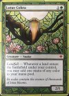
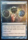
Hm okay. I am of the opinion that people should be allowed to be however they are as long as they do not try to hurt other living beings. Sometimes some people have more difficulty adapting to the new world order that the majority have decided to follow and I do not fault them because they were born into a different world. There are for sure things I haven’t understood of this situation from reading that article. Thank you for explaining and I will continue to upload the Ponder and Lotus Cobra that I run:
 
1691684706893.jpeg1691684716342.jpeg

I voted for the original from Zendikar because it is my favorite Lotus Cobra art. Also my favorite set logo of the available ones. My cube actually has three Cobras because the cube is massive. I run the Zendikar, the Zendikar Rising and the Zendikar Rising cartoon variant. When a cube has more than a singleton card it gives the card a certain feeling of being uncommon instead of rare. Two players around the table can actually get one. Or a single player can get two if they are lucky.
 
I love the OG art for sure. I always felt like the Nielson art was beautiful but less like a magical snake and more like a really pretty snake. I love the color in Sam Rowan's art but feels a little on the nose. Bastien Grivet's just has too much pointless energy to me? I'm not sure how to properly express that. Crom's is just super cute to me. I think it's OG art but Crom's is sick for sure.
 

Day 13: Lotus Cobra | Results​

Chippy | ZEN - 7 votes (50%)
Terese Nielsen | GP Promo - 3 votes (21%)
Sam Rowan | ZNRv1 - 2 votes (14%)
Bastien Grivet | ZNR v2 - 2 votes (14%)
CROM | SLD - 0 votes

Chippy's original is iconic for a reason, taking in half the votes of a competitive field. As many folks here have said,

Day 14: Orcish Bowmasters | Survey

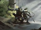
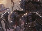
ltr-103-orcish-bowmasters.jpgltr-433-orcish-bowmasters.jpg
Maxim Kostin | LTR
Tyler Jacobson | LTR Promo

Take the survey here!

Only two choices today, but with this high-profile card, this is a compelling choice that many of us have had to make recently!

The standard art is probably more fitting, since the composition is optimized for an individual card and it feels more like the 1/1 with a friend the card implies, but there's something primal and thrilling about Jacboson's take on the card. I think this is as close to a tie as it comes from me, even though the two pieces are so fundamentally different.

With me trying to decide which to include, this is a bigger question about the frame - which is not the purpose of this endeavor, but is still plenty meaningful! I chose the standard version because the frameless one looks too messy and it's too hard to tell it's a black creature....but on the other hand, the standard version looks like an artifact creature at first and second blush.

So it's a wash all around! I very slightly prefer the standard art for that clarity of purpose but I might change my mind by the end of voting on Monday.
 
For me this was easy

I don’t mind the Universes Beyond card frame. I just wish they had chosen to do a different one for each universe. Middle Earth seems like it should look more like a scroll, forest nature, quest or wizard spell kind of frame.

However the art is a lot better for me because zoomed in action face doesn’t look like a creature to me.
 

Onderzeeboot

Ecstatic Orb
Yeah, looking at the art, I prefer Jacobson. It captures the bowmaster and the army it creates better, I feel, than the standard art. That said, the frame does make a mess of the art, with the title bar overlapping the titular Bowmaster :(
 

Chris Taylor

Contributor
I think like reprive I might make a version of this with universes within frame, otherwise unchanged.
Unless I can find siiiiiiick art somewhere for a borderless version.
 

Day 14: Orcish Bowmasters | Results​

Maxim Kostin | LTR - 7 votes (50%)
Tyler Jacobson | LTR Promo - 7 votes (50%)

Our first tie! As mentioned previously, I'm pretty close on these two pieces, so I was not surprised in the least to see the consensus here to be...a non-consensus.
Day 15: Watery Grave | Survey

rav-286-watery-grave.jpggtc-249-watery-grave.jpgScreen Shot 2023-08-14 at 2.54.30 PM.pnggrn-259-watery-grave.jpgsld-124-watery-grave.jpgScreen Shot 2023-08-14 at 2.54.09 PM.png

Rob Alexander | RAV
Raymond Swanland | GTC
Min Yum | EXP
Cliff Childs | GRN
Victor Adame Minguez | SLD
Chris Ostrowski | UNF

Take the survey here!


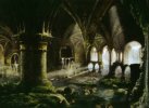
Rob Alexander is probably my favorite Magic artist, so it's hard for me to imagine going with anything but his atmospherically perfect Watery Grave from the first Ravnica set and yet...as a land, I think the GRN one is a better representation of both Ravnica as a unique fantasy plane and of the Dimir aesthetic. Where Alexander's art could easily just be mistaken for a swamp, Childs' is perhaps too much on the Island side of thing, but really, only the Secret Lair and Unfinity versions are good middle-grounds in that respect.

I quite like the Secret Lair Watery Grave on Ixalan, even if it's perhaps overly literal. This whole cycle of plane-specific shocks was a delight, and even if we're spoiled for choice on the cycle already, I can't complain to have the option.

I continue to be unimpressed with Min Yum's Expeditions...really all of the original suite of Expeditions. This goes far beyond my generally anti-Zendikar bias, as I consider the Zendikar Rising Expeditions to be the best art for at least half of the fetch lands. They do a poor job taking advantage of the vertical frame, which is cut off too much by the text box anyways, and seem overly vague. Yum's more painterly, representational works are much better than their Ixalan basic land cycle, but it just doesn't work for me here.

Ultimately, I think the Guilds of Ravnica edition by Cliff Childs is the best depiction of what I want from a Watery Grave and offers the most in terms of allure, composition, and, well, magic. I'll probably keep the original Ravnica one in my cube for nostalgia's sake and because the art is gorgeous, but I'll have to know in my heart of hearts that it's not the best Watery Grave out there.
 
Normally I go for the RTR shocks for how vibrant they are (Plus they're the set I have in foil), but for Watery Grave I think Raymond Swanland comes in 3rd. Usually for Swanland I'd expect that to be from being overexposed to his art and how samey his works can get (I like a fair few of his pieces, but for every one of those there are several with many of the exact same traits that I just find dull or uninspiring), but in this case it's not the the iconic Swanland Spikes and hypercontrast turning me off. No, in this case it's just because it's not a Grave that's Watery.

The SLD drop Grave does that job, and it's gorgeous, so it's my #2 - but it's missing that connection to Ravnica that I personally want out of a shockland. Would not judge anyone for putting it as their #1.

Winner for me is Cliff Childs - he implies that people are lost and drowned in this section of the undercity by showing a few spirits wandering the catacombs (Without getting too on the nose), shows off that gorgeous Dimir architecture, and gives a real sense of scale to the undercity into the bargain - looks like Duskmantle would actually fit below the city if you have spaces like this belowground. Totally believe a planewide conspiracy could be hidden down here. Plus it's the right colours - the OG Alexander is pretty, but the inclusion of overgrown mosses and stagnant standing waters always left it looking more Ana/Sultai or even Golgari rather than Dimir to me.

Love the Expedition and Unfinity for the same reason I love all the full art shocks - they made acquiring the ones I actually wanted so much more feasible :p
 
I voted for original Rob Alexander art. The low, vaulted ceiling looks more crypt-like than the other Ravnica themed art, and to me feels more appropriate for a grave. Rob Alexander is also a master at creating a mood and sense of place.

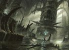
Minguez’s shipwrecks are my second favourite, as an interesting alternative take on the theme.

The unfinity art is fine, but just looks like a swamp.
 

Onderzeeboot

Ecstatic Orb
I don't like the Alexander art, because it doesn't look like an {U/B} dual. My two favorites are Childs and Minguez, but my vote goes to the latter, because of its unique and beautiful take on the land.
 

Day 15: Watery Grave | Results​

Rob Alexander | RAV - 5 votes (28%)
Raymond Swanland | GTC - 5 votes (28%)
Cliff Childs | GRN - 4 votes (22%)
Victor Adame Minguez | SLD - 3 votes (17%)
Min Yum | EXP - 1 vote
Chris Ostrowski | UNF - 0 votes

Tie between the first two editions! Surprising to see the GRN one below the other Ravnica renditions, but it was a close one.

Apologies for the lack of updates here, life and other spoilers have gotten in the way. Will probably pull back from doing the survey part for a bit as I start moving across the world again, but will still post new face-offs here frequently. Speaking of which...


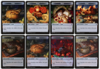
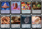
Day 16: Food Tokens | Rank Them!!​

Screen Shot 2023-08-21 at 9.50.51 AM.png
Screen Shot 2023-08-21 at 9.51.01 AM.png
Screen Shot 2023-08-21 at 9.51.05 AM.png

What are your favorites? I think the Lord of the Rings ones are my favorites. I don't know why so many of the earlier versions are so grotesque...maybe one, but it's like half of them. The point of food is to eat them, but I'd rather eat most animal tokens than what's depicted on these.

The LotR ones (minus the Sheolob-specific edition) are stunning and have the Ghibli food effect of making me want to eat them more than real food. Also...feels good to have LotR represent the food in my cube.
 
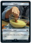
My usual extreme antipathy towards Universes Beyond does not, for the first time, affect my opinions of these tokens. The LoTR ones at least - the Doctor Who references are very on the nose and drag me out of the "Magic" mindset even if I like the jelly baby art. I'm a fan of the Eldraine basket of baked goods and the LoTR bowl of bread, lamb and veggies the most in a vacuum, but would tailor the food tokens I provide in my box to the flavour of the card/s in my cube that produce them (as I do all my tokens).
 
Easily the LotR food for me, then actually the weird Unfinity theme park food. Something about a meter-tall burger and a Ben and Jerry's factory sundae just speaks to me.
 

Day 15: Watery Grave | Results​

Rob Alexander | RAV - 5 votes (28%)
Raymond Swanland | GTC - 5 votes (28%)
Cliff Childs | GRN - 4 votes (22%)
Victor Adame Minguez | SLD - 3 votes (17%)
Min Yum | EXP - 1 vote
Chris Ostrowski | UNF - 0 votes

Tie between the first two editions! Surprising to see the GRN one below the other Ravnica renditions, but it was a close one.

Apologies for the lack of updates here, life and other spoilers have gotten in the way. Will probably pull back from doing the survey part for a bit as I start moving across the world again, but will still post new face-offs here frequently. Speaking of which...


Day 16: Food Tokens | Rank Them!!​

View attachment 8709
View attachment 8710
View attachment 8711

What are your favorites? I think the Lord of the Rings ones are my favorites. I don't know why so many of the earlier versions are so grotesque...maybe one, but it's like half of them. The point of food is to eat them, but I'd rather eat most animal tokens than what's depicted on these.

The LotR ones (minus the Sheolob-specific edition) are stunning and have the Ghibli food effect of making me want to eat them more than real food. Also...feels good to have LotR represent the food in my cube.
This is tough. My top choices in no particular order are: Fish Finger and Custard (WHO), Hamburger (UNF), Scorpion Cake (MH2), Breakfast Spread (LTR), and the originals from Throne of Eldraine minus the angry cake.
 
Fun that this is a deviation from the votings, nice!

Ranked from best to worst:

1. March of the Machines Commander (vegetables)
2. Throne of Eldraine (wild bore)
3. The Lord of the Rings (bread and sausages)
4. Throne of Eldraine (cake)
5. Throne of Eldraine (fruits)
6. Throne of Eldraine (bread)
7. New Capenna Commander (soup)
8. The Lord of the Rings (bacon and mushrooms)
9. Modern Horizons 2 (scorpion steak)
10. Unfinity (cake)
11. Unfinity (burger)
12. The Lord of the Rings (Frodo Shelob food)
13. Doctor Who (photorealistic real life candy)
14. Doctor Who (photorealistic tie and glass bowl)

You didn't include the 'Year of the Rabbit' promo version. I would probably rank it between 9 and 10.

The Food tokens have been ranked after how tasty and how much their art look like they belong in Magic's fantasy settings. This means the first 8 are fine and fair in a fantasy setting and the other 6 doesn't feel right. They are either set in a theme park in space, doesn't look like food or belongs in a sci-fi setting.
 

landofMordor

Administrator
I like the Eldraine tokens with the fruit and the pastries. I also like Asmo's food from MH2 with the scorpion tail, as a "Underworld Cookbook" vibe. The others are all forgettable and I don't care enough to rank them.

But, I like this format in addition to the polls!
 
Gimme that wild boar for the bit o' semi-nostalgia it provides in reminding me of this:
1692726985491.png
Bad ol' Homelands, such a terrible set and yet I'm so terribly fond of it (...any yahoos around wanna get scrappy over how it actually has the 2nd-best booster packs aesthetically behind 4th Edition??) :rolleyes:
 
The loopy bananas in the Eldraine fruit basket weird me out, but otherwise that art is really good. Do bananas ever look like that, or is that just canonically what they look like on Eldraine? (In Eldraine? Gosh, what a mess.)
 
Top