You are using an out of date browser. It may not display this or other websites correctly.
You should upgrade or use an alternative browser.
You should upgrade or use an alternative browser.
General Custom Cards: The Lab
- Thread starter anotak
- Start date
Onderzeeboot
Ecstatic Orb
This looks good, based on the Zendikar fetches. The outer border is colorless, the inner border is black.What color should this border be?
View attachment 5353Note: I couldn't figure out how to get the paint brush by the artist's name in this frame, but it seems kind of obvious what the name is, based on the placement.
The color of the frame of lands are there to help your opponent cipher which colors of mana you have access to.
Cards like Prismatic Vista and City of Brass have multicolored frames because you have access to all colors.
Cards like Evolving Wilds and Terramorphic Expanse do not because they do not give you access to all colors. They only give you access to a tapped land which in turn could have a colored border.
A card like Grasslands has colored
border because when it is tapped, it doesn’t give you access to mana just like any other land but when it is untapped it gives you access to white and green.
Chris Taylor
Contributor
Whatever is "right", make this black so players can discern the intent betterWhat color should this border be?
View attachment 5353Note: I couldn't figure out how to get the paint brush by the artist's name in this frame, but it seems kind of obvious what the name is, based on the placement.
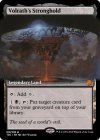
My Volrath's Stronghold has a black land frame:

Onderzeeboot
Ecstatic Orb
So... This taps forWhatever is "right", make this black so players can discern the intent better
My Volrath's Stronghold has a black land frame:
View attachment 5354
Chris Taylor
Contributor
If you put this in your deck thinking it taps for black, you might be making an error of too many utility lands.So... This taps for, right?

If you put this in your deck thinking it's a colorless land, there's aprox an 80% chance (Quik Mafs) that it's literally useless.
That is not how Wizards see it. And I believe if got some experience, you would also not see it this way.I see "uses black" as a valid reason for border coloration the same as "makes black"
Having a black frame on a land that doesn’t add black mana will lead to many, many, many situations where someone will tap it for
When the controller themselves notices:
“Why doesn’t this tap for black mana when it is a black land???”
and
When opponent notices:
“I know it is confusing but Volrath’s Stronghold doesn’t actually tap for black.”
Onderzeeboot
Ecstatic Orb
That's one step better than me. I'm just annoying period.True! <3 I'm just a little annoying wotc fanboy here
Chris Taylor
Contributor
A non zero amount of the border change is to help me sort my cube by color 
To give anecdotal evidence, I regularly see myself and others forget that this doesn't tap forHaving a black frame on a land that doesn’t add black mana will lead to many, many, many situations where someone will tap it for. Some of those times a player will notice.
Exactly!To give anecdotal evidence, I regularly see myself and others forget that this doesn't tap forwithout sacrificing a creature:

I see people forget these things all the time.
I think you saw the post that was up for two seconds then deleted lol. The images were too janky here. Here's the full thing:fortress of secrets gets an immediate helllll yeahhh from me
Lands so far. They're in alphabetical order, so it's kind of dumb.
I tried to make them similar power levels to shock-fetch. The tri colors had to be a little janky to get away with being untapped and the duals need a minor drawback.
EDIT: That imgur embed is so nice.
I really like this design!I think you saw the post that was up for two seconds then deleted lol. The images were too janky here. Here's the full thing:
Lands so far. They're in alphabetical order, so it's kind of dumb.
I tried to make them similar power levels to shock-fetch. The tri colors had to be a little janky to get away with being untapped and the duals need a minor drawback.
EDIT: That imgur embed is so nice.
Which one?I really like this design!
Well, all of them, but specifically the first one that loaded, which is Ancient Boneyard.Which one?
That's exactly the ones I want people to like.Well, all of them, but specifically the first one that loaded, which is Ancient Boneyard.
I think the signet lands are gonna trigger blacksmithy. We'll see. They're pretty bad, BUT tricolor swamp.
Chris Taylor
Contributor
YesWhich one?
I don't see why they would be triggering– they do tap for mana in their own right!I think the signet lands are gonna trigger blacksmithy. We'll see. They're pretty bad, BUT tricolor swamp.
@blacksmithy care to explain?
He's a land hater and making two nonblack mana is pretty sketchy.I don't see why they would be triggering– they do tap for mana in their own right!
@blacksmithy care to explain?
Glad no one has said anything is obviously out of place yet.
Is MPC the primary way people make cards? Kind of sick of $10-50 lands that aren't even specified to my weird color pie.
Chris Taylor
Contributor
If you're super happy with these, MPC is excellentIs MPC the primary way people make cards? Kind of sick of $10-50 lands that aren't even specified to my weird color pie.
If they're still in the testing phase, I'd just print em out and stick em in sleeves
Obv those are super vague
Reasonably happy. No one has given me any reasons that they suck yet, so that's a good sign. Debating customing all my lands. Maybe I leave some real lands in there. Not sure yet.If you're super happy with these, MPC is excellent
How much testing does a land need, ya know? I'm pretty confident it'll tap for colors.If they're still in the testing phase, I'd just print em out and stick em in sleeves

