Agreed with all about the disappointment to this set.
The Good:
 Jumpstart is an excellent format, particularly for newer players. More of it (the real one, not the set-specific ones) is a big boon to Magic. I like many of the themes and hope to grab a couple games with this.
 Some interesting designs, likeBenevolent Hydra which has me considering a change to my green section to finally make the dive into a +1/+1 counters sub-theme, or the previously discussed Ardoz, Cobbler of War who both supports existing archetypes and still meaningfully changes your draft strategy/priorities. Lita, Mechanical Engineer is only a few developmental knob-turns away from being a favorite of cubers twice over.
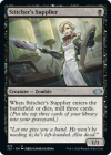
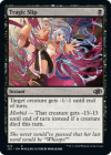
 Flavor text was a bit on the nose or "cringe", but very positive overall, particularly on the anime alternative art versions. The one anime art that I'm planning to swap to in my main cube is a great example of this, and the Tragic Slip is absurd and I can't help but laugh.
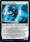
 THEY FINALLY GAVE MY BOY THE UPDATED FRAME!
The Bad:
 The anime bonus cards had a lot of potential, but the overridingly weird card selection for them doesn't match with either cards that would benefit from the aesthetic and/or aren't very beloved cards. A good example of how to do a curated list that people care about that just came out is the Retro Artifacts from Brothers' War: even the common ones are cards that see reasonable play in one format or another, or are nostalgic favorites. Like I said before, even as a huge anime fan, there's only a single card I'm "upgrading" to, which is a far cry from what one would expect based on Jumpstart 1's reprints. Also, Kasmina, Enigmatic Mentor already got an anime alt-art!!! Let the other anime girls in!
 It really feels weak when compared to Jumpstart 1, as far as original cards go. This is an opportunity to flex your designer muscles and make compelling limited build-arounds, but instead, each of the new cards feels explicitly directed at Commander. Too much "each player" stuff makes this present on the most obvious level, but even the mana costs feel like they're made with Sol Ring in mind.
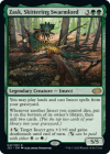
 Zask, Skittering Swarmlord is the kind of compelling card I adore. It's a green "lord" that makes for interesting games without being oppressive (it tucks your insects to minimize repetitive gameplay, very cool) and even though it's way too expensive for my current environment (and I don't have nearly enough insects to justify it), I'd love to find/make a cube that would be a good home for him some day. THAT SAID, the Commander-friendly off-color activations on this cycle have always been egregious from a design POV, but this is the dumbest one yet. It's such a marginal upside that's so clearly there for color identity reasons and it just ADDS TEXT.
 I've already made enough noise about my biggest complaint but I will state it here once more for the record: WHY ARE THERE NO BASIC LANDS?! I know they use Basics as a shortcut for every kind of promotion these days and are running out of interest in the audience with the whole booster fun thing of a full art in every "Premiere" expansion, but with only three basics per type, losing the "unique" thematic lands that allowed for a great diversity of new land types to help players better customize their decks on a thematic angle is a real loss to what made Jumpstart 1 so special.
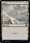
Worse than that, they reprinted Wastes with Zendikar Rising art once again. Please, give us another art for this card. I'm begging you WotC. A whopping 3 of the 5 unique pieces of art for this card are Warhammer 40k themed.
The End:
I'm including one new card in my cube (Ardoz) and one anime art (Stitcher Supplier). For the 720 card behemoth behemoth I manage, this is my smallest change for an expansion with new cards printed in it since the pandemic started, and I don't even get to enjoy 40 new basics like last time. A real shame.
The Good:
 Jumpstart is an excellent format, particularly for newer players. More of it (the real one, not the set-specific ones) is a big boon to Magic. I like many of the themes and hope to grab a couple games with this.
 Some interesting designs, likeBenevolent Hydra which has me considering a change to my green section to finally make the dive into a +1/+1 counters sub-theme, or the previously discussed Ardoz, Cobbler of War who both supports existing archetypes and still meaningfully changes your draft strategy/priorities. Lita, Mechanical Engineer is only a few developmental knob-turns away from being a favorite of cubers twice over.
 Flavor text was a bit on the nose or "cringe", but very positive overall, particularly on the anime alternative art versions. The one anime art that I'm planning to swap to in my main cube is a great example of this, and the Tragic Slip is absurd and I can't help but laugh.


The Bad:
 The anime bonus cards had a lot of potential, but the overridingly weird card selection for them doesn't match with either cards that would benefit from the aesthetic and/or aren't very beloved cards. A good example of how to do a curated list that people care about that just came out is the Retro Artifacts from Brothers' War: even the common ones are cards that see reasonable play in one format or another, or are nostalgic favorites. Like I said before, even as a huge anime fan, there's only a single card I'm "upgrading" to, which is a far cry from what one would expect based on Jumpstart 1's reprints. Also, Kasmina, Enigmatic Mentor already got an anime alt-art!!! Let the other anime girls in!
 It really feels weak when compared to Jumpstart 1, as far as original cards go. This is an opportunity to flex your designer muscles and make compelling limited build-arounds, but instead, each of the new cards feels explicitly directed at Commander. Too much "each player" stuff makes this present on the most obvious level, but even the mana costs feel like they're made with Sol Ring in mind.
 Zask, Skittering Swarmlord is the kind of compelling card I adore. It's a green "lord" that makes for interesting games without being oppressive (it tucks your insects to minimize repetitive gameplay, very cool) and even though it's way too expensive for my current environment (and I don't have nearly enough insects to justify it), I'd love to find/make a cube that would be a good home for him some day. THAT SAID, the Commander-friendly off-color activations on this cycle have always been egregious from a design POV, but this is the dumbest one yet. It's such a marginal upside that's so clearly there for color identity reasons and it just ADDS TEXT.
 I've already made enough noise about my biggest complaint but I will state it here once more for the record: WHY ARE THERE NO BASIC LANDS?! I know they use Basics as a shortcut for every kind of promotion these days and are running out of interest in the audience with the whole booster fun thing of a full art in every "Premiere" expansion, but with only three basics per type, losing the "unique" thematic lands that allowed for a great diversity of new land types to help players better customize their decks on a thematic angle is a real loss to what made Jumpstart 1 so special.
Worse than that, they reprinted Wastes with Zendikar Rising art once again. Please, give us another art for this card. I'm begging you WotC. A whopping 3 of the 5 unique pieces of art for this card are Warhammer 40k themed.
The End:
I'm including one new card in my cube (Ardoz) and one anime art (Stitcher Supplier). For the 720 card behemoth behemoth I manage, this is my smallest change for an expansion with new cards printed in it since the pandemic started, and I don't even get to enjoy 40 new basics like last time. A real shame.
