What Is This?
Back in June 2024, @ellogeyen ran the 30+ Eggs In One Basket contest on these very boards. After waffling for a while on what to do for it (a process that was not helped by the fact that I had been in a major cubing slump for months), I remembered the existence of Land Grant and something clicked. The result is the pile of cards that you can see at the link above, which I think has way more legs than most of the gimmicky cube concepts that I've tossed around or built.
What's Land Grant?
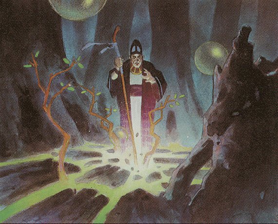
I wouldn't be terribly surprised if you've never heard of a common printed in Mercadian Masques that has never seen a reprint. Let's take a look at our new best friend:
This thing is a beast in the right contexts - if you build your mana base correctly, it lets you straight-up replace a bunch of your lands with spells without losing tempo. Now, normally it's held back by only being able to grab Forests, but what if you do something a little nuts and make your basic land box look like...
So... Why "Gaslight"?
Because I had to come up with a silly name, and I used "Green Is Not A Creative Color" in a previous contest!
More seriously, it's because of one of the brain-bending side effects of making sure that Land Grant can grab any land in the cube: green is effectively colorless. In the context of this cube, the following cards are all mono-colored:
If I ever have a spare day or three (or feel the need to build this in paper), I'm definitely going to have to make alters that make it easier to see that green isn't important... outside of the one sneaky Soul Reap (look, I can't resist putting in cute cards, alright?).
So Now What?
I'll be honest with you all - as much as I love the idea behind the cube, this first rendition has some problems.
The first one (and probably the biggest one?) is that I picked the wrong lands. While having the ABU duals in the basic land box is certainly eye-popping (and something like that is pretty much necessary for this kind of format to work), it does lead to mana being a little too good. After all, the cube is built around getting a free Lay of the Land every turn, and in a four-color cube that means that splashing for colors is super easy. Not a huge problem, but it's not how I like building my cubes. It also lead to a problem where I felt the need to run cards that care about basics just to justify having Forests in the cube, which feels awkward from a design perspective.
More importantly, though, I made the mistake of putting the triomes in the cube as tapped "duals". The problem is that they're way less powerful in this cube than they are normally (both because they're only duals and because the baseline fixing is way better), so people are going to pick these cards that are pretty meh in this cube way more highly than they should. Since I'm already fighting drafter instincts with the whole "green isn't real" thing, I probably shouldn't also stick in bad signals.
Speaking of bad signals, I'm not too happy with some of my card choices in retrospect. This is a side effect of putting the cube together quickly - you have weird stuff like there being more artifact hate/removal (5 cards) than there are artifacts (2 cards), cards that were orphaned from themes that I didn't end up pursuing, cool cards that probably don't fit in the cube (Quandrix Apprentice isn't going to do much in a cube where decks usually run ~10 lands and actively tutor them out on the regular), and the kludgetastic way that I tried making basic Forests worth running (4 whole cards - I apparently didn't try very hard?).
Negativity aside, though, there are definitely some cool things that I want to preserve moving forwards. The big one that I know people have picked up on is this Wildfire-esque beauty:
I definitely feel like I want to lean harder into that.
Last edited:

