General Other News

I think the new frame generally looks better, but in this specific case the art matches the muddier frame better. And, on top of that, the old border one has a cleaner text box. Not great for actual play, but prettier for display.
 
I'm mostly cool with alternate frames in my cube as long as they maintain the general form of a typical Magic card and the meaningful information is easy to pull on first glance. Mainly what's the P/T on creatures, card name, mana cost; you know, the basic information you need. Love the Adventure borders and most alternate treatments, despise things like Amonkhet Invocations, textless cards or Future Sight frames.
 
If I was putting them on a shelf to look at, sure.

But if I'm playing a game, I want the board state to be as clean and easy to read as possible.
But ... it never even came to my mind that different frames woulf make a board state harder to read? I never felt like this before and it's the first time I hear about this concern.

I am exactly there:

I'm mostly cool with alternate frames in my cube as long as they maintain the general form of a typical Magic card and the meaningful information is easy to pull on first glance. Mainly what's the P/T on creatures, card name, mana cost; you know, the basic information you need. Love the Adventure borders and most alternate treatments, despise things like Amonkhet Invocations, textless cards or Future Sight frames.

Shamizy summerizes my opinion here very well. As long as everything is readable and every bit of information is in it's traditional place, I don't think a different frame or having you're artwork expanded over the irrelevant parts of your border matters.
 
the pet peeve i have is the black and white stuff like the sketches from MH2 and comic book pages from MID. i like them by themselves but next to a normal card they’re SO weird looking to me
 
The art on the Midnight Hunt lands is great, but the color palette isn't so great in person. I think the faded B/W across all different colors doesn't work as well in paper when your main identifier is the border + symbol. They just don't stick out very much. I picked up a handful of the Esper ones for my Aminatou EDH deck and while goldfishing I had to get familiar with the art rather than the usual quick glance at the color to know which basic I had drawn.

I'm still going to run them in something like a Modern or EDH deck where there are a handful, but I'm not going use them as the base for a cube's basic lands. Just not practical.
 
Speaking of variant frames, have any of your drafters gravitated their early picks towards cards that are/aren't in special frames?

I've noticed it a bit for borderless cards with my playgroup, though not as much as foil vs non-foil vs proxy. (We like our shiny cards, lol)
 
It's actually crazy WotC couldn't identify that all these cards look the same at first glance.
So, they look really nice on Arena, and I think that they just overestimated the capabilities of their printer. When you look at the physical versions next to the images on a screen, they look nothing alike because the backlit white is so much more vibrant than the printed white--plus, the digital versions tend to be larger when they're relevant and sort themselves into piles without you having to do too much work. Take a look at the swamps, for instance. The purple actually pops on screen, but put them against any playmates that's not pure white and they just fade into the background.

And then there's the issue of ninety different batches of the lands each looking different. Some are actually decent, but most of them turn out muddy with not enough negative space to make the designs really work. It's a shame because it's a cool idea.
 

Chris Taylor

Contributor
I think that they just overestimated the capabilities of their printer
I have done this myself in their defense. Dark cards are specficially really nice on a crisp monitor but can get muddied in the light of day.

Take for example:
Contrast by Cynthia Shepard.jpg
Contrast by Cynthia Shepard

Amazing image, but you need to purple shift it for the ravens to actually look distinct on paper.
 
While we are in the spoiler season for Kamigawa: Neon Dynasty

Wizards announced the three Judge Foils for this season:

026A88F2-56D1-489C-94AB-A794B8D24F32.png
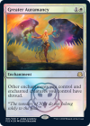
This is Emeria (Emrakul, the Aeon’s Torn) from Shrine of the Forsaken Gods. It is also an enchantment to go with the theme in Neon Dynasty.


9E6D10FD-821D-4595-A9C4-BBCE82168B34.png
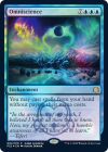
Another enchantment. Teferi is hot shit these years.


14A2A01D-F8D8-461B-B972-26077E4A3B40.png
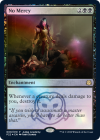
Another enchantment. Last time we saw No Mercy was when Phyrexia attacked Tolaria.


Their timing is pretty spot. And a bit frightening.
 
Top