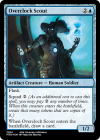
Sorry to be that guy, but the type line still says Tyranid >_>
Kill me. End my life. Take me out back, tell Paw to set one less place at the table. I reckon I was a good boy.
Sorry to be that guy, but the type line still says Tyranid >_>
Aw no, hang in there buddy! There’s still time to make thisKill me. End my life. Take me out back, tell Paw to set one less place at the table. I reckon I was a good boy.
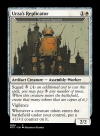
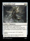
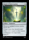
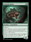
Two very good points, thank you! I'll correct that tomorrow in the full size linke.Spiritcaller's Staff is a great name, but your players may be confused how much to pay when equipping it.
Should you take this opportunity to put reminder text on the Sword, as well?
If you put it in MEDIA tags, it can display here without huge images. I seem to recall that editing the album later doesn't affect the post on here, though.Two very good points, thank you! I'll correct that tomorrow in the full size linke.
I just corrected the custom cards and uploaded them to imgur, they are now updated in your media post. Neat!If you put it in MEDIA tags, it can display here without huge images. I seem to recall that editing the album later doesn't affect the post on here, though.
I'd maybe center the sword in the art, too. Feels wonky to me as is.
I've used Dall-E for this, but it's kinda all over the place with results. It will throw some weird stuff in there occasionally. Granted, that was 6-12 months ago, so maybe it's hugely improved by now. Another issue is that it burns up your uses really quickly because you have to go all the way around the image, meaning you need to do several generations.I have a question though for the ones who use image editing tools: does anyone know of a good free tool to extrapolate background? I often struggle with art that is a bit too close to the subject and doesn't fit well in the magic card art box. There are freemium AI tools aplenty but nothing I liked so far..
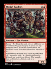
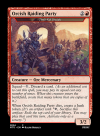
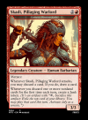
Damn, you have to do some trickiness to get that frame.Good Point about the junky orcs.
Unfortunately I had to do it like this with the text box, because sorcery was overlapping with the p/t box
You can actually change the size of the text box in CardConjurer and shave off a bit from the bottom so it doesn't clip the PT boxDamn, you have to do some trickiness to get that frame.
Three versions.
Blank line top and bottom.
fontsize-21
fontsize-20
Huge HQ images in the imgur album if you want to use them.
I looked through as many gits as I could find and they all, including this one, have the wrong frame. It'd be in /img/frames/seventh/regular/w.png. Google didn't have anything I could find, either.You can actually change the size of the text box in CardConjurer and shave off a bit from the bottom so it doesn't clip the PT box
When you edit the Text box text, there's an option to "Edit bounds".
Also, you can run CC locally using https://github.com/joshbirnholz/cardconjurer
Maybe you can find a darker white frame there for your project?
Hehe, yeah it's always a hassle with the Godzilla frame.Damn, you have to do some trickiness to get that frame.
Huge HQ images in the imgur album if you want to use them.
You can actually change the size of the text box in CardConjurer and shave off a bit from the bottom so it doesn't clip the PT box
When you edit the Text box text, there's an option to "Edit bounds".
It's definitely true that it distracts less from the art and that it's a cleaner way to show it, what I like about the godzilla frame though is that it clearly shows what card it represents. While my playgroup might remember a restored UB card they would never look at anything written below the rules text box. More options on how to do it is more better thoug, maybe I'll just ask my players, what they wantInstead of the inset second name line overlaid on the art, it lists the original SLD collector number in the collector info at the bottom of the card. When I restore one of these UnB cards, I usually list the set code and original card name here.
I find it's a lot less distracting from the card art.
Their Artstation has quite a few gems. Check it out.That's also a sweet piece of art and
Well, I didn't save it into my current project, so the ball is back in your court lol.you fell right into the Scryfall copy-paste trap that costs me a few minutes every time because I don't notice immediately: in the textbox it still says Thrill-Kill Disciple.
I just now realised that I can save images and don't have to do them from scratch every single time! Any idea how many images I can save? Also, I have stored the art locally and it says it uses way more than using a URL for the card but I don't see that option.Well, I didn't save it into my current project, so the ball is back in your court lol.
I just now realised that I can save images and don't have to do them from scratch every single time! Any idea how many images I can save? Also, I have stored the art locally and it says it uses way more than using a URL for the card but I don't see that option.

You'll want to upload the local image to an image hosting site before you put it on the card. If not, you only have a few MB of storage via CC.I just now realised that I can save images and don't have to do them from scratch every single time! Any idea how many images I can save? Also, I have stored the art locally and it says it uses way more than using a URL for the card but I don't see that option.
Is there a good one to use? When I've tried it with Imgur the art doesn't show up for me for whatever reason.You'll want to upload the local image to an image hosting site before you put it on the card. If not, you only have a few MB of storage via CC.
I had that issue sometimes, as well. I've been using imgbb. I Googled like image hosting or something and it came up.Is there a good one to use? When I've tried it with Imgur the art doesn't show up for me for whatever reason.
