General Aesthetics Debate Club: Optimizing Art in Cube (Daily!)

Def one of the two original from Alliances which depicts the Ice Age ending after Freyalise cast her World Spell.

Don’t know which to vote for because for me they both live up to my requirements. I have put my vote on the one with the most red in the art but it could have gone either way.
 
#1: the 1st RKF art posted. Feels more appropriate to what the card does than the 2nd. Iconic.
#2: the 2nd RKF art posted.
#3-#5: hate the rest equally
 
Original Kev Walker art for the Titan: it really captures the heat coming from the lava from which it is emerging.

RKF Arcane Denial with orange fireball. Though I do give credit to Mark Zug for depicting magic as slime and goo rather than ethereal energies.
 

Day 2: Arcane Denial | Results

RKF | Alliances (Red version) - 12 Votes (67%)
Mark Zug | Commander 2013 - 5 votes (28%)
RKF | Alliances (Blue version) - 1 Vote (6%)

RKF reigns supreme, but not by the margins many of us may have predicted!

Day 3: Ponder | Survey

The image downloads from Scryfall are too big today?? To see all the options in their full glory, please click here.

lrw-79-ponder.jpgpewk-2-ponder.jpgm10-68-ponder.jpgsld-245-ponder.jpg
slc-2007-ponder.jpgp08-6-ponder.jpg

To participate in the survey, click here!

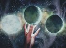
This one was chosen to mess with Waddell's algorithm! The most popular and iconic art for Ponder is not the original printing, but the reprint from a few years later with three orbs representing the three choices the card provides, and there are quite a few compelling and abstract promos/Secret Lairs that make this not as easy a decision for the Jason-bot as another card would be :)

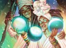
My personal favorite is Julie Dillon's Eternal Weekend promo. I don't personally proxy cards, but if I were to, this would be one I would absolutely need, even absent the gorgeous old-bordered frame that's not found on any other printing.

I'm currently running the M12 Ponder, but I'm not sure if that was a conscious decision or if it's just what I had on hand at the time and I've yet to update it, as I'm confident I have the Lorwyn art too.
 

Onderzeeboot

Ecstatic Orb
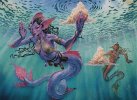
Julie Dillon is one of my favorite artists in Magic right now, and hers is the prettiest Ponder for me. I don't like the aesthetics of Tedin's Lorwyn merfolk, plus he seems to have a thing for merfolk tiddies, so the original art doesn't really do it for me. I like the more abstract M10 Ponder art, and Ejiwa "Edge" Ebenebe's promo, as an hommage, is basically a better version of that artwork. I can appreaciate Lauren YS's artwork for its art, but as card art I don't like it. Steve Argyle's version, finally, is pretty, but only available in textless, and therefore automatically last place.

1. Julie Dillon
2. Ejiwa "Edge" Ebenebe
3. Dan Scott
4. Mark Tedin
5. Lauren YS
6. Steve Argyle

Incidentally, my top three also best represent the card mechanics in the artwork.
 
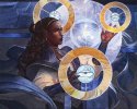
I love the eyeball + rings art that I’d never seen before, but have to go with the m11 printing. It’s iconic and makes drafting so much easier when you recognize the art at a glance.
 
My favorite Ponder art is my altered art one I have in my cube. But of all the official arts, and there are many to choose from, I prefer the M10 with the three orbs. I also like the new eyeball rings but it doesn’t have a new card frame so that’s a no. If I were to only include a single copy of Ponder in a cube it would be the original from Lorwyn even though the art is my 3rd choice. The set logo does it for me.

My vote goes to M10 orbs.
 
Cool series! Ponder was a great choice for the latest vote. I like the M10 since I prefer to use the most well known art, and I prefer art that explains the card. I also like art that isn't specific to a plane when I can get it.

I might go with one of the Commander versions that use the newer frame to keep things even more consistent, but that's a tossup. I like the M10 frame better.
 

Chris Taylor

Contributor
I'm a new border guy, so ideally I'd want julie dillon but in borderless, but I'm not sure the original piece has the dimensions for it.
Having it in the Odyssey era old border is fine I guess.
 
For this one I have been pondering it, but while I usually like new art, the m10 one just works so perfectly in conveying the mechanics with the art. Just something about the hand reaching out towards its choice that is just *chef's kiss*.
The Julie Dillon art looks too much like the butterfly meme in my head
 

Day 3: Ponder | Results

Julie Dillon | Legacy Invitational Promo - 9 votes (45%)
Dan Scott | M10 - 8 votes (40%)
Mark Tedin | LOR - 2 votes (10%)
Ejiwa "Edge" Ebenebe | SLD - 1 vote (5%)

Very close, but Julie Dillon's entirely inaccessible promo takes the cake here!

Day 4: Temple Garden | Survey


rav-284-temple-garden.jpg
Rob Alexander | RAV

rtr-248-temple-garden.jpg
Volkan Baǵa |RTR

exp-10-temple-garden.jpg
Min Yum | EXP


grn-258-temple-garden.jpg
Titus Lunter | GRN


sld-127-temple-garden.jpg
Tyler Jacobson | SLD

unf-281-temple-garden.jpg
Piotr Dura | UNF

Click the survey to share your opinion here!


This is one I actually asked amongst my old playgroup last year and was wholly contentious.

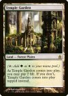
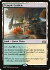
For me, it's very easy. The original Rob Alexander, even without the sentimentality I have associated with it, both does the best job representing the collision of white and green mana as a land and captures the imagination. Stunning lighting, perfect framing, and an evocative landscape. One of my favorite all-time card arts.
 
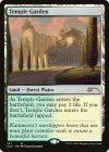
i love both the alexander and baga arts... its really hard for me to vote against baga, but i do really enjoy how grounded and real alexander's landscape is. that's a temple garden i could see myself walking around, yknow?
 

Onderzeeboot

Ecstatic Orb
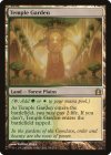
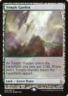
I think Tyler Jacobson has the prettiest art, but it's hard for me to not associate Temple Garden with Selesnya, so it feels out of place. I was never a fan of Volkan Baga's version, and while Titus Lunter's art is on a frame I personally like better, I do think Rob Alexander takes the cake here. I'm not going to waste many words on Min Yum's and Piotr Dura's versions. It's not that either piece of art is necessarily bad, but bot feel very, very far removed from what I'ld like my Temple Garden to look like.

1. Rob Alexander
2. Titus Lunter
3. Tyler Jacobson
.
4. Volkan Baga
.
.
.
5. Min Yum
.
.
6. Piotr Dura
 
Last edited:

Chris Taylor

Contributor
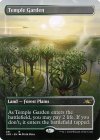
It is a shame the Unfinity one is so off theme for temple garden, I love the borderless frame/small text box to bits asthetically.
I think my favorite art is the Titus Luntner, the Rob Alexander one always felt too washed out and textbooky, for lack of a better word.
 

Day 4: Temple Garden | Results


Rob Alexander | RAV - 12 votes (63%)
Titus Lunter | GRN - 3 votes (16%)
Volkan Baǵa |RTR - 2 votes (11%)
Min Yum | EXP - 1 vote
Tyler Jacobson | SLD - 1 vote
Piotr Dura | UNF - 0 votes

Not as close as I anticipated! Nothing against Piotr, but I think any of the other Unfinity lands would've at least scored a few points. Even if I'm not a fan of this one in particular, I thought it'd get some love!

I was worried about engagement on weekends, but we got about the same number of votes as usual, so I guess I will do my damndest to keep this up truly daily :)

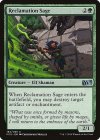
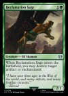
Day 5: Reclamation Sage | Survey

pm15-194-reclamation-sage.jpg
Clint Cearley | PM15

m15-194-reclamation-sage.jpg
Christopher Moeller | M15

ltc-259-reclamation-sage.jpg
Ilker Yildiz | LTC

Click for the survey here!

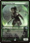
This one's difficult for me, as I don't adore any of them. From a composition perspective, the original M15 art (not the promo) is the most visually interesting. When I saw it was getting a LotR skin, I was very excited for an art upgrade but....I don't think this one's it, which is too bad - could've been a cool opportunity to get some Mirkwood or Rivendell action going on in my cube!

The Game Day promo has never done it for me. It's part of that overly-digital feeling era of MTG art I just wasn't a fan of, no disrespect to the artist. It's the one I've seen most commonly on Cube Cobra lists, though, so I anticipate it'll be the winner here.
 
Top