New Weekly Fun Q whenI think it would be a good idea for you to change your schedule to 1 time per week.
And also stay out of the official spoiler seasons which are those 1-3 week periods where cards are being spoiled every day.
You are using an out of date browser. It may not display this or other websites correctly.
You should upgrade or use an alternative browser.
You should upgrade or use an alternative browser.
General Aesthetics Debate Club: Optimizing Art in Cube (Daily!)
- Thread starter MilesOfficial
- Start date
Day 6: Elvish Mystic | Results
Wesley Burt | M14 - 6 votes (50%)Magali Villeneuve | SLD - 3 votes (25%)
Greg Staples | CMM - 2 votes (17%)
Winona Nelson | F14 - 1 vote
Iga Oliwiak | LTC - 0 votes
The original art is clearly the most iconic. I do agree with the comments here that Villeneuve's rendition may not reflect what an Elvish Mystic is/should be, but I am sad such a gorgeous piece only got three votes! Appreciate all the perspectives shared all the same
Day 7: Battlefield Forge | Survey
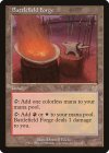
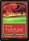
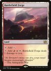
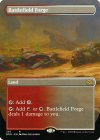
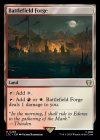
Darrell Riche | APC
MSCHF | SLD
Thomas Stoop | BRO
Rob Alexander | BRO
Victor Harmatiuk | LTC
Participate in the survey here!
While I may strongly prefer the classic border, I think I'll be upgrading to Harmatiuk's Lord of the Rings-flavored rendition upon reflection. The original art just doesn't reflect what a land should be as far as I'm concerned, and is not nearly as evocative as the Rohan encampment as a piece of fantasy art as well.
Rob Alexander is undoubtedly my favorite Magic artist, but beyond my slight preference against the full-art style, I don't really know what's going on here. It's evocative of the time period and I see some Brothers' War-era stuff going on, but this looks like a general desert battlefield, not a "battlefield forge" and certainly not a land that is both a mountain and a plains.
I'm a big fan of the MSCHF Secret Lair Plains, but I would never remove the sticker. Fan of the concept here and not so much the playability.
It frustrates me to no end that all of the LTC nonbasics cycles are incomplete and that nobody else seems to have picked up on it. I know, I know, great place to make your own, but you'd think WotC would make the missing lands available in set boosters or a secret lair or something for the fans who want complete sets of LotR lands.
Agreed that the original is a little ham-handed and that the LotR commander one is shockingly nice.
Agreed that the original is a little ham-handed and that the LotR commander one is shockingly nice.
Last edited:
Onderzeeboot
Ecstatic Orb
Apocalypse: Battlefield Forge
Secret Lair: Burning Golf Course
Brother's War Regular: Lavastream Mountains
Brother's War Borderless: Noxious Scrap Heap
Lord of the Rings: Tent Camp Forge
It may be a little ham-handed, but the original art is the only one that really feels like it's depicting an actual forge on a battlefield. LotR one is close though, and also a nice pick. The other three suuuuuck!
Yet another easy pick for the Waddell System.Apocalypse: Battlefield Forge
Secret Lair: Burning Golf Course
Brother's War Regular: Lavastream Mountains
Brother's War Borderless: Noxious Scrap Heap
Lord of the Rings: Tent Camp Forge
It may be a little ham-handed, but the original art is the only one that really feels like it's depicting an actual forge on a battlefield. LotR one is close though, and also a nice pick. The other three suuuuuck!
i like the old paint style of the OG card. honorable mention to the urzas borderless
Chris Taylor
Contributor
You know this art fight is lopsided when I'M voting for an old border card.
New Weekly Fun Q when
After Wilds of Eldraine spoiler season is over.
The current spoiler season is an eternal winter.After Wilds of Eldraine spoiler season is over.
It frustrates me to no end that all of the LTC nonbasics cycles are incomplete and that nobody else seems to have picked up on it.
What is the LTC nonbasic cycle?
Onderzeeboot
Ecstatic Orb
I mean, we're voting for the art, not for the borderYou know this art fight is lopsided when I'M voting for an old border card.
I don't know, to me the question is about "which card should I put in this box of cards, based on aesthetics", and the border is part of the aesthetic.I mean, we're voting for the art, not for the borderThe Apocalypse art is available in the new border

Day 7: Battlefield Forge | Results
Darrell Riche | APC - 9 votes (60%)Rob Alexander | BRO - 2 votes (13%)
Victor Harmatiuk | LTC - 2 votes (13%)
MSCHF | SLD - 1 vote
Thomas Stoop | BRO - 1 vote
A decisive victory for the classic!
Day 8: Recruitment Officer | Survey
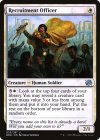
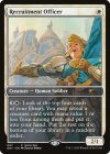
Johan Grenier | BRO
Zoltan Boros | GDY
A smaller sample today, with a recent reasonably-popular cube inclusion!
I like both. The original one is the one I've picked, because the composition is nice and it matches the flavor of the card well. The Game Day promo has fantastic art, and I love how it shows off the mech in the background, but the perspective is a bit uncanny and doesn't really jive with the card's purpose or narrative. Would be happy to have it on a card that pilots mechs though.
What do you all think? Take the survey here!
Onderzeeboot
Ecstatic Orb
That mech does not have a mana value of 3 or less. Case closed.
Artist name isThat mech does not have a mana value of 3 or less. Case closed.
yeah the boros one is pretty fun, whereas the original is 1) really dark colorwise and 2) icky default frame
I dunno, I like the starker contrast of the set printing, the full art looks washed out to me - a shame as I quite like Boros for his charms.
Onderzeeboot
Ecstatic Orb
I agree, Boros Charm in particular has that Boros charm!I dunno, I like the starker contrast of the set printing, the full art looks washed out to me - a shame as I quite like Boros for his charms.
Chris Taylor
Contributor
I think that gameday frame is a relic of when we didn't have good frames to use. I also don't love that art, so easy original for me
Both Recruitment Officers look so happy! Most magic card folk seem to have their faces set to grim determination, so it’s nice to see these two taking joy from their job of encouraging others to die in a brutal and senseless war.
I prefer scroll-waver over flag-hugger.
I prefer scroll-waver over flag-hugger.
Day 8: Recruitment Officer | Results
Johan Grenier | BRO - 10 votes (67%)Zoltan Boros | GDY - 5 votes (33%)
The booster pack edition wins by a 2:1 ratio!
Day 9: Phyrexian Metamorph | Survey
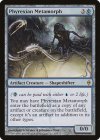
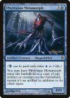
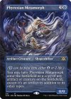
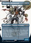
Jana Schirmer & Johannes Voss | NPH
Jung Park | PNPH
Thomas M. Baxa | 2XM
Yoji Shinkawa | SLD
Click the survey here!
I picked Metamorph for our next edition because we've gotten two different printings that people have seemed impressed with in recent years...and it's also a card I can't imagine ever removing from my cube, even with the state of power creep in modern Magic.
I was a longtime Promo-hater on this card for reasons that don't really make sense to me in hindsight (other than a general aversion to foil-only printings), but when a Secret Lair for Yoji Shinkawa (of Metal Gear Solid fame) was announced, I knew it was the end of the classic Jana Schirmer & Johannes Voss version in my 720, no matter how much nostalgia I associated with it.
Yoji Shinkawa is one of the few artists whose art books I collect. I've also picked up most of the MGS comics over the years primarily to have extra opportunities to appreciate the intense emotion that makes its way into every pen line. Shinkawa's got a deeply human way of representing war and death and while those elements may not be present in his Phyrexian Metamorph, the incredible talent behind his character design shines through into a creature that would be the envy of most artists' portfolios.
A concern I have with including SLD art in my cube, especially those that are more distinct from "traditional" MtG art, is that the cube grows increasingly harder to grok as a box of Magic cards as time goes on. While this card certainly looks vastly different from most artifacts, the unsettling figure and the sci-fi vibes are more appropriate on a Phyrexianized artifact creature than they'd be anywhere else, so I'm able to double-sleeve this one guilt-free.
@MilesOfficial Have any of the voting results surprised you?
Many of them!@MilesOfficial Have any of the voting results surprised you?
The previous two are great examples. I thought my impassioned argument for the LotR version of Battlefield Forge would be strong enough to sway at least one or two of my fellow classic-border-preferrers, but it only got one vote besides myself.
Yesterday's as well was a more positive surprise, as most cubes I've seen on CubeCobra and most decks I've seen IRL prefer the promo art for Recruitment Officer.
