General Aesthetics Debate Club: Optimizing Art in Cube (Daily!)

Unlike Evolving Wilds, none of the newer arts are really improvements over the original art for me. My favorite choice (New border with flavor text bar and current wording, e.g. Dominaria United Commander) isn't there, so I'll go with the TSP version.
I like C17 or C19 since it doesn't have flavor text and has the new frame. But the original is good. Remastered is also a good choice since it gets the new frame with a similar expansion symbol to original TSP.

The Jumpstart art is cool, too! But this is a card that has been printed many times with the same original art, and it's sensible art, so I gotta go with that.
 
I'm going to specify that it's about the art going froward, and will make polls with the art crops to encourage folks to vote accordingly -- but will ask folks to share their perspectives on frames/set symbols/etc like I've tried to do in my own commentary. Still open to make changes to that, but centering the conversation on art seems like the best way forward. Thanks for the feedback, folks!
 

Onderzeeboot

Ecstatic Orb
Cool, I was just going to suggest you could use the art crops from Scryfall if you really want the votes to be about the art :)
 
Straight up won't be voting for art I love if it's only available in a frame or border I dislike, crop or no. That said, 100% agree with Nemo, you're going to all this effort to make something fun for us to consider and discuss and I'm very happy to take this as it's given <3

Oh, and BRC Terramorphic Expanse. OG art in old border, colours agree nicely, I like the altered contrast in that print, easy vote.
Second place to JMP though 'cause that art is pretty. Would love to have one more piece of art in a non-UB frame for my art singleton cube legacy, to go with all the different evolving wilds.
 

Day 11: Terramorphic Expanse | Results​

Dan Scott | TSP - 8 votes (42%)
Dan Scott | BRC (Old Border) - 5 votes (26%)
Andreas Rocha | JMP - 4 votes (21%)
Full-Text | SLD - 1 vote
Dan Scott | CMB (Extended art) - 1 vote
Dan Scott | Salvat 200
Kekai Kotaki | 40k
Adam Burn | ONE
Alexander Gering | LRC

No love for the white border version, eh? I expected the Jumpstart version to fare a little better here - nearly 70% of people prefer the original art, which to me, is meh enough that I think many folks are right to run multiple Evolving Wilds rather than even a single Expanse just to optimize in terms of art.

As mentioned before, I'll be encouraging the voting to focus specifically on the art going forward, but feel free to chat about the overall aesthetics as well - I know I will!

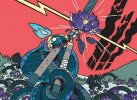
Day 12: Sad Robot | Survey


mrd-245-solemn-simulacrum.jpgm12-217-solemn-simulacrum.jpgmps-25-solemn-simulacrum.jpgc19-222-solemn-simulacrum.jpgm21-319-solemn-simulacrum.jpgsld-1113-solemn-simulacrum.jpg

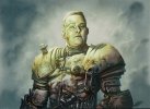
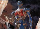
Greg Staples | MRD
Dan Scott | M12
Daarken | Kaladesh Inventions
Donato Giancola | C19
Joseph Meehan | M21
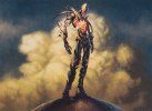
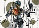
Yoji Shinkawa | SLD

Take the survey HERE!

Solemn Simulacrum, who has one of the better names in Magic, is up next. I keep expecting this card to get power-crept out of cubes, and I do see it happening here and there, but I'm happy that overall, it still makes 100% sense in my list since it has so much history and fond memories associated.

I am with many of you in thinking it's somewhat criminal that Magic reprints invitational/world champion cards with artwork that does not feature the winner in question, something I'm sure I'll feel doubly strongly about with our friend @Dom Harvey wins the event later this year and makes the greatest cube card known to humankind.

That said....my previous spiel about Yoji Shinkawa's art wins out here again. I feel bad, I really do. Never met you Jens, but I do love you and care about you but I can't fight this. Very happy to know there's an old-border version with the OG Sad Robot art available though!
 
Seriously, I don't love any art for Simulacrum. Sad robot is the og, but it always reminds me of data from stat trek. I went with Meehans glass-like art. It looks otherworldly and more interesting than any of the others.

I wouldn't cube that version because it only exists in the bad frame, but that's another story.
 
I voted for the “iRobot” M12 art

Funny how for the first time when you crop the art to make me specifically look at the art and not the card is also the first time I would have gone 100 % for the card that I think has the best art anyways :)
 
They're all bad, but Jens' Simulacrum arrived at the peak of my magic playing days, and I will never forget how funny me and my friends thought the art was. It has a special place in my heart.
 
They're all bad great, but Jens' Simulacrum arrived at the peak of my magic playing days, and I will never forget how funny me and my friends thought the art was. It has a special place in my heart.
I mean you basically covered my sentiments :p

For me its solidly Jens. It's the only one that features a simulacrum as opposed to "Sci-fantasy humaniform golem" that's solemn and not just "Downward tilted power pose".
That said I like most of them though, saving for the Inventions one (as it's just too dark in person) and the M21 Borderless (Competently done, beautiful reflections and all that, but feels... static and empty?). Would love to see a version that marries name and effect to the art - Staring across a barren/devestated landscape with a seed ready to plant or something like that.
 

Chris Taylor

Contributor
Fun fact #1: Sad robot was originally submitted at 2UG, and made colorless because mirrodin by development.
Fun fact #2: My copy of sad robot from mirrodin is signed by an old friend, there is a moustache drawn on the art, and "Take that Jens Thorén!" in the text box.
 

Day 12: Sad Robot | Results​

Greg Staples | MRD - 8 votes (40%)
Dan Scott | M12 - 6 votes (30%)
Joseph Meehan | M21 - 5 votes (25%)
Yoji Shinkawa | SLD - 1 vote
Daarken | Kaladesh Inventions
Donato Giancola | C19

I was all alone on this one! The classic Greg Staples version won out, but it was close with Dan Scott's "looking at that power I hold in my hand" pose from M12 right behind it, and the T2-esque extended art from M21 not far off either.

As mentioned before, I'll be encouraging the voting to focus on the art going forward, but feel free to chat about the overall aesthetics as well - I know I will!

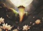
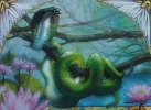
Day 13: Lotus Cobra | Survey

zen-168-lotus-cobra.jpgpgpx-2012b-lotus-cobra.jpgznr-193-lotus-cobra.jpgznr-307-lotus-cobra.jpgsld-1223-lotus-cobra.jpg

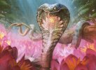
Chippy | ZEN
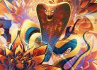
Terese Nielsen | GP Promo
Sam Rowan | ZNRv1
Bastien Grivet | ZNR v2
CROM | SLD

Take the survey HERE!

The gluttony of good choices here should be obvious for all besides the Indiana Joneses of the world. While this isn't particularly close for me -- I'm a Terese Nielsen ride or die guy when it comes to artwork, regardless of her bizarre personal views -- each one of these offers something unique and evocative, featuring a snake without obvious fantasy elements while still maintaining a sense of....power? Mana? As in, I feel like each of these snakes, though without clear magical elements depicted explicitly, could definitely do something magical if I ran into them, maybe talk or something? I love it. I love all of them. The classic is second best, but the other 3 aren't that far off either.
 

Onderzeeboot

Ecstatic Orb
Yeah, no, I’m not going to vote for Nielsen. It’s not my favorite art regardless, once again I’ll have to go with the original art. Chippy’s composition and lighting are just chef’s kiss!
 
EZ OG for me too, same reasons as Zee. I think rank order is same as print order TBH.
That said, I do like that when the Secret Lair prints go for something unique even if I'm not a fan of the result - it's absolutely the place for it.
 
Top