Forum Aesthetics and Usability

Jason Waddell

Administrator
Staff member
Hi guys. We had a chat today about possible improvements to the forum functionality and aesthetics, and would appreciate any and all feedback so that we can make improvements. Keep in mind these are all software related, not content related.

Some questions:
What do you like about these forums?
Are there any properties of the forum that make you less likely to post?
Did you know the forums can log you in automatically via Facebook?
Do you have difficulty telling where posts end and begin?
Is there functionality from other forums that you wish we could emulate?

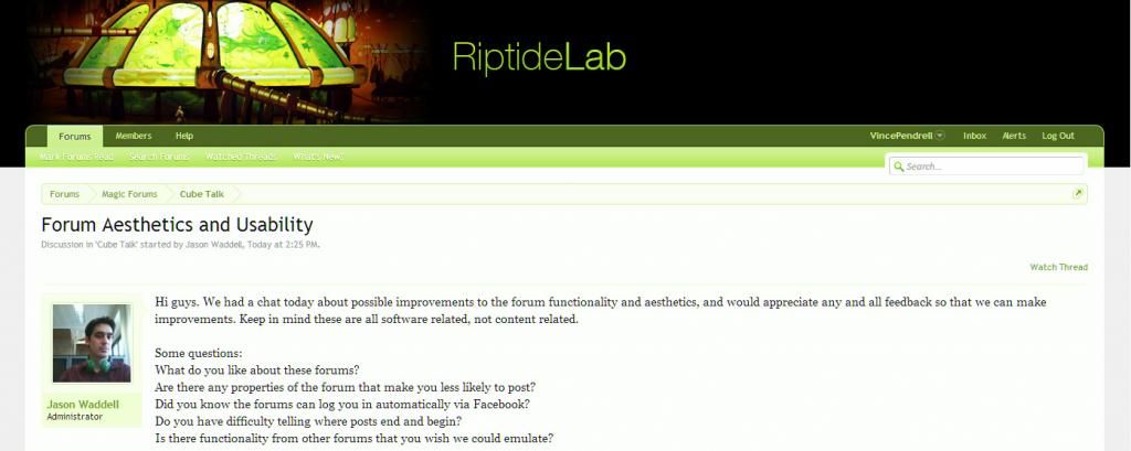
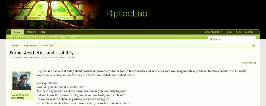
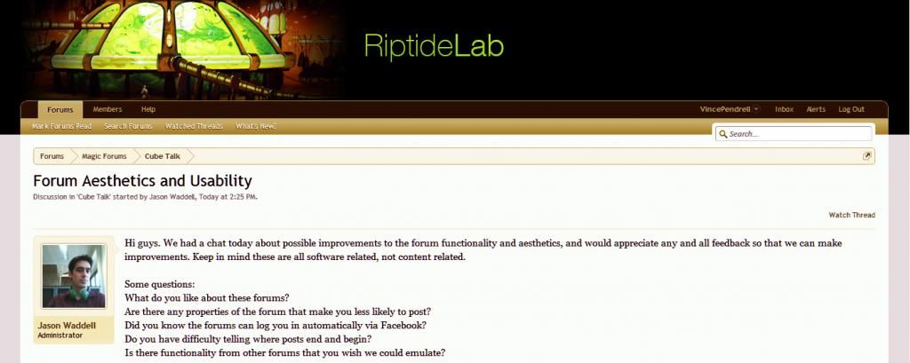
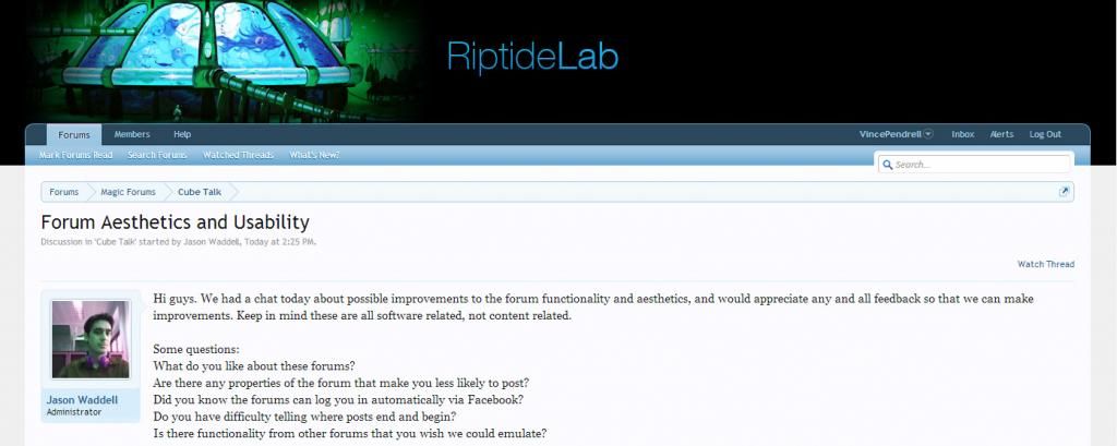
As a comparison, here are screenshots of MTGS and RipLab.
lkeiQiG.png


Cp5MSG3.png


Lastly, does anybody have experience with PHP?
 

Dom Harvey

Contributor
What do you like about these forums?
The internal automatic notification thing is really good.

Are there any properties of the forum that make you less likely to post?
It would be nice if there were more solid lines or something, threads look like a open spaces atm.

Did you know the forums can log you in automatically via Facebook?
I didn't, but I hate any kind of FB-linking with non-FB stuff on principle.

Do you have difficulty telling where posts end and begin?
Only CML's

Is there functionality from other forums that you wish we could emulate?
Some kind of Quote Post button would be neat.
 

Eric Chan

Hyalopterous Lemure
Staff member
This is great feedback, Dom. For the last question, I'm not sure if you mean something other than just quoting someone's whole post, which is something this forum software supports but unfortunately hides behind the not-very-descriptive "Reply" button. Changing it to "Quote".
 

VibeBox

Contributor
i rather like that threads look like clean, open space as is. it's a good aesthetic, imo.
the only think that comes to mind for me is that i wish we had better integration of decklists.

12 Black Lotus
12 Channel
12 Fireball

is functional, but doesn't look how magic players have been conditioned to expect a decklist to look.
 

Eric Chan

Hyalopterous Lemure
Staff member
For a Magic forum, decklists are definitely a must-have at some point, and I agree that card tags alone aren't enough.
 

James Stevenson

Steamflogger Boss
Staff member
So far nothing annoys me about the site, which to me is the most important thing about web design. No silly mouse-overs to make buttons appear or whatever, it's easy to use and easy to read.
Decklist tag sounds like a great idea.
Oh I would really like to stop receiving these damn emails every time I get notifications. I have unchecked all the boxes I could find that seemed applicable, I don't know what I haven't done.
 
Right now, this is pretty much one of the best forum softwares I have ever used. Notifications are amazing as they are and using them in junction with watch/unwatch threads function is very satisfying. Text editor is also wonderful and the integration with the Quote/Reply button makes multiquote the easiest thing ever. A couple of things that I miss from other sites or otherwise:

• Mana emoticons that can be put inside a MANA tag. IE, [mana]2bb[/mana] would become {2}{B}{B}. Extra points if {2bb} or <2bb> automatically becomes a mana cost.
(Btw, mana emoticons are pretty much hidden behind that :) face right now. Switching colon for parentheses, brackets or braces would be cool as well).

• As mentioned by everyone, deck tags would be great, especially if there is some way to make it visually more like the decks on Daily Magic articles than on MTGS. Having a centralized spot to view the cards is great! Having the ability to comment on specific cards inside the decklist is also a good feature that MTGS already has.

• I also agree with having a different section for site-specific discussion to aggregate site news and troubleshooting, might not be needed right now, but would be good in the near future as we get more traffic.

• A card image tag would be useful, especially for Jason's post when he refers to some cards. , for instance, could add the image we get from mouse-over at Tarmogoyf (maybe with click function taking to the same place as the regular card tag).

• I asked for keyboard shortcut for card tagging already in the official card tags thread, so just mentioning again that it would be cool to have it. Also, if it ever happens, shortcuts for any other tagging functionality cited above would be superb.
 

James Stevenson

Steamflogger Boss
Staff member
Hey I have a cool idea. On your profile page there should be a place to add a link to your cube list, if you have one online. Then on your posts you could have a little link to your cube list under your avatar. I guess it's redundant, but I made this masterpiece of a diagram, so this is what I mean:

ajbE0Aw.png


This might be totally useless
 

Jason Waddell

Administrator
Staff member
Hey I have a cool idea. On your profile page there should be a place to add a link to your cube list, if you have one online. Then on your posts you could have a little link to your cube list under your avatar. I guess it's redundant, but I made this masterpiece of a diagram, so this is what I mean:

ajbE0Aw.png


This might be totally useless

This might be doable, but in the meantime I think we have to rely on signatures.
Great graphic, by the way.
 
A couple more suggestions:

• A table with milestones and priorities for planned site/forum features so we know what is baking. No need to estabilish delivery dates. Would probably be better if we had a site-specific section to have this, but the original post in this thread might be a good place as well.

• Post history for whenever you go to "More options..." posting. Pretty much how MTGS hadles it. Helps a lot when you are typing something that ends up big, you want to preview it and keeps writing but forgets if something was already mentioned before.

• A button for the spoiler tag functionality in the toolbar for the text editor.

• A "what's new on the website" at the main forum page just above the categories for those of us who go directly to the forums. Not sure how applicable this is. A step forward from this feature should be auto-link the new articles on the website to a system-generated discussion thread for the article in question.

• Speaking of main page, change the header image to the light transparent one already :p

A while ago I had stepped forward on the task of trying my hand at a RiptideLablogo. I'm sorry to say that I've hadn't had enough time to work on that with all the documentation I am having to hurl around with moving to Europe. I did made some simple tests with the forum coloring to see if we make it look better along with our current placeholder banner. I am not sugesting any of those, just putting them forward for your appreciation.
colortestinggreen.jpg
colortestingothergreen.jpg
colortestingbrown.jpg
colortestingjasonunderwater.jpg

This one changes the banner and uses the default forum colors
If you guys are interested, we could try some new tones quickly through Photoshop and change the default look of the forums just slightly.
 

CML

Contributor
So I like it all, but the extra font options are a pain in the ass when I just wanna c&p a chunk of text from elsewhere and then it's in something other than the default. Maybe we could pare those down a bit more, NWO-style, and thereby achieve a more successful if not superior product

I like the forum style with indentations ca. 2000, but nobody else does

I actually like the form of MTGS (building on Vince) if not anything else
 

Chris Taylor

Contributor
Also CML, I'm sure you love the indented forums, but after a few posts everyone is 200 pixels wide. That sucks. That's why we stopped :p
 
Since you guys loved the blue one so much, there you go! Also made a couple ones with a light gradient background for the main page so there are visible bounds to the header image. I included the design-ey helvetica placeholder logo if you guys feel like using it for anything until there is something better for us to use.

EDIT: One thing I thought about earlier yesterday: We had discussed the fact that having multiple sections eventually splits the community in 'neighborhoods' as a downside for more categories being added. I have also noted that notifications also makes a good job in transforming posts that you have participated in central focus while making posts from other people more transparent, which helps into us making more posts that will be seen by less and less people.

We could have a "recent posts for this section" right beneath the description of each section in our main forum page as to make new discussions more visible. The brazilian MTG online community Ligamagic does have one of these 'most recent posts' spots at their landing page and it does a good job at dispersing users aglutinating into single forum categories (and eventually pissing me off with the most stupid rules questions and worst demonstrations of written portuguese I have ever seen). Of course, it does also makes older threads disapear more quickly, so it is not a failproof system. Though I should mention this train of thought I had today anyways to see if my experience and observation matches with anyone elses.
 

Jason Waddell

Administrator
Staff member
Since you guys loved the blue one so much, there you go! Also made a couple ones with a light gradient background for the main page so there are visible bounds to the header image. I included the design-ey helvetica placeholder logo if you guys feel like using it for anything until there is something better for us to use.

EDIT: One thing I thought about earlier yesterday: We had discussed the fact that having multiple sections eventually splits the community in 'neighborhoods' as a downside for more categories being added. I have also noted that notifications also makes a good job in transforming posts that you have participated in central focus while making posts from other people more transparent, which helps into us making more posts that will be seen by less and less people.

We could have a "recent posts for this section" right beneath the description of each section in our main forum page as to make new discussions more visible. The brazilian MTG online community Ligamagic does have one of these 'most recent posts' spots at their landing page and it does a good job at dispersing users aglutinating into single forum categories (and eventually pissing me off with the most stupid rules questions and worst demonstrations of written portuguese I have ever seen). Of course, it does also makes older threads disapear more quickly, so it is not a failproof system. Though I should mention this train of thought I had today anyways to see if my experience and observation matches with anyone elses.

Hi Vince, is it me or are the images you linked to on photobucket super tiny? Maybe I just don't know how to use them correctly. In any case Eric will be in to take a look.
 
Oh no, you just have to go into each one and copy it somewhere else. I've just put up the link to the album so I wouldn't have to paste each image directly and clog up the post, so the ones you see when you go through my link are actually just thumbnails.

Here is an exemple of one of the images (this is the one you can use for the main page header):
riptidegradientlighttitle.png


EDIT: Just noticed that mouse-overing on the forum topics shows up the latest post. This is a pretty neat functionality :p
 

VibeBox

Contributor
no offense, but the old banner looked amazing, and this blue version looks like an ugly mountain dew ad
please please turn it back
 
Personally, I was fonder of the "Other Green" option that maintained the original color for the banner, but mostly because it seems that everywhere on the internet websites are turning into a shade of blue. Nothing against the current one though (There is no mountain dew here so I can't even make that comparison :p).
 
Top