General Speculation-Thread

Since this is a speculation thread.

It is pretty interesting that the spoiled mechanics kind of help each other out. They have synergy across the Guilds.

This leads me to believe that the othe five Guild mechanics will continue this trend. Maybe Simic actually could get peoliferate since it would help out Boros etc. If many of the Guild mechanics go well together with other Guild mechanics then we are in a very flavorful spot when ‘Allegiance’ come around. I bet alliances will be formed across the ten Guilds (making them pseudo 3-colored or more) and that our Gatewatch guys will find new allies and enemies before finally confronting Bolas.
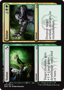
 
Maybe Wizards will finally get a handle on their storyline, and after consolidating into powerful 3-color blocs, Ravnica will be split open by the struggle with Bolas, crescendoing as betrayals are made, guilds are forced to their knees, the Guildpact is shattered and magically reformed into shard and guild alliances, an online website gives you the current 'Guild wheel' of the current state of affairs along with a timer in real time counting down to a long novel-ish story release, with final set spoilers coinciding with the reveal, and both the plane and Gatewatch being completely reforged in flame, hopefully with a lot of death(s)...

While I'm dreaming, I think they should do a Timeshifted section for the last set using a bunch of OG Ravnica and RTR cards, with original art and frame
 
Middle frame looked much better than the current one, especially on rares with that ugly stamp cutting a hole into the textbox
 
Just in case somebody was wondering:

Alpha-Scourge: Original frame
8’th Edition-Commander 2014: Modern frame
M15-> Today and ongoing: M15 frame
 

Onderzeeboot

Ecstatic Orb
Middle frame looked much better than the current one, especially on rares with that ugly stamp cutting a hole into the textbox

I know this comes down to personal preference, but I do prefer the M15 frame. I honestly think it looks better than the modern frame, and a lot better than the original frame.
 

Chris Taylor

Contributor
Frames over time: Less Flavor, better gameplay.

Sure black cards don't look like ancient forbidden tomes anymore, but we have a ton of useful information on the bottom of the card now. Work in a game store for like a day and tell me this information isn't super necessary.
 
No love for the Future Sight frames huh?

I do like the new frames, except I'm not sure how I feel about the new frame being applied to split cards (very boxy):
Status-Statue-Guilds-of-Ravnica-Spoiler.png
 
Background looks messier, text and art boxes smaller, almost no relevant technical info at the bottom, title and type line harder to read (on some older cards it can be very hard to read), not all cards available with the old frame so you end up with a mixed border deck/field.

I would like the old art on the newer frame. I'm often not a fan of the more "photoshop" style art. Old art on Evac looks as desperate and smokey and confused as an evacuation can actually be.
 
The background looks like a high fantasy flavor home run to me. The slightly smaller art box is a good point though, but far outweighted by the overall look of the card.

Also, I said aesthetically, not practically. But what necessary information am I as a cube manager/player missing even?
 
I'm simply giving you reasons that people (including me) don't like the old frame, which is basically what you were looking for. I would guess that the majority of players prefer the modern borders, which is why they switched: it's just a better graphic design.

Practically, Set can definitely matter because it could help inform a TCGplayer search, for instance, and the card number can be used for something as simple as guessing odds or evens on a random card as a way to determine who plays first, or it can be used to find exact lands to make matched sets.
 
I don't believe that, most players I know personally, prefer the classic border by far. MtG Salvation has a similar tendency. Maybe we should do a poll here?

And the set is determined by the set Symbol?
 
If the majority would prefer the old border then Wizards would print cards in the old border.

Nobody wants to lose out on extra money.

Edit: Nobody wants to lose out on extra money at no cost. At least that is how I see it. You are welcome to try and change my mind.
 
As to set symbol, just like Scryfall search lingo, not everyone has the energy or desire to remember all of them. I can't type the set symbol for Scourge into google, but I can type "C18 MTG" thanks to the M15 border and google will happily help me find out it's for Commander 2018. Especially useful on sets with frustratingly similar set symbols (like commander products).
 
I don't believe that, most players I know personally, prefer the classic border by far. MtG Salvation has a similar tendency. Maybe we should do a poll here?

And the set is determined by the set Symbol?

My order in terms of looks is Old -> Modern -> New. However, using Set Symbols to determine set seems really bad to me. It can be a cool new edition, but imagine if each planeswalker type has a symbol rather than a name that we had to memorize :/

I really don't like the newest border, but I guess it does have an indication of "Anything in the black is actually not for the game", which helps separate things.
 
I really don't like the newest border, but I guess it does have an indication of "Anything in the black is actually not for the game", which helps separate things.
This is in fact exactly why they did the black at the bottom like this. But not for human benefit; they did it so automated printing/sorting systems could read the pertinent info more clearly.
 

Grillo_Parlante

Contributor
It is beyond my understanding ability how anyone could prefer this:

evacuation.jpg


Over this:

evacuation.jpg


flavorwise and aesthetically.

I prefer the older as well. The shape of the new frame confuses me.

The bigger thing with me though is just the blue. I like how the older frame looks more like actual paint, with different shades of blue that have been mixed with one another but dried? I don't know, you get that feeling of creative potential from the color mixing, but because it looks dried, it still has that solid feeling you expect from a frame for an image.

The newer blue color palette makes me think of computer generated art--that kind of fake real feeling. Its hard for me to get past that. Its like it dosen't have enough form to really be a frame for an image, and the tapering towards the bottom dosen't help.

I don't know, interesting discussion. I just get this mild uncanny valley feeling comparing the new frame vs. the old one, with the old one feeling more real.
 

Onderzeeboot

Ecstatic Orb
The new design has a better font, more room for the art, better readability, and a cleaner and crisper layout. The only thing I like about the old border is the unique border for each color (that basically matched the corresponding basic land in theme) was more visible. It's still there in the new design though, so I'm not docking too many points for that. Basically the old border looks, well, old, out-dated, out of fashion to me.
 
I prefer the old border but that's mostly due to nostalgia, as I started playing only shortly before it changed so it represents my very first forays into the game. I also prefer how old border foils look, having the foiling all around the edge makes it stand out a lot more. The old cards look more like "spells", the new ones look more like game components - this does have its benefits in readability and clarity, which are overall more important to the game.

One thing I do love about new borders is the thin border around the text and art on gold cards with the colours running into each other. Ravnica blew me away with how good the cards looked because of this. Just an example:


This was the first time they had done the border like this (there were only two gold cards in the new border before Ravnica, and I guess they didn't think about the presentation so much until a whole gold set) and having a set full of cards like this was amazing.
 
The new design has a better font, more room for the art, better readability, and a cleaner and crisper layout. The only thing I like about the old border is the unique border for each color (that basically matched the corresponding basic land in theme) was more visible. It's still there in the new design though, so I'm not docking too many points for that. Basically the old border looks, well, old, out-dated, out of fashion to me.

But shouldn't a card that represents a spell from a (high) fantasy card game look old? The newest frame with it's odd shape and sterile look doesn't invoke the feeling of fantasy and spells at all. It looks literally modern, like it would fit Kaladesh block maybe with race cars and shiny robots, but not you're average MtG set.

Maybe the older cards were harder to read, but how often do you have to read a card, once or twice? Then the picture is enough to recognize often. And I'm willing to look a little closer, when in exchange I get that special feeling of searching through a library of ancient spells and creatures full of, well, Magic. Like this game is called.

Today we have data-focused frames, bland digital art and characters that look like powerrangers or are wearing stupid modern day haircuts. Now even the logo doesn't look like it belongs to a fantasy game anymore.

I am not an old Grumpy, many things improved over the last 20 years, but flavor is definitely none of them
 

Grillo_Parlante

Contributor
I prefer the old border but that's mostly due to nostalgia, as I started playing only shortly before it changed so it represents my very first forays into the game. I also prefer how old border foils look, having the foiling all around the edge makes it stand out a lot more. The old cards look more like "spells", the new ones look more like game components - this does have its benefits in readability and clarity, which are overall more important to the game.

One thing I do love about new borders is the thin border around the text and art on gold cards with the colours running into each other. Ravnica blew me away with how good the cards looked because of this. Just an example:


This was the first time they had done the border like this (there were only two gold cards in the new border before Ravnica, and I guess they didn't think about the presentation so much until a whole gold set) and having a set full of cards like this was amazing.


My favorite is when they do that with the hybrid cards.

Image.ashx


Its just perfect: a division of two things mixing. And than when they have the colors of the art match the colors of the border, like with guildmage, it makes it feel like the border is part of the art.
 
One thing that stands out when playing cube is the card names in the modern/new frame are much more legible. I prefer the old frame in terms of flavor and feeling - especially the card name font and the texture of the text boxes - but the new ones are much more functional and accessible.
 

Onderzeeboot

Ecstatic Orb
But shouldn't a card that represents a spell from a (high) fantasy card game look old?
No, why should it? That's just your personal preference. Which is fine, don't get me wrong, but it's not a universal truth. Obviously, since I don't share your preference ;) Ultimately I'ld say the new border has, objectively, a couple of improvements over the old border (readability, anti-forgery measures, better collector's information), but if those are not things you care much about, it all comes down to whether you favor the old look and feel or the new one, and it seems like we have a different taste in that matter!
 
Top