To me the RTR one looks too much like one of those clean architectural renders with shadow silhouettes of people.
You are using an out of date browser. It may not display this or other websites correctly.
You should upgrade or use an alternative browser.
You should upgrade or use an alternative browser.
General Aesthetics Debate Club: Optimizing Art in Cube (Daily!)
- Thread starter MilesOfficial
- Start date
Onderzeeboot
Ecstatic Orb
This. Pretty much this.From a composition perspective, the original M15 art (not the promo) is the most visually interesting.
Hate the bog-standard frame and would rather never see it in my own cube, but Moeller's art is the best for this card
Are we discussing just art or also frame? Because if it is also frame then I have a clear winner:Hate the bog-standard frame and would rather never see it in my own cube, but Moeller's art is the best for this card
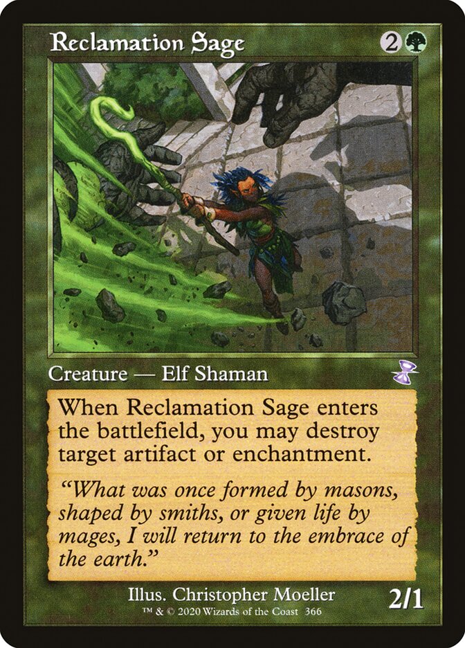
For the Temple Garden, I know I'm late, but in my cube I have all original Shocklands from Ravnica block, except for the Temple Garden because I opened one foil from RTR (from a Dragon's Maze booster) when I was young and so it has a personal connection. And now I also like the art more
The Temple Garden is one of the easiest choices for me. In fact probably the easiest because the original Ravnica is by far my favorite Magic art of all time.
All of the original Ravnica dual lands have good art, but the printing process made them all look “grainy,” which I don’t like. The RTR lands are cleaner and more colorful for the most part, which I enjoy.
I like the RTR shocks on the basis that I own the entire RTR cycle.
Rob Alexander on dual land art is awesome because he also has that awesome Underground Sea art from the very beginning. That Temple Garden art was also the first shockland spoiled for what turned out to be an exciting block overall. The shocks were shocking when they were spoiled. I wasn't expecting basic land types and being able to enter untapped. So put that all together, and I easily pick the Rob Alexander version based on nostalgia.
and let me know if you have any ideas for how to improve this!
I think it would be a good idea for you to change your schedule to 1 time per week.
And also stay out of the official spoiler seasons which are those 1-3 week periods where cards are being spoiled every day.
Day 5: Reclamation Sage | Results
Christopher Moeller | M15 - 8 votes (73%)Clint Cearley | PM15 - 3 votes (27%)
Ilker Yildiz | LTC - 0 votes
Not quite the results I anticipated based on casually browsing folks' cube
Day 6: Elvish Mystic | Survey
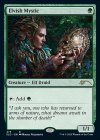
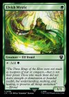
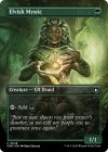
Wesley Burt | M11
Winona Nelson | F14
Magali Villeneuve | SLD
Iga Oliwiak | LTC
Greg Staples | CMM
Please enter your thoughts in the survey here!
Personally, Magali Villeneuve's is stunning to me. The original art is fine, but like Nelson's promo that came out originally, it doesn't inspire or excite. Should a 1-drop mana elf inspire or excite? I think so, and Villeneuve's charges my creativity and pulls me into the game of Magic in a...magical way.
Like with yesterday's vote, this is a situation where I'd have loved to make my cube more LotR-themed if possible, but the art is not terribly evocative of Middle Earth even ignoring the overly-bright digital sheen it's got to it.
For any of the singleton purists out there, this is perhaps a more complicated question considering the convergence of Llanowar Elves and its 10 different pieces of art, but I imagine that these Elvish Mystic variations would be discounted since the name doesn't carry the same weight as the OG elf.
I think it would be a good idea for you to change your schedule to 1 time per week.
And also stay out of the official spoiler seasons which are those 1-3 week periods where cards are being spoiled every day.
I guess I don't know what the benefit would be to puling back on this? I would have cut down on the cadence already had there been a drop-off in votes or chatter (I might discontinue weekend voting for my own sake) but I'm honestly pretty happy coming on these forums and seeing activity, the more the better as far as I can see. Is this crowding out other conversation?
On a more personal note, if I don't do something every day then I'm liable to forget and never do it again.
Onderzeeboot
Ecstatic Orb
I love a bit of engagement, so I’m here for the daily poll 
I also adore the Magali art, it’s soooo pretty and evocative! The only problem I have with that art is that, from a mechanics standpoint, it doesn’t convey what the card does at all. Who knew talking to a skull adds , amirite?!
I also adore the Magali art, it’s soooo pretty and evocative! The only problem I have with that art is that, from a mechanics standpoint, it doesn’t convey what the card does at all. Who knew talking to a skull adds
magali baby!
just make sure to rip the art out of that poopoo frame and into something cool looking
just make sure to rip the art out of that poopoo frame and into something cool looking
I guess I don't know what the benefit would be to puling back on this?
Usually the fatigue will set in the audience after some time.
i’m happy to see the poll and discussion everyday  and i don’t think it’s crowding anything else out, for what it’s worth
Magali’s art is good but the M14 art is great and iconic so it’s the clear winner.
hear me out tho, magali art on DRS or Elves of Deep Shadow
I voted for Magali Villeneuve’s art as my favourite, though I am quite happy with the M14 art in my cube.
Chris Taylor
Contributor
Honestly I love the borderless, I just can't help it.
hear me out tho, magali art on DRS or Elves of Deep Shadow
I'd give Magali the edge if this was a Regrowth effect, but as far as mana dorks go, I'll stick with the original.
This is what I came here to say. I want the Magali art on Eternal Witness.
Chris Taylor
Contributor
Ooooo that's a good oneThis is what I came here to say. I want the Magali art on Eternal Witness.
Onderzeeboot
Ecstatic Orb
It was definitely wasted on the wrong card  Would have made a killer DRS or E Wit!
