
You are using an out of date browser. It may not display this or other websites correctly.
You should upgrade or use an alternative browser.
You should upgrade or use an alternative browser.
General Alchemy
- Thread starter Velrun
- Start date


They simply seem to care less. Look at Bellowsbreath Ogre. Why is it an artifact creature? There are a lot of weird details about the Alchemist cards.Does anyone with a better eye for art know why the art is invariably bad on the Alchemy cards? Do we think it's just rejects from the regular set, or is it something about the saturation/aspect ratio being slightly squished/different font sizes necessitated by Arena?
because, uh.... pauldron.They simply seem to care less. Look at Bellowsbreath Ogre. Why is it an artifact creature? There are a lot of weird details about the Alchemist cards.
If anything that moonfolk needs to be an artifact creature. It's got a freakin' metal leg!
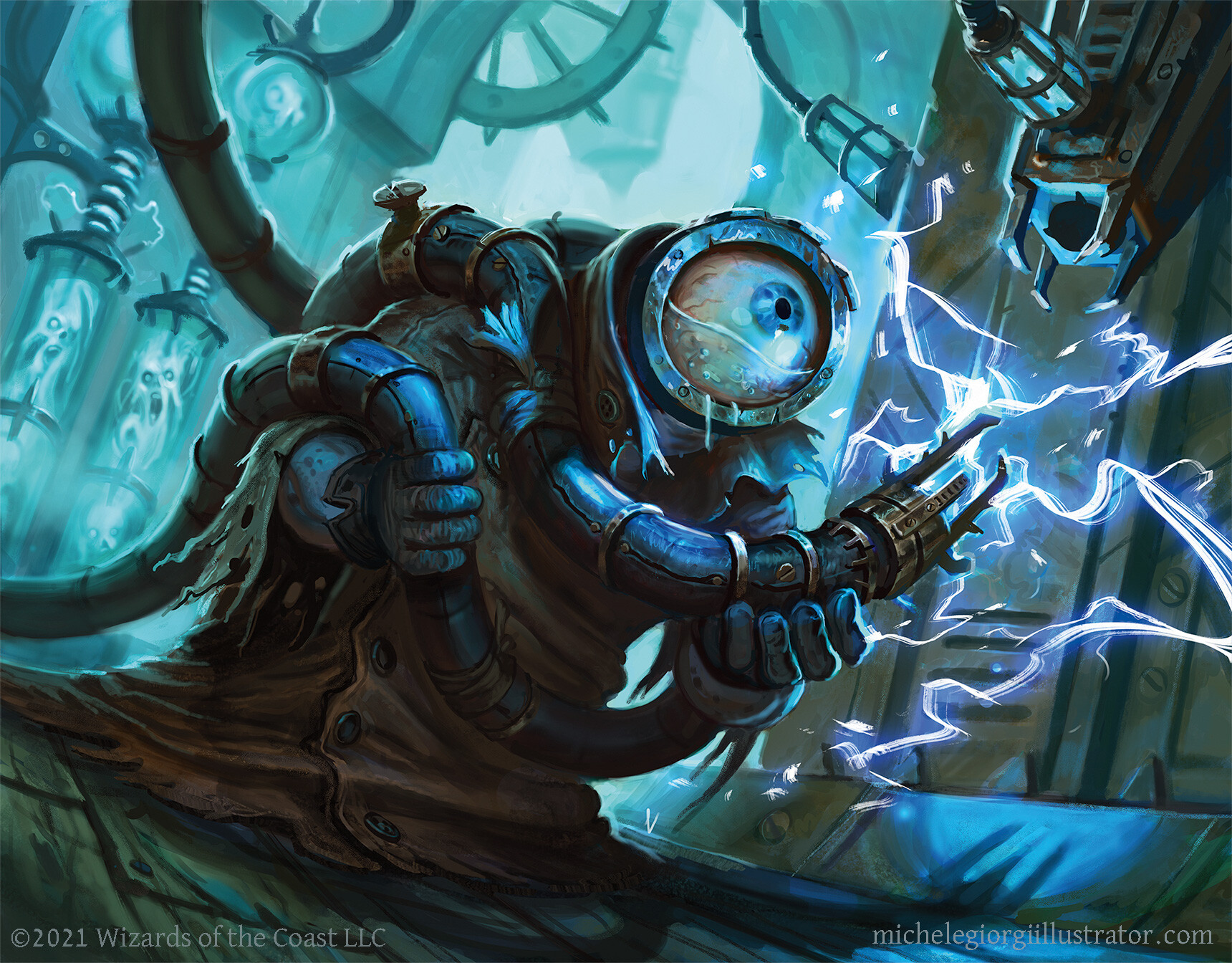
Onderzeeboot
Ecstatic Orb
to me one of the benefits of seek>search is simple convenience, so i would rather resolve the whole ability without shuffling if i translated it to paper
Aight, aight, I got u!I agree you probably don't want to shuffle the whole library, but putting the rest of the card on the bottom in a random order is probably still a time saver rather than letting people organize them

Though, to be fair, seeking for card categories that make up only a small percentage of your deck is a lot less efficient than searching for them.
you know, the art for Bounty is actually pretty cool when it’s blown up big enough to see what’s happening. i always just thought it was a big smudgy wave
I still think it's a bit smudgy all the same, even the large art version looks like it's missing the last 15% or so, factoring in feedback from the art director that took this set off or something. All the same, it's a great piece of art, which is a nice change of pace for Alchemy. For a game with such incredibly high standards for artwork, I just really don't get why they wouldn't maintain quality, other than maybe timing since they don't have the standard year+ to develop everything?
Onderzeeboot
Ecstatic Orb
I think it has a lot to do with image compression to make sure Arena keeps running (relatively) smoothly. E.g.


Hmm if you compare an Alchemy set to a normal set, which is monetized in paper, mtgo and arena, an Alchemy is a lot less important. So it seems logical that they spend less money on artist for it.I still think it's a bit smudgy all the same, even the large art version looks like it's missing the last 15% or so, factoring in feedback from the art director that took this set off or something. All the same, it's a great piece of art, which is a nice change of pace for Alchemy. For a game with such incredibly high standards for artwork, I just really don't get why they wouldn't maintain quality, other than maybe timing since they don't have the standard year+ to develop everything?
It's less important, sure, but they don't have to spend money to make it physically, meaning that there's correspondingly fewer expenses associated with its production. And they're clearly not budgeting much for the designers, given the incredibly poor wording on some of these cards, so I'd imagine that they're at least breaking even on the expense/revenue ratio in comparison with paper cards.
Onderzeeboot
Ecstatic Orb
Dear lord, you're harsh! Do you have some examples of especially poorly worded cards? There's some weird mechanics in the digital design space, but none of them really stood out as poorly worded. I might have missed something though.And they're clearly not budgeting much for the designers, given the incredibly poor wording on some of these cards
i wanna say there’s been at least 2 cards in each alchemy release with templating errors that got hotfixed after the fact, but i couldn’t tell you which ones
Onderzeeboot
Ecstatic Orb
To be fair, that's a luxury they can't afford in paper Magic, and even there we get some templating errors every now and then. I think their paper product sets a higher bar than is necessary for a digital product, but it does condition us to notice gaffes when they occur.i wanna say there’s been at least 2 cards in each alchemy release with templating errors that got hotfixed after the fact, but i couldn’t tell you which ones
For sure!Dear lord, you're harsh! Do you have some examples of especially poorly worded cards? There's some weird mechanics in the digital design space, but none of them really stood out as poorly worded. I might have missed something though.
This card can give itself the returning text many times, which feels incredibly sloppy.
I don't see any good reason why the last sentence needs the second "perpetually," which would normally be fine except that I think it would save them a line break here.
Normally, this style of card would be two sentences. However, a lot of cards in this release splice effects together, which is stylistically jarring (personal taste, though).
There was another card that was particularly egregious, but it's not jumping out at me on scryfall at the moment. And maybe I was too harsh with how I phrased my comment, but in comparison with how tightly worded paper cards are, these are voluminous.
Also, "starting intensity 1" is really, really unnecessary. Why not just write "perpetually increase this number by 1?" You literally already have a mechanic for this! Unless you're making starting intensity tribal, you're just adding words for words' sake which is poor UX design.
Edit: these two cards handle whether shuffling is a separate sentence or not differently, which bugs me.
This card should read "when" it etbs, not "whenever." Again, it's not game-breaking, just annoying. And I don't want to pay to be annoyed.
Last edited:

Chris Taylor
Contributor
Well I'll be
Onderzeeboot
Ecstatic Orb
Sweet! Thanks for taking the time to do this! I love the formal language Magic uses, so indulge me while I pick these designs apartFor sure!
")
At first I was like, this card is already very wordy and it doesn't matter much, but I agree it does play a bit sloppy. In theory you'ld need to resolve each instance separately, though Arena probably has some UX Magic to automatically resolve this shit, since it's an al upside mechanic in most cases. I checked Scryfall a bit to see if they ran into this problem before, but it seems to be a completely unique design precisely because of the 'perpetually' clause. I'm still not sure how to fix this ability without making the card too wordy, maybe adding ", if it doesn't already have this ability" before ", it perpetually gains ..." works?
This card can give itself the returning text many times, which feels incredibly sloppy.
There is actual precedence for this in paper Magic, but it's hard to spot in the wild since it never made it onto a printed card. If you look at the Oracle wording of Shorecrasher Mimic and Woodlurker Mimic you'll see "until end of turn" being used twice in the same awkward way. The problem here is that WotC would usually words this as "until end of turn, it has base power and toughness X/X and gains ward
I don't see any good reason why the last sentence needs the second "perpetually," which would normally be fine except that I think it would save them a line break here.
". The way 'perpetually' is used in Magicese prevents the use of this lingual pattern though, since it would be ambiguous whether only the first ability is perpetual or the entire thing. You could very well write "It perpetually has base power and toughness X/X and gains ward until end of turn." so adding the second perpetually does clarify things. In fact, you arguably would end up with another Riding the Dilu Horse if you didn't.WotC is surprisingly inconsistent in this, and abilities have been spliced together in paper Magic before. For example:
Normally, this style of card would be two sentences. However, a lot of cards in this release splice effects together, which is stylistically jarring (personal taste, though).
The phrase "Starting intensity X" is ugly as heck, but it has one major advantage. It allows designers to conceivably create cards that start at a higher intensity in the future. I distinctly remember MaRo saying one of his regrets about Odyssey block was that they hadn't written Threshold as Threshold 7, which meant they could never reuse the mechanic at a different number of required cards. That said, I agree with you that they could probably have found a way to reword this that avoids the need for a (subjectively) ugly keyword.Also, "starting intensity 1" is really, really unnecessary. Why not just write "perpetually increase this number by 1?" You literally already have a mechanic for this! Unless you're making starting intensity tribal, you're just adding words for words' sake which is poor UX design.
Standard currently has paper cards that use both wordings. See with comma vs. without comma.Edit: these two cards handle whether shuffling is a separate sentence or not differently, which bugs me.
KekwThis card should read "when" it etbs, not "whenever." Again, it's not game-breaking, just annoying. And I don't want to pay to be annoyed.
They also fudged this up on Gutmorn, Pactbound Servant and Kami of Mourning. Sloppy!Edit: I think that in most cases, the problem is not the wording, but the fact that they are going out of their way to make designs that don't really work in paper. All these cards play around in basically three areas of design that are off limits in paper Magic: memory issues (e.g. perpetually), hidden information (e.g. seek), and extra resources (e.g. conjure). My theory is that these designs feel off because they venture into territory that we've been conditioned to recognize as off limits. This makes them feel forced and inelegant, even if they are semantically correct.
Last edited:
Sweet! Thanks for taking the time to do this! I love the formal language Magic uses, so indulge me while I pick these designs apart
Precisely! Like I said, I don't know how to fix it, but it's going to result in a lot of triggers that do nothing except break the game in weird corner cases of triggers that trigger on triggers, and I don't want to worry about those edge cases. Cool design, though.At first I was like, this card is already very wordy and it doesn't matter much, but I agree it does play a bit sloppy. In theory you'ld need to resolve each instance separately, though Arena probably has some UX Magic to automatically resolve this shit, since it's an al upside mechanic in most cases. I checked Scryfall a bit to see if they ran into this problem before, but it seems to be a completely unique design precisely because of the 'perpetually' clause. I'm still not sure how to fix this ability without making the card too wordy, maybe adding ", if it doesn't already have this ability" before ", it perpetually gains ..." works?
There is actual precedence for this in paper Magic, but it's hard to spot in the wild since it never made it onto a printed card. If you look at the Oracle wording of Shorecrasher Mimic and Woodlurker Mimic you'll see "until end of turn" being used twice in the same awkward way. The problem here is that WotC would usually words this as "until end of turn, it has base power and toughness X/X and gains ward
WotC is surprisingly inconsistent in this, and abilities have been spliced together in paper Magic before. For example:
Standard currently has paper cards that use both wordings. See with comma vs. without comma.
I must have Berenstein Bears'd myself, jeez.
Edit: I think that in most cases, the problem is not the wording, but the fact that they are going out of their way to make designs that don't really work in paper.
Fair points on a number of those! And yeah, a lot of this is probably "old man yelling at a cloud territory," lol. That said, I still wholeheartedly disagree on starting intensity. Take this card:
Is there any reason why this couldn't have been written as the following? I don't see why not.
Whenever Bellowsbreath Ogre attacks, it deals 1 damage
It's not quite as explicit, which is probably why they did it the way they did, but I think you're conveying the same information without having to create an entirely new mechanic. That's a no-brainer for me, especially when they just created the mechanic that recapitulate this effect. The design team also retains full control over all of these levers, so I'd argue that by not entrenching the effect into a full mechanic you're not giving players a possibly faulty mental shortcut when the design team starts using Starting Intensity 2.
The use case I see could be that they're trying to create an exponential scaling system whereby there will be multiple effects keying into a card's intensity, but that seems like a lot of setup cost on their end and on ours for little benefit.
Anyways, like you said, none of this is game-breaking. I just wish these cards got another couple of passes of copy writing to smooth these bumps out. Thanks for pointing out how rich Magic's rules and history are! It's like what Maro says about how Magic isn't really a game, it's a rules system.
Would I cube this if it were a real card? Yeah, probably.
Man, the art feels so...unfinished? It's such a big gap from the art direction of the main set.
yeah the art on these is perennially bad, but definitely some gems in this release as far as cool effects that could translate to paper
There's a pretty simple reason why the art on the Alchemy cards is "invariably bad" – they're not being shown at their full resolution.Does anyone with a better eye for art know why the art is invariably bad on the Alchemy cards? Do we think it's just rejects from the regular set, or is it something about the saturation/aspect ratio being slightly squished/different font sizes necessitated by Arena?
Arena tends to compress the image size for artwork in order to stop the game from taking up more space on computer (and now also mobile phone) hard drives. What this means is that art which is otherwise completely fine and standard Magic art ends up looking really, really awful. For example, take a look at Oglor, Devoted Assistant.
This card has like... ok art, right? It lacks a bit of detail and looks a bit fuzzy. But there's a reason for that: the art isn't in its full resolution! Here's the scryfall art crop for Oglor taken directly from the card in Arena:

...and here's the full HD art provided by the original artist:
The original image is far crisper, cleaner, and has more detail than its arena counterpart because it's not being compressed to fit the client. This is what Oglar would look like if he was printed on paper.
A lot of good art is getting ruined because Arena compresses the images so much. A god damn Steve Argyle got ruined by compression:
Tl;dr, the art itself isn't bad, it just looks bad because cards on Arena look bad to save on drive space.
I can't say anything about that. But let's say your right, they break even on the expense/revenue ratio in comparison with paper cards. Then the big thing is, when they design a paper card, they can use it "for free" in MTGO and Arena.It's less important, sure, but they don't have to spend money to make it physically, meaning that there's correspondingly fewer expenses associated with its production. And they're clearly not budgeting much for the designers, given the incredibly poor wording on some of these cards, so I'd imagine that they're at least breaking even on the expense/revenue ratio in comparison with paper cards.
I think simple charge counters would have worked perfectly. It is also an artifact so it works, flavor-wise. We also have over a decade of artifacts that use charge counters so it also causes no problems there.
Is there any reason why this couldn't have been written as the following? I don't see why not.
Starting Intensity 1
Whenever Bellowsbreath Ogre attacks, it deals 1 damageequal to its intensityto any target, then perpetually increaseits intensitythis number by 1.
This card is overly-fancy for no reason at all. It's also probably too good in my artifact which is a shame. I'm actually considering printing off a Inchblade Companion to test out there. I see no reason at all this wasn't included in the set. I mean...we can do that in paper. (Bloodforged Battle-Axe)
Onderzeeboot
Ecstatic Orb
Actually, there is one reason. The intensity stays increased when this leaves the battlefield, which means that bouncing and replaying it or reanimating it doesn't reset the clock. I'm not saying this design should exist, but it does do something that can't be done with charge counters.I think simple charge counters would have worked perfectly. It is also an artifact so it works, flavor-wise. We also have over a decade of artifacts that use charge counters so it also causes no problems there.
This card is overly-fancy for no reason at all. It's also probably too good in my artifact which is a shame. I'm actually considering printing off a Inchblade Companion to test out there. I see no reason at all this wasn't included in the set. I mean...we can do that in paper. (Bloodforged Battle-Axe)
Thanks. Overlooked this. If anything, that is just too good as it means removal basically didn't do anything actually meaningful. Why even run removal? Very poor design (imo) but I am not surprised at all over this approach they took. They love their snowballs. I'm not sure "love" really adequately describes it anymore--it's way more than that.Actually, there is one reason. The intensity stays increased when this leaves the battlefield, which means that bouncing and replaying it or reanimating it doesn't reset the clock..
Still scratching my head over Inchworm though. That card could see print, I think? Would've been very cool in paper.
Onderzeeboot
Ecstatic Orb
They did actually print something similar in paper Magic before. Skullbriar, the Walking Grave kept its counters as long as it went to checkable zones. Card never broke any formats iirc.Thanks. Overlooked this. If anything, that is just too good as it means removal basically didn't do anything actually meaningful. Why even run removal? Very poor design (imo) but I am not surprised at all over this approach they took. They love their snowballs. I'm not sure "love" really adequately describes it anymore--it's way more than that.
Still scratching my head over Inchworm though. That card could see print, I think? Would've been very cool in paper.
Also, yeah, Inchblade Companion looks completely printable in paper. Bloodforged Battle-Axe is a thing after all.
I mean, the difference there is that you could still get rid of the counters by bouncing it back into its owner's hand or shuffling it away. You could also permanently deal with it by killing it with -1/-1 counters.Card never broke any formats iirc.
It is literally impossible to reset Bellowsbreath Ogre's Intensity... and I agree with Morphling that that feels like very poor design.
It is literally impossible to reset Bellowsbreath Ogre's Intensity
for 1 -> 0 before it's attacked even once.

...okay, it's a stretch and it's still a design mistake.