I think I might have finally found a card I'm going to cut for purely aesthetic reasons:

And from the top: I like this card mechanically! I like that it encourages actually interacting with your opponent and not just filling your deck with
air, but it's still good with that air. I like that it's a solid cheap blue creature, because I'm the kind of sicko that wants like 17 blue 1-2 drop creatures. I like that it's evasive, it blocks, but it doesn't really block all that well barring some shenanigans, all of it.
So this all started when I wanted a version of this card with Crime reminder text:
I think this is fine, the world champ text being in the collector info is pretty necessary for a card with this much text.
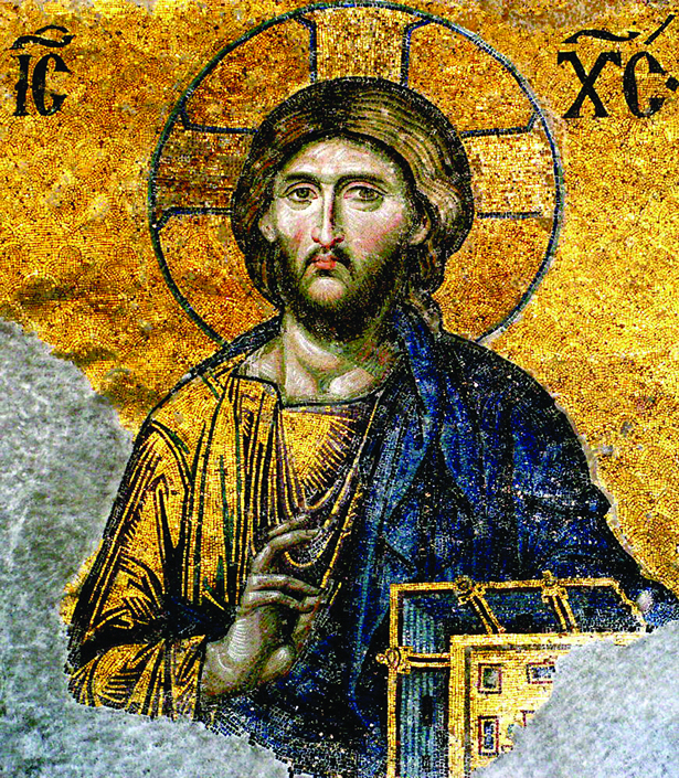
But oh Christ I think they did Nathan dirty with that art. The pose of the figure frustrates me. Like he's just floating there, and the hands are set up in this way where it mimics that he's supposed to be casting a spell with the ghostly scroll/quill combo in front of him, but the hands feel off so it just looks like he's doing the (and here's where I out myself as a non-scholar) "jesus hands"
Like there is a specific meaning that these hand gestures have and a specific name for them, it's not sign language but it does represent something, I just can't remember what, more educated people than I can fill you in if they wish. Sign of Benediction maybe? I'm no Catholic.
I hate the stupid ghostly stairs, why are those there if he can fly? Surely there isn't need for both those AND the stupid non-functional ass looking wings?
But my personal favorite is the strange mix of painterly detail in the bottom right with the sharp crisp detail of the main figure
Here's the high res artwork from Darren Tan's Artstation (
Link)
So when I added this to card conjurer and zoomed in a bit, I didn't zoom in enough to actually avoid the magic logo over there, and it ended up looking like there was just a box of revised just out of frame, just sitting in the corner.
At this point, the more I stare at it the more I find little things that annoy me, like the name "Duelist of the Mind" never really got to me until now. That is 11/10 edgy, how did I ever take this seriously? How had this name not already been used by some


1/1 from legends that can give another creature -2/-0 for

,


?
From there I started looking for new art, maybe that'll scratch this itch, and like
This is a fine if goofy art and doesn't really show flying (Also I mislabeled the art, this is The Wizard by Filipe Pagliuso)
This shows flying in that it's a bird that's just standing there I guess
I gave up after an hour or so and maybe I'll try again, but for now I might just cut both the copies I'm running for
Malcolm, Alluring Scoundrel and a second
Ledger Shredder 


