okay, here’s my process.
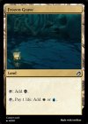
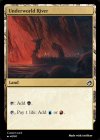
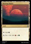
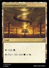
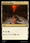
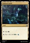
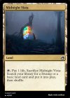
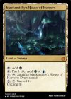
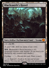
step 1: make the card in Artificer, save the image.
step 2: resize the image to 744x1038px at 300dpi, then place this image in the center of an 816x1110px black background.
(this gives the image the correct bleed/cut size for MPC’s process and you can see the difference right away if you try to upload non-resized/backed images to the site.)
step 3: start your MPC order. i use the custom game cards option, 63x88mm, no border (your image already has the correct border built in), S33 Superior Smooth, full color print, MPC game card finish. there are other options but these are the ones relevant to “making it feel like a Magic card.”
step 4: at this point you can fiddle a bit with the deck size/number of decks to optimize price, main thing is to know going in how many cards you need printed vs their print run quantities, as it’s a better deal per card to get as close to their max print run quantity as possible.
step 5: start your design. you’ll want different images for each front, no text on front or back, and (i assume) same image on each back. you have to upload each front image and then basically double click it once loaded to add to order. a bit tedious but it’s part of the fun and a good time to check over what you need and how it looks and such.
step 6: once your fronts are done you’ll upload a card back. DO NOT USE THE REAL CARD BACK or even a modified version that still has any of the trademarked text on it, as this will flag you for copyright violation and delay your order. i will paste what i used below for reference but you can go pretty wild with this as long as you don’t have the real trademarks on the back.
https://www.google.com/amp/s/amp.re...ts/itdu9g/custom_minimalist_mtg_back_for_mpc/
step 7: once you upload the card back it’s basically just a matter of completing the checkout, i got mine within a couple weeks but your mileage may vary based on location, i have heard they ship from Hong Kong and/or Germany.
Further reading:
https://www.reddit.com/r/mpcproxies..._source=amp&utm_medium=&utm_content=post_body
Hope this helps!


