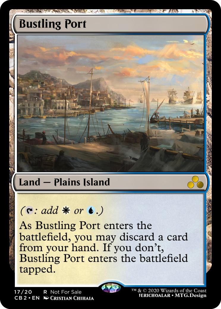
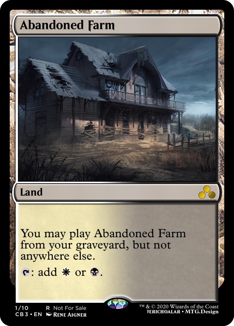
Absolutely free to riff on these designs, I think it's awesome to see what other people think too. I was originally trying for an intentionally slower-clunky format so being hard to play turn 1 was a feature for me. I also think it's important that custom cards be as straightforward and easy to scan as possible, even if that means less overall power. (although, with types these are close to oduals, with a higher ceiling - I don't have a problem with "better than odual" in cubes, but it is worth remembering that 'power level of lands is tricky': these bring their own recursion against LD, being dead in the opening hand is maybe a fair price to pay for a land your opponent can't get rid of. the Wx ones in particular are probably very powerful if
armageddon is in the environment.) also with enough early discard outlets, these are Card Advantage on a land, which is kind of a huge deal even if they can't be played without an enabler.
In a more typical cube (or a cube that isn't chock full of sweet mill and yard shenanigans) you'd probably want either only a very few of these in targeted colors (ala
flagstones of trokair), or to change them to use counters of some kind yeah.
I like Onderzee's design for untyped. for the typed version I think you'd have to do:
Lost Shrine
Forest Plains
"You can play ~ from your graveyard. If you don't, it enters the battlefield with a depletion counter on it. ~ loses all land types while it has a depletion counter"
T: add

.
(the 'if you don't' language makes these bad to fetch btw.) too bad "wastes" isn't a land subtype, the templating would be easier if we could just say "is a wastes"
spreading seas, then it wouldn't need the T: add

. If your target environment has eldrazi this should probably say "T: pay 1 life, add

")
I'm going to continue forward with the designs which are dead in hand. If anyone wants to do the others, the scaled images are available here:
https://imgur.com/a/8gzcAr1 (these are 627x459 which is the size mtg.design uses for rendering) feel free to reuse (or change!) the art and titles but please change the set symbol

Art/Title discussion: (feedback and further suggestions appreciated!)
B/R: The more I look at {Suspicious Tavern} the more I think creative fits with the Bustling Port cycle. (a suspicious tavern also seems like a place where you might have to 'pay' extra costs.) I love the creative, I just don't think it fits the rest of the cycle. I'm going to trial the "Bancur Slums" art for this part of the cycle tonight. (working title: "Rickety Slums" although if we can get something that isn't Ramshackle for the UR land, I like "Ramshackle Slums")
U/G || R/G: I think the art is just too 'mirage era' to work with modern magic sensibility (where even basic lands usually have fantastic elements) I'm not married to either title or depiction, so if people have other ideas for a U/G or R/G land that thematically ties into 'old, disrepair, forgotten, damaged, lost' I'd love to see other takes. (The Pirate Ship in the stream one onderzee linked is my front runner for U/G retake right now)
U/R : I agree that the ramshackle lighthouse looks non-fantasy and definitely could use new art/title, feel free to suggest stuff! We do have "lighthouses" in UR (
desolate lighthouse) and ixalan shows age of sail in era for magic, more or less, so it's not too far off, but the red brick looks like rusted metal in the smaller card art which is maybe too far. (I'll look more after work today too).
U/W : Sanctum is good, Sunken Sanctum might be too sibilant. "Drowned" usually feels blue-black to me. Flooded Sanctum? (is it still flooded if it's hundred of yards underwater?) Sunken Abbey is interesting but the art doesn't look much like an abbey to me, honestly it's kind of palatial but "Drowned Palace"... well, that actually does sound kind of UW I think? (still looking for more ideas/feedback here)
I think I'm pretty happy with the other 5 after a sleep on it.


 .
.
