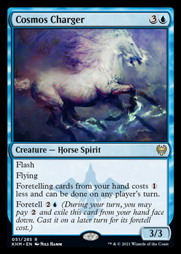
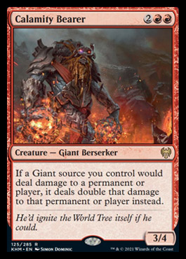
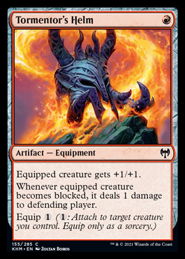
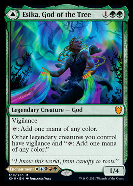
Oh, sure! My apologies for the huge images, but the art is so beautiful in high-res.
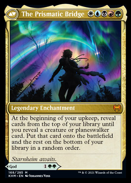
Here, we have the showcase frames for Zendikar Rising, Kaldheim, Eldraine, and Theros Round 2: Elspeth's Revenge. The ZNR frame has a couple neat things going for it, namely changing up the shape of the frame into a diamond and the details on the bottom leaves of the hedron (I like to imagine that these are all pictures taken by hedron-cameras or some sort of listening post set up by Nahiri, Ugin, and Sorin way back when). However, the inscriptions behind the text box are obscured by, well, the text box, and it doesn't do all that much for me, artistically. If you didn't know that Hedrons Are A Big Deal On Zendikar, you'd just think it looks weird. Plus, having one corner of the image visible but not the other three bugs me. Also, this frame is kind of chunky and Art Deco, which really works for some cards and really doesn't for others depending on how angular/wispy the actual art is. Plus, the art style between showcase frames is INCREDIBLY inconsistent.
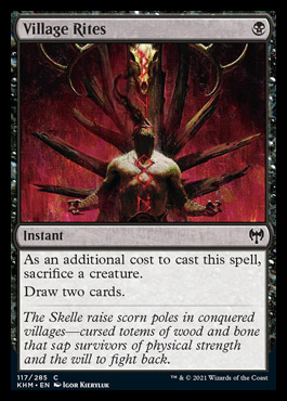
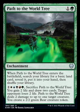
Contrast this to the Kaldheim frame. We have some lovely scrollwork and wooden textures as well as some tasteful but not intrusive scrollwork on the text box. The frame's shape is changed, but it's done so in a way that enhances the viewer's focus on the art rather than drawing attention away from it. Plus, the art and the frame match each other! The same can be said of the Eldraine frames. Look at how the art is very pastel-colored, and how the natural motifs are picked up in the frame. Almost universally, Eldraine's showcase cards feature swirls and turns, tying the art into the frame (see here the ranger's hair, the spear, the brambles, the pose of the fox, and the vines entwining the slender frame, as well as the curvature of the book that makes up the text box). The line work is very thin and delicate or otherwise completely omitted, allowing colors to blend into each other, and the art spills out of the border, making me feel as if I'm inside the story. For me, Eldraine has the best frame by far, but Kadheim is a close second (note how Kaldheim's showcase cards so far tend towards the monochrome, bringing to mind inlaid woodwork).
Theros: Beyond Death took a more abstract approach to showcase frames but used them a lot more sparingly. While they're a lot less inventive in terms of frame--they literally just created a new background--it's such a good match for the art that you don't even notice that it's not an extended art card (see how Heliod's spear stops abruptly at the frame?). The gods of Theros are quite literally part of the sky, and this is a dramatic departure from Magic's usual style while still feeling appropriate. It's not as adventurous in its treatment of borders, but they're such a cohesive idea I can't help but like them, at least more than Zendikar's. While ZNR's showcase frames are a cool idea and I want to see them continue to push borders in a similar way, I just don't think there was enough play within the realm of "MTG ART STYLE" to get the actual card art to align with the frame. Personally, with this sort of frame, I'd expect to see chunkier, blockier art, much like Mayan carvings or even Egyptian hieroglyphics.
My power rankings for showcase frames so far:
Eldraine >= Kaldheim = Ikoria >> Theros Beyond Death > Zendikar Rising
(>>>>>>>> Core Set Showcase Cards (I don't consider those to be true showcase cards, as they're more like borderless cards))
edit: oh heck, I forgot Ikoria. Gimme a moment. It's here now.
Ikoria doesn't do anything with the actual frames, but the art is INCREDIBLE. Bold, dynamic, and frankly top-tier art. Their contrast is incredible. They only lose points for not doing anything with the frame and for most of the art being the same--that of a beastie roaring at the three-quarters angle. Sure, that's a comic book trope, but I do like variety. Godzilla cards look great too but I'd never play with them because they don't work for my preferred Magic aesthetic. I'd collect them for sure, though.
Just look at them. They're great, but it's preeeeetty much the same.


