You are using an out of date browser. It may not display this or other websites correctly.
You should upgrade or use an alternative browser.
You should upgrade or use an alternative browser.
Card/Deck Low Power Card Spotlight
- Thread starter Grillo_Parlante
- Start date
Chris Taylor
Contributor
Man how dare you say that with the Amonket Invocation frame right thereSo much, don't get me started. Few things get me as emotional as the worst possible card frame in existence. Aesthetically.
It massively lacks color, the thin border doesn't frame the card well, it feels weirdly topheavy thanks to the bland black bottom, it combines like a dozen different round shapes, it doesn't evokes no fantasy feeling at all, you can see on every part that the frame wasn't created, but a (d)evolution of existing things.
They can create beautiful frames, as showcase versions like Eldraine have shown us, but instead they decided to turn their 2003 frame, which wasn't great bit good, into this aberration.
It speaks volumes about my love for the game that I am still playing despite having my eyes hurt whenever I look too closely at new cards.
Gross (thought I agreed with you in principal)Vibe>All. 1st printings or bust.
I do like the more modern frames, but I can see where y'all are coming from
Look at this beauty:
Function over raw aesthetic. Virtually every box, both art and text, is bigger by a bit, and the artist/technical information is much more readable.
But there could be a mix of both if they would design from scratch for it, see eldraine showcase for example. And would you honestly play frames that are just black text on white background with a small line of color between, no texture, nothing else?
Onderzeeboot
Ecstatic Orb
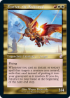
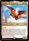
The left one makes me puke, the right one makes my heart soar. The old gold frame is subjectively a mess. It's ugly and hard to read. I love the crown they added to legendary creatures, I love the legibility of cards in the modern frame, and I love how clear they generally are. The art is still kick-ass, and you can actually tell that there is more room for art in the new frame. To each their own, but I'll remain on Team M15 Frame!
The only exception I'll make is for artifacts. I miss the brown frame.
to be faaaaaaair, the glowup from old frame gold legend to new frame gold legend is by far the most dramatic. i’m pretty easy to please otherwise, but i do NOT like old gold frames.
Chris Taylor
Contributor
though TBH they picked a bad gold frame for TSR
Like this is fine

They just went with the fukin Chronicals color pallete for TSR for some reason
Actually wait am I halluicinating?

this is very quickly turning into some blue/black/white/gold dress insanity in my brain
Like this is fine

They just went with the fukin Chronicals color pallete for TSR for some reason
Actually wait am I halluicinating?

this is very quickly turning into some blue/black/white/gold dress insanity in my brain
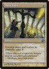
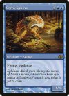
The gold frame is the biggest reason why the new frames are an upgrade. I still strongly prefer the old-border for everything else, but if it's the new frame, I wish everything could be the incredible Colorshifted frame that they've only used once (!) that still evokes a fantasy feel with its textures while having the clean and clear design from the 2004 frame:
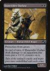
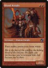
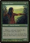


Adventure showcases are not a good example IMO, because as functional as adventures are, the graphic layout of the cards is very... busy... to say the least. The showcases just make it even busier.But there could be a mix of both if they would design from scratch for it, see eldraine showcase for example. And would you honestly play frames that are just black text on white background with a small line of color between, no texture, nothing else?
This topic is obviously subjective by it's very nature. I like clean and functional most of the time, unless it has a good composition, like mystical archive shock. I like the 2004 frames, and I think the new ones improve on that by cutting a little bit of excessive border and by improving readability. I'm not saying this border is only functionality. It *is* a blend, and I think it's a better blend than the 2004 one.
In my post I was just pointing out the goal I presume they were trying to accomplish with the change.
I'm not a big fan of the alternate frames in general, because I really want consistency in my decks/cube. The only exception for me are lands and tokens, because I think being able to immediately see that a given card is a basic land or a token is important. I use these basics in Cockatrice, by the way, because they look sweet as fuck.
One thing that really frustrates me about Cockatrice is that there's no control over which art you get for each card (short of using your own custom art). Which in some cases means that the card is in the wrong language.
One thing that really frustrates me about Cockatrice is that there's no control over which art you get for each card (short of using your own custom art). Which in some cases means that the card is in the wrong language.
View attachment 4492 View attachment 4493
The left one makes me puke, the right one makes my heart soar. The old gold frame is subjectively a mess. It's ugly and hard to read. I love the crown they added to legendary creatures, I love the legibility of cards in the modern frame, and I love how clear they generally are. The art is still kick-ass, and you can actually tell that there is more room for art in the new frame. To each their own, but I'll remain on Team M15 Frame!
The only exception I'll make is for artifacts. I miss the brown frame.
I dislike both of these tbh, the old one has just an awful texture and is hard to read, the new one has all the shape and propotion problems I've mentioned before. The best gold frames were the 2003 ones, especially from og ravnica, were they were a little brighter on the name/type bars.
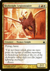
I also like the 2003 frame in white more than the original. I think the marble texture fits white better than the ... scales? And white needed black text to actually allow the cards to be white all the time.
Where all Riptide discussions end...og ravnica
Come on, ravnic, stop pretending that your cube is an actual Magic set. You even named it after yourself!ravnica
Onderzeeboot
Ecstatic Orb
So... if ravnica is ravnic's main cube, is his secondary cube called ravnicb?Come on, ravnic, stop pretending that your cube is an actual Magic set. You even named it after yourself!
We just use the set code RTR.So... if ravnica is ravnic's main cube, is his secondary cube called ravnicb?
No, he just puts that on the outside of his Magic boxes in case he loses them, silly!We just use the set code RTR.
Chris Taylor
Contributor
Card Database --> Manage Set does let you disable in swaths (Amonket Promos, 5th Edition, etc)I'm not a big fan of the alternate frames in general, because I really want consistency in my decks/cube. The only exception for me are lands and tokens, because I think being able to immediately see that a given card is a basic land or a token is important. I use these basics in Cockatrice, by the way, because they look sweet as fuck.
One thing that really frustrates me about Cockatrice is that there's no control over which art you get for each card (short of using your own custom art). Which in some cases means that the card is in the wrong language.
How are you getting the wrong language? Mystic Archive Japanese cards?
For anyone wondering, 1Card Database --> Custom Image folder: anything in here will override the image used for a given card, no matter what's enabled.
A great place to put BASIC LANDS, Fetches/Shocks, Delightful Julie Dillon Ponders, etc
I sometimes get random cards that are in Italian or Portuguese. Like, I get the Portuguese version of Wildheart Invoker, and I have for a while.
I'm not sure which set I should be disabling in that case.
I'm not sure which set I should be disabling in that case.
Chris Taylor
Contributor
That is odd for sure
If you go file -> settings -> language settings, is it english or something else?
Most of the discussion I've found has been about people trying to get forein cards to show up and not being able to, rather than the oppisite
If you go file -> settings -> language settings, is it english or something else?
Most of the discussion I've found has been about people trying to get forein cards to show up and not being able to, rather than the oppisite
Yeah, I have it set to English.That is odd for sure
If you go file -> settings -> language settings, is it english or something else?
Most of the discussion I've found has been about people trying to get forein cards to show up and not being able to, rather than the oppisite
