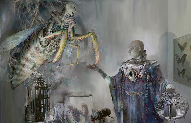
Wow thats a tough one. I like the visual appeal of the second one, because the additional art helps you get more excited about playing the card, but the first one illustrates the actual mechanics of the card better i.m.o. I think I would go with the second one, but if I had newer players I might be tempted to go with the first.
The original one Jonas posted I like the most though.
Is there a way to maybe incorporate the below image that would be better? To express both arts of the card, without having to spend two frames?

Part of this is that I just love that art.
I like this idea. I could do it on gimp, but don't really have time for a couple days.

