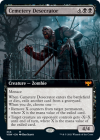
This leg of the cycle is a noxious gearhulk variant that can potentially boop a planeswalker or some other corner case involving counters. Fairly meh, but alright.

Now that is a spicy heroic creature for formats with that in mindView attachment 5577
This might be one of my favorite cards so far! Really elegant, and seems very fun to play.
That's exactly what rubs me completely the wrong way about this card.I like choice cards
View attachment 5560View attachment 5561
Not exactly Demonic Pact
Not exactly Rankle, Master of Pranks
Not exactly Captive Audience
Not exactly Garth One-Eye
But something else. On the backside it is an overpowered Vampire Nighthawk
Really love this one! Gets me thinking..View attachment 5565
6 is pretty dang deep to dig, and this can dig for anything noncreature (nonland), so helps artifact decks, can dig out a PW, etc. And on top of it all its a flier. I like it!
Honestly, I feel the same. A lot of cards from recent sets I've just completely glossed over because it's just paragraph after paragraph, sometimes even on both sides of the card.gonna walk back my previous statement about texty cards, i think i’m biased because i tend to just ignore cards that i can’t be arsed to read regardless of how good they are
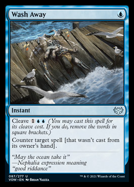
One like.
"Oh, everyone loves Vampire Nighthawk" (A 20-year old design by now..)
It would have to be very different to be green. I'm just appreciating the continued support for white discard. this can replace or be run alongside seasoned hallowblade. I'm tipping towards replace.
Can we make this the most liked spoiler post of the year? That would be funny, and this card is cool enough to deserve itView attachment 5577
This might be one of my favorite cards so far! Really elegant, and seems very fun to play.
I'm also happy about the white discard support! It really helps tie the color into graveyard shenanigans that it used to not be good at despite having some decent payoffs.It would have to be very different to be green. I'm just appreciating the continued support for white discard. this can replace or be run alongside seasoned hallowblade. I'm tipping towards replace.
How did I miss this was a mana dork lol.View attachment 5570
I think I'm in love. The utility, the end game punch, the self-mill synergy, the fixing. wow.
No end of year tally manipulation! @Kirblinx, any opinions?Can we make this the most liked spoiler post of the year? That would be funny, and this card is cool enough to deserve it
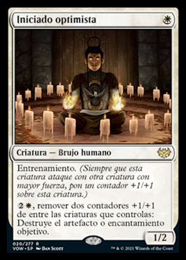
This is a good one drop, even without the Disenchant ability. I like how it gets bigger when attacking with your 2/1s, 3/3s, and so on. It seems really good with Porcelain Legionnare. I think I want to try this for sure.Optimistic Initiate said:Optimistic Initiate
W
Creature - Human Warlock
Training (Whenever this creature attacks with another creature with greater power, put a +1/+1 counter on this creature.)
2W, Remove two +1/+1 counters from among creatures you control: Destroy target artifact or enchantment.
1/2
I don't run any +1 with tempo ETBs unless they have a drawback or are higher up in the curve to deserve it.this card seems very relevant in BO3 standard for the next couple years
EDIT: also probably does work in the Black Cube @Brad
Like this one. Finally some mild graveyard hate that doesn't have a bunch of OP effects tacked on. Just an under statted dude who will affect the board and the yard.View attachment 5576
This leg of the cycle is a noxious gearhulk variant that can potentially boop a planeswalker or some other corner case involving counters. Fairly meh, but alright.
I don't read DFCs. You guys were excited about one a few pages back and I was totally lost.gonna walk back my previous statement about texty cards, i think i’m biased because i tend to just ignore cards that i can’t be arsed to read regardless of how good they are
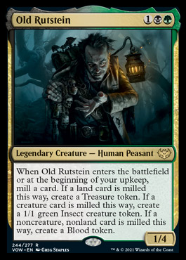
The solid block of text (without reminder text as mentioned) over 55 words long causes me to really wrinkle my nose. I really think they could use a variant of their choose one templating to make this sort of effect much easier to read.
I like this design and the fact that it always provides a little bit of value. It is unfortunate that it doesn't have reminder text for any of the tokens.
