I think wizards should redesign their regular frame. Italics so weird and ugly now because they tried to adapt the former one instead of creating something new. They could easily come up with a frame that's just as functional as the current one but also looks and feels more like fantasy and magic. They've proven this with the storybook versions.
You are using an out of date browser. It may not display this or other websites correctly.
You should upgrade or use an alternative browser.
You should upgrade or use an alternative browser.
Sets [ELD] Throne of Eldraine
- Thread starter Onderzeeboot
- Start date
Onderzeeboot
Ecstatic Orb
I'll go on record and say I have no problems with the current frame, and I don't like the alternate adventure frame (though the art on the alternate frames is unfortunately gorgeous).
Magic's frames are very old-fashioned in that there are several borders. There's the black (or white, or silver) border around the edge and then another border around the picture and the text box. Compare with the cards in a typical FFG game, which use no outer frames, minor inner frames and leaves more space to the art. Note how different types of cards have different frames:


FFG's promos do away with even more of the frame. Here's an example from Netunner:
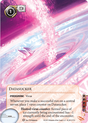
The printing process plays a part. Older games had large borders because printing was imprecise. There are more off-centered cards in say, Antiquities, than there are in Zendikar. According to Rosewater they could aim for a higher quality but not all of their current printers would be able to match it. This also explains why Keyforge cards have borders, they use a different printing than FFG's other games.
Compare these designs with VTES, which uses massive frames:

The outer border is the same as Magic and, in general, VTES cards look very much like old Magic cards do worse. The space between the drawing and the text box is wasted and putting cost on the left alongside required discipline and card type wastes far more space than putting them on top would. Too much space is dedicated to the expansion symbol (top right).
This is the same card as above, but with a fan-made border:

It doesn't make any great changes but it's significantly better.


FFG's promos do away with even more of the frame. Here's an example from Netunner:

The printing process plays a part. Older games had large borders because printing was imprecise. There are more off-centered cards in say, Antiquities, than there are in Zendikar. According to Rosewater they could aim for a higher quality but not all of their current printers would be able to match it. This also explains why Keyforge cards have borders, they use a different printing than FFG's other games.
Compare these designs with VTES, which uses massive frames:

The outer border is the same as Magic and, in general, VTES cards look very much like old Magic cards do worse. The space between the drawing and the text box is wasted and putting cost on the left alongside required discipline and card type wastes far more space than putting them on top would. Too much space is dedicated to the expansion symbol (top right).
This is the same card as above, but with a fan-made border:

It doesn't make any great changes but it's significantly better.
And for the third time in a row, the tokens are beautiful!
https://magic.wizards.com/en/articles/archive/card-preview/tokens-throne-eldraine-2019-09-19
https://magic.wizards.com/en/articles/archive/card-preview/tokens-throne-eldraine-2019-09-19
Onderzeeboot
Ecstatic Orb
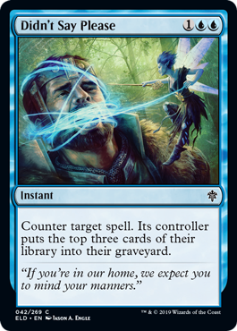
Best name for a counterspell ever
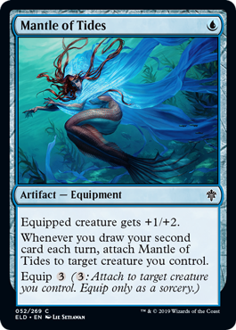
This is kinda cute, might be just impactful enough to see play?
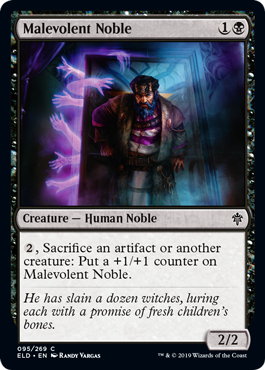
Sacrifice an artifact you say? Hmm... Probably still too low power.
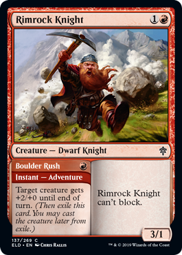
This is pretty cool as a combat trick that turns into an acceptable body for an aggro deck. Cute with Feather, the Redeemed.
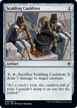
This is a good rate for colorless removal that plays nice with graveyard recursion!
Chris Taylor
Contributor
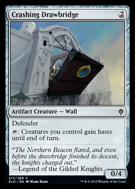
Also interesting in the last few
Tell me more about this? It sounds fun.
Here you go
https://riptidelab.com/forum/threads/the-coliseum.2054/
It is very rough. Tons of rules to explain and this is my first thread created in the Cube Blogs. There aren't any pictures yet. I will update as we go along. Now the first sentences has been written
In very, very short:
3 player format, 1v1 games.
The winner keeps playing. The loser gets better and better cards.
The winner levels up but also gets some temporary and permanent downsides.
It is a loooooot of fun with tons of variaty between each game and each tournament.
The format can be done with 100 % normal Magic cards but the level system needs to be custom home made. Same goes for Wounds and Events.
Tournaments take about 4 hours.
Happy reading
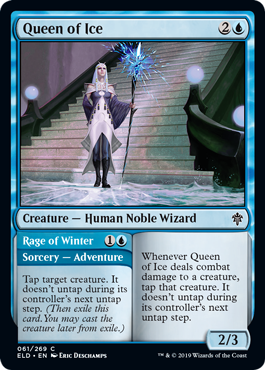
I'm kinda into Elsa here. That's a nice tempo piece in the last dump.

I'm kinda into Elsa here. That's a nice tempo piece in the last dump.
I'm kinda pissed Elsa got a card but the Killer Rabbit got snubbed. You're seriously telling me that Frozen fits the theme of Eldraine better than Monty Python and the Holy Grail??
Onderzeeboot
Ecstatic Orb
It's even a black knightWe got a Monty Python reference. It’s the knight who has to attack every turn and comes with four +1/+1 counter “limbs” that are removed one at a time each combat.
We got a Monty Python reference. It’s the knight who has to attack every turn and comes with four +1/+1 counter “limbs” that are removed one at a time each combat.
Yeah but the Black Knight is a fairly common Arthurian Legends trope. Maybe the card is trying to parody Monty Python to some degree, but it's not immediately evident.
The witches from Macbeth and Smash Mouth both got cards in this set. Why couldn't my Killer Bunny Boi have gotten a card as well?
Onderzeeboot
Ecstatic Orb
Monty Python made a whole movie (Monthy Python and the Search For the Holy Grail) set in a parody Arthurian setting. Therein lies the problem though, as Eldraine definitely isn't a parody Arthurian setting.
I'm sure Wizards, being the company who makes D&D, has banned any and all Monty Python references in their own work under penalty of death.
Wasn’t Monty Python a joke? Like a show that was suppose to make you laugh?
And it didn’t feel very much like a fairy tale, did it?
That would be my bet. It wasn’t even on the table because it doesn’t qualify.
Usually I would agree with the general point of your statement, except for the fact that there are at least 3 references to Shrek in this set. One of the cards is a Smash Mouth reference as well!
It just kind of sucks when your favorite trope from a "top-down x" world gets snubbed. To me, this feels like Hercules not being on Theros. Of course the key word there being "me." I understand and recognize that the Killer Rabbit probably isn't even in the top 20 things most people think about involving "Arthurian Legend" or "Fairy Tales." It just really, really sucks that one of the coolest possible creatures for this world didn't make it in to the final product.
Onderzeeboot
Ecstatic Orb
He's talking about the killer rabbit. Or possibly swallows, though whether of the African or the European variety, I don't know.
...
AAAAAAAAAAAAAAAAAAAAAH!
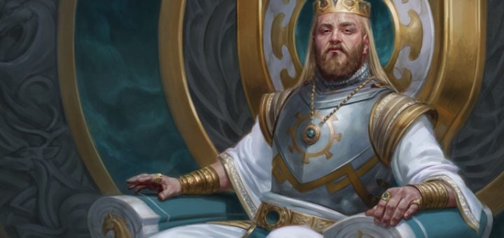
PS. Besides Oathsworn Knight being inspired by Monty Python, apparently King Kenrith's attire is inspired by that worn by King Arthur in Monty Python and the Holy Grail
...
AAAAAAAAAAAAAAAAAAAAAH!
PS. Besides Oathsworn Knight being inspired by Monty Python, apparently King Kenrith's attire is inspired by that worn by King Arthur in Monty Python and the Holy Grail
Usually I would agree with the general point of your statement, except for the fact that there are at least 3 references to Shrek in this set. One of the cards is a Smash Mouth reference as well!
Which ones?
Which ones?
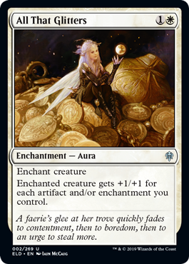
A reference to the song "All Star" at the beginning of the film. It features the verse: "And all that glitters is gold. Only shooting stars break the mold."
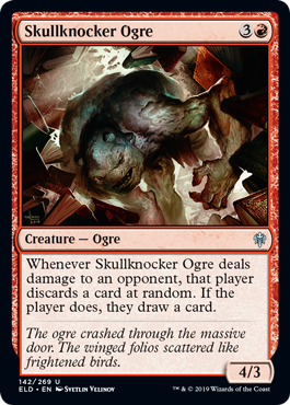
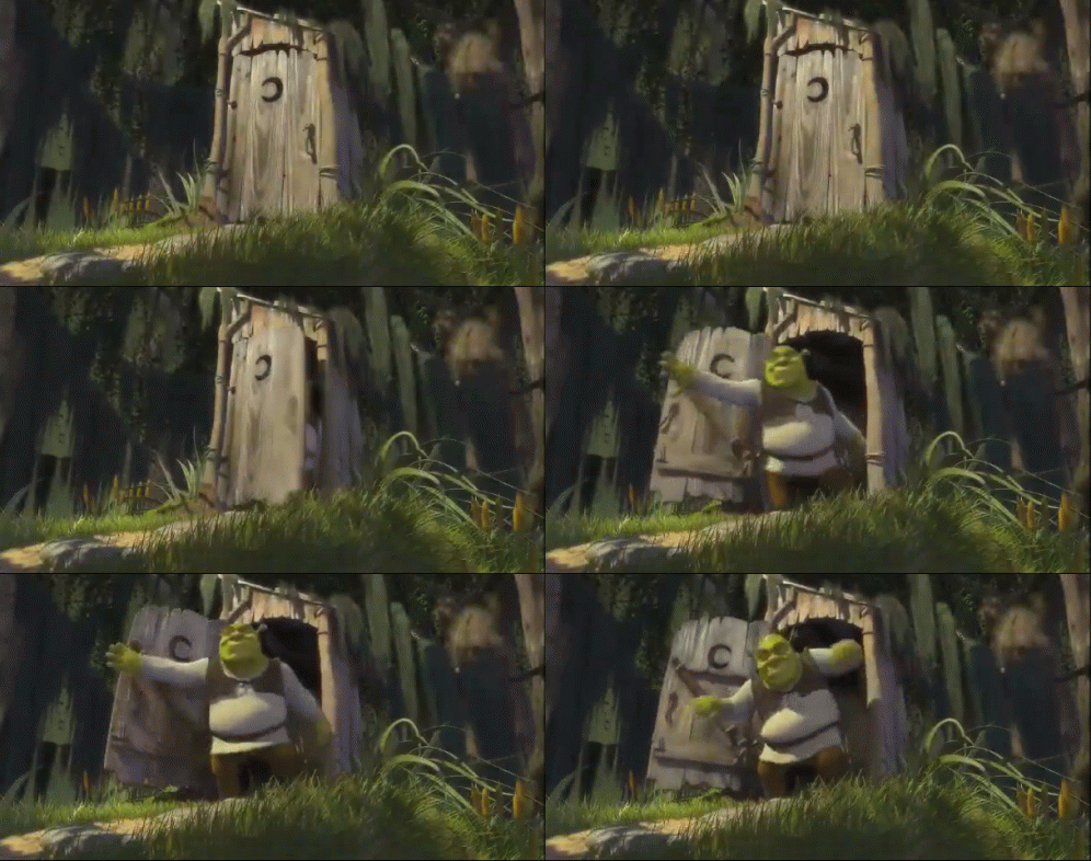
A reference to the scene at the beginning of the first Shrek movie where Shrek bursts through a door. This specific Ogre even has little ear stubs, not unlike Shrek!
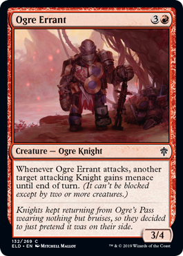
A reference to the scene where Shrek dresses up like a Knight when he's going to fight a Dragon.
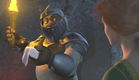
He's talking about the killer rabbit. Or possibly swallows, though whether of the African or the European variety, I don't know.
...
AAAAAAAAAAAAAAAAAAAAAH!
PS. Besides Oathsworn Knight being inspired by Monty Python, apparently King Kenrith's attire is inspired by that worn by King Arthur in Monty Python and the Holy Grail
Haha I see what you did there...
If King Kenrith's attire is based on King Arthur's, that would make me feel a fair bit better


A reference to the song "All Star" at the beginning of the film. It features the verse: "And all that glitters is gold. Only shooting stars break the mold."

A reference to the scene at the beginning of the first Shrek movie where Shrek bursts through a door. This specific Ogre even has little ear stubs, not unlike Shrek!


A reference to the scene where Shrek dresses up like a Knight when he's going to fight a Dragon.

Are you sure those are Shrek references? I don’t really see it. Is there any confirmation?
Also: I would 100 % put Shrek into my fairy tale world before I put Monty Python into my fairy tale world because Shrek is actually a magical story like a real fairy tale and is not a prank.
Are you sure those are Shrek references? I don’t really see it. Is there any confirmation?
Also: I would 100 % put Shrek into my fairy tale world before I put Monty Python into my fairy tale world because Shrek is actually a magical story like a real fairy tale and is not a prank.
They're pretty obvious references to Shrek... "Ogre Knights" and Smash Mouth are not common fairy tale tropes. If you go onto the MTGS Eldraine trivia page, they even have All That Glitters listed as a Smash Mouth reference. They also made a Shrek Reference in the twitter reveal for the Skullknocker... You know, layers.
Ultimately, Shrek was just Jeffrey Katzenberg giving a giant middle finger to Michael Eisner disguised as an animated film. It just so happened that the film is decently good. It really isn't meant to be taken seriously. Shrek is a joke in the same vein as Monty Python. It's a different type of joke, but still a joke. Shrek, just like an Onion, has layers.
Onderzeeboot
Ecstatic Orb
Shrek uses a more classical fairy tale as a medium though, while Monty Python and the Search for the Holy Grail is wholly irreverent, no layers needed.
