...you've uncovered the real mission statement behind Riptide Lab, the actual reason Jason started this website. I'm sorry but we now need to revoke your access.If I recall correctly there are two other art threads and at least one previous thread that derailed into art discussion
You are using an out of date browser. It may not display this or other websites correctly.
You should upgrade or use an alternative browser.
You should upgrade or use an alternative browser.
General Fight Club
- Thread starter Jason Waddell
- Start date
...you've uncovered the real mission statement behind Riptide Lab, the actual reason Jason started this website. I'm sorry but we now need to revoke your access.
Ah good I can get on with my life finally.
lol I had the exact same reaction. I really like about half of the pictures Grillo posted there.Heard you talking shit about brushwagg >:C Brushwagg's the best.
Old art is far, far better than new in my book. Some if it is bad, but on the whole you could expect a huge variety of styles, which I really miss. The world evoked more of a sense of wonder back then. It felt like there was this open world of mysterious places and entities, but today there is very little to provoke the imagination. Every card is like THIS IS A BOROS SOLDIER LOOK AT THIS BOROS SOLDIER.
To create an analogy: old magic art is to odd side adventures in The Hobbit as new magic art is to CGI movie battles.
Laz
Developer
The world evoked more of a sense of wonder back then. It felt like there was this open world of mysterious places and entities, but today there is very little to provoke the imagination. Every card is like THIS IS A BOROS SOLDIER LOOK AT THIS BOROS SOLDIER.
Edit: Flavour text has really waxed and waned in quality throughout the ages also.
CML
Contributor
anyone else wanna take a stab at finding the nazi imagery in knight of the mists? https://www.facebook.com/harold.mcneill
edit: anyone asking about flavor text, i know why it is bad these days:
-it can be
-commercialism
-the people who write it are retarded
edit: anyone asking about flavor text, i know why it is bad these days:
-it can be
-commercialism
-the people who write it are retarded
Laz
Developer
anyone else wanna take a stab at finding the nazi imagery in knight of the mists?
Looking at his website, he is also a big fan of butts. Also, bizarrely, Cthulhu...

Chris Taylor
Contributor
Y'all best not be hatin on Phil Foglio...
Grillo_Parlante
Contributor
Y'all best not be hatin on Phil Foglio...
Hey, Rebecca Guay is my favorite mtg artist, but even I cannot ignore the laziness that is aven mindcensor. Recycle is one of Foglio's worst pieces.
I kind of suspect that back in the day they had very little art direction (and/or quality control), which gets you interesting art on cards like stasis but a lot of randomness as well. The old presence of the master is a good example.
I opted to spare you the true horrifying face of old magic art. No more. Behold!
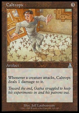
Because nothing expresses the idea of a medieval weapon designed to cripple horses better than a guy with a bowel cut, tip-toeing across a floor covered with origami triangles, while in his underwear.
I love the look of horror on his face too. As if he can't just pick them up with his hands and move them.
Onderzeeboot
Ecstatic Orb
Hahaha, I'll never look at that card in the same way again 
Onderzeeboot
Ecstatic Orb
There's probably one in the lab in the background. I mean, it's a lab. Stuff breaks, and you gotta use a broom to clean that up, right?All that guy needed was a broom.
Not in this lab. If some glass breaks, you gotta tiptoe around it.There's probably one in the lab in the background. I mean, it's a lab. Stuff breaks, and you gotta use a broom to clean that up, right?
Not in this lab. If some glass breaks, you gotta tiptoe around it.
And if your name is Bob, you will die before you get to the other side of the room. So you may want to check another closet for a broom or go to Home Depot or something. Just saying.
Grillo_Parlante
Contributor
All that guy needed was a broom.
He dosen't need a broom, just look at his hands.
They're huge omg :eek:
I don't know what is going on in that laboratory, but it appears to be a threat to anatomically correct limbs everywhere.
Speaking of anatomical correctness, lets revist an old friend.
I realize that having a tron-esque light cycle race occuring in your kitchen must be a distraction, but oh god Gerrard, how are you holding that spoon?! I also love the Foglio's classy art direction of garishly scrawling their name across the art piece. In this case, on the side of squee's soup pot.
Onderzeeboot
Ecstatic Orb
Wait. That's Gerrard and Squee? I... Eh... What.I realize that having a tron-esque light cycle race occuring in your kitchen must be a distraction, but oh god Gerrard, how are you holding that spoon?! I also love the Foglio's classy art direction of garishly scrawling their name across the art piece. In this case, on the side of squee's soup pot.
CML
Contributor
you guys are haters. i love the recycle and caltrops art. i hate art like this:

makes the game look dumber

oh look more spikes from raymond swanlad

five-year-old's watercolor

magic art's "ugly period"
in general stuff like Legends presence of the master is stupid and stasis is awful and Drew Tucker was just a disaster but old art and new art both fill me with joy. current flavor text pisses me off, though maybe this is just me growing out of fantasy writing and considering myself above it, i mean, i guess i am? todd anderson reads and enjoys patrick rothfuss, for example, and i'm not going to pretend this doesn't make him below me in a characteristic i consider important.
makes the game look dumber
oh look more spikes from raymond swanlad
five-year-old's watercolor
magic art's "ugly period"
in general stuff like Legends presence of the master is stupid and stasis is awful and Drew Tucker was just a disaster but old art and new art both fill me with joy. current flavor text pisses me off, though maybe this is just me growing out of fantasy writing and considering myself above it, i mean, i guess i am? todd anderson reads and enjoys patrick rothfuss, for example, and i'm not going to pretend this doesn't make him below me in a characteristic i consider important.
Onderzeeboot
Ecstatic Orb
I think Brian Jacques wrote some brilliant fantasy 
Also: http://riptidelab.com/forum/threads/ugliest-magic-card.599/
Man, there's some excellent topics on this forum
Also: http://riptidelab.com/forum/threads/ugliest-magic-card.599/
Man, there's some excellent topics on this forum
Chris Taylor
Contributor
CML Wild Slash isn't even spiky
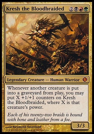

CML
Contributor
I think Brian Jacques wrote some brilliant fantasy
Also: http://riptidelab.com/forum/threads/ugliest-magic-card.599/
Man, there's some excellent topics on this forum
i STILL have pet rodents.
Okay, the ferrets and the thoughtlash are really neat cards. Mechanics-wise. My cube(s) might just have weak enough cards for those to see play.I am going to crash the art nostalgia party. Old magic art was strange and weird, and for every Serra Angel or Sengir Vampire, you had dozens of stinkers like these:
Artwise, I'm mostly kookoo for Rebecca Guay. Idk how to link specific printings in here, but her versions of Traveler's Cloak and Bitterblossom are fannnnnnnnnnnnnnnnnnnnnnnntastic. Other things I love:
Oh also the acid trip owl. It's like a rare. Blue I think. I have a bad memory for rares, since we don't use 'em round here.
Grillo_Parlante
Contributor
This isn't necessary my favorite piece by Rebecca Guay, but I think its part of why she is my favorite artist:
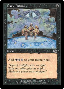
Just beautiful in a creepy sort of way. Really jumps out compared to the other versions of the card.
Bitterblossom is my favorite art as well.
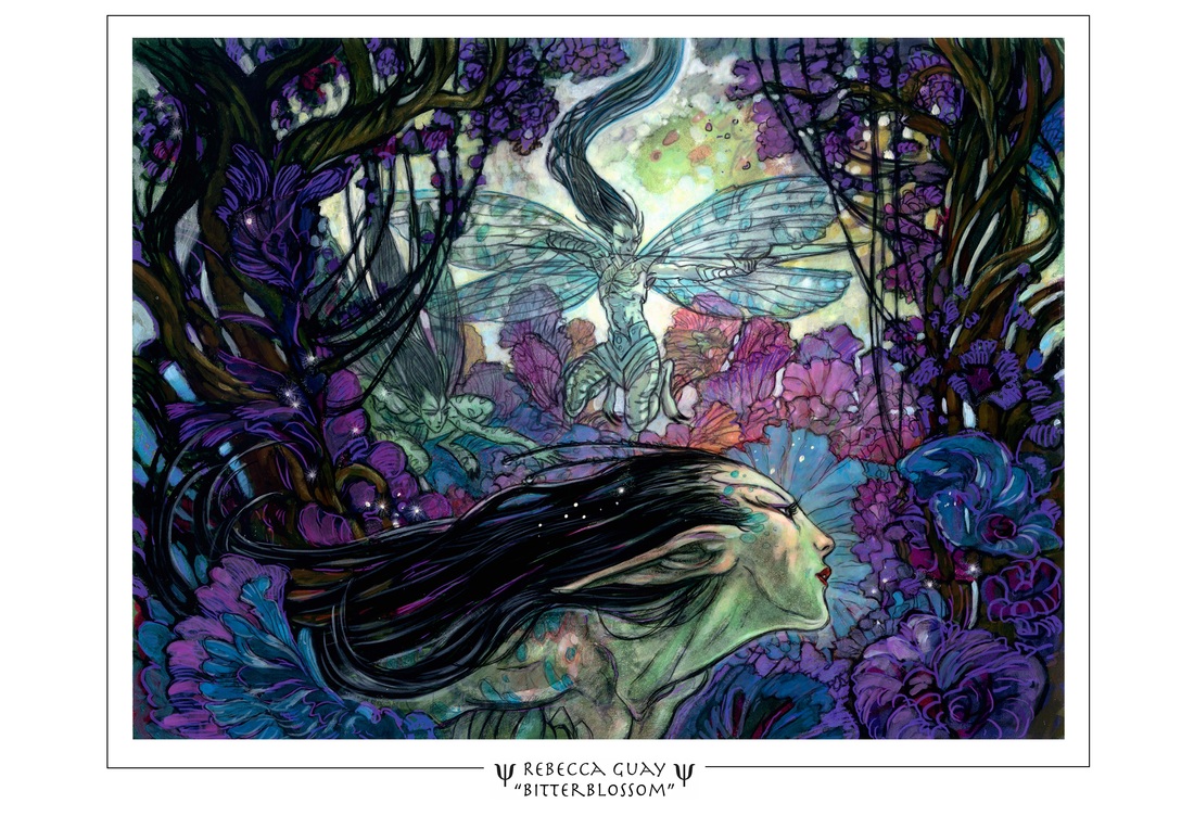
Just beautiful in a creepy sort of way. Really jumps out compared to the other versions of the card.
Bitterblossom is my favorite art as well.

Based on her website, it seems like Guay still likes to do art as a living, so the lack of her work on recent sets would suggest that she doesn't fit with the new, improved, "Every card is a monster or a guy with a sword, surrounded by fog, smoke and magic air dust" meta for card art.grateful for what we have today.
