You are using an out of date browser. It may not display this or other websites correctly.
You should upgrade or use an alternative browser.
You should upgrade or use an alternative browser.
General CBS
- Thread starter James Stevenson
- Start date
I built a Upheaval Cackling Counterpart Birthing Pod deck the other night and it was pretty neat. I closed one game out with Upheaval -> Primeval Titan and I closed another by making two copies of Primeval Titan with Cackling Counterpart. The one Birthing Pod added a little bit of value, letting me fetch my Shriekmaw when I needed, or Sower of Temptation. It was a bit of brew, I think I whiffed on Augur of Bolas 3/4 times I played it.
There was one game where I was falling a bit behind, facing down two planeswalkers and a bunch of creatures. I had a signet and was gunna hit 8 or nine mana next turn and cast Upheaval. Then I got Duressed and I was so disappointed I scooped out of exasperation. Anyway it was a three player grid draft and all our decks kinda sucked.
EDIT: Oh by the way, I played in a 9-man peasant (cards, not players) draft yesterday (3 teams of 3). I had a sweet mono-white token/weenie deck splashing for the flashback on Lingering Souls and Rally the Peasants. I just wanted to mention Swell of Courage because it looks perfect for the Fencing Ace/tokens archetype me and Chris have been championing.
Today I pumped my Epochrasite with Nameless Inversion and killed my opponent from 7.
Dom Harvey
Contributor
Stories like that are why I love Nameless Inversion, even without Haakon.
Yeah, I really wanted Haakon but it was in his pool. My pool had the Gifts Ungiven and a Gravecrawler so I really wanted that Haakon! (and nameless inversion of course)
So, er, new card frame?
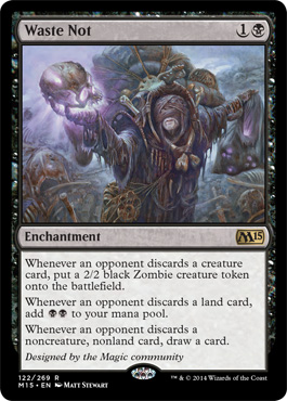
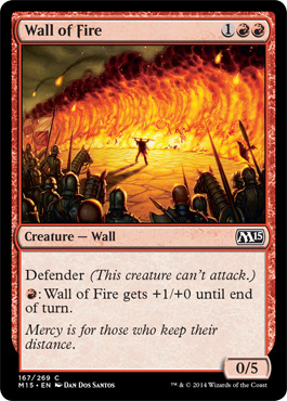


Oh right, commentary; I have no strong emotions about this change, really. I don't particularly like the black border becoming the frame for the bottom of the text box, but you know, whatever. The holo-stamp on the rares and mythics is weird, but I guess now that alters are becoming a thing, it's becoming increasingly easy to paint over a common or whatever with your rare (or just general counterfeiting), so this at least means you have to get a dollar rare instead of a 'god, please take it' draft reject common.
I hate the credit-flavour-text. Fuck that noise.
I hate the credit-flavour-text. Fuck that noise.
Looks dumb. The change to collector's number and stuff reminds me of chopped-up old photo reels or average film and honestly I feel it's a step backward. I absolutely hate the stupid holo/foil stamp, part of the reason I don't like ultrapros is because I don't like those little circles; they're not even pretending magic cards aren't currency anymore.
I agree credit text over flavor is stupid, and I hope absolutely zero of the cards with it ever credit someone who designs magic for a living.
I laughed at their "proprietary font" being named "Beleren." The only good thing to come out of this is smaller borders, which will probably look awful in-hand with mostly 'old modern frame' cards.
I guess a company like Wizards that doesn't do much creative work gets bored now and then and gets itchy to change things.
I wish we had a few more characters of the new font to judge it on, but I bet they minimised that through card choice.
Maybe it's the Goat Tribal thing, but I feel like RiptideLab should make a fake Born of the Gods preview card and article.

For comparison.
Is the flavor text trying to relieve WOTC of culpability for such a poorly designed card?
Re: new cards. As Sun Tzu said, "If it ain't broke, don't fix it"
Re: Riptidelab having moresatyr satire: Good idea.
Edit: re:
Re: Riptidelab having more
Edit: re:
Wow they're much bigger we'll have to buy new sleeves and binders >:CFor comparison...
I don't really buy a new front being needed for the rare "packaging errors" that machine readability can prevent. Is there any other advantage? Like, a physical card authenticator where you can "check-in" your Standard deck and be able to play with it online... one can dream.
If the text box is bigger, the font size must also be non-negligibly bigger for the flavour text to wrap on the new one and not the old. Also the P/T box seems clearer, but that could just be the image size? I'd call those a win, I think?
yeah, nostalgia is a bad reason to include that thingIs the flavor text trying to relieve WOTC of culpability for such a poorly designed card?
They can't let you check in your deck, because people would just print out pages that you could scan and have it anyway. It seems to be for singles vendors, to let them inventory better, and possibly for TOs to register decks more easily. I can imagine them scanning in draft packs and such at PTs and what have you.
Ooh, I wonder if this is to solve the coverage problem of 'what do they have in their hand'? If you can just scan the bottom of the card as you draw it (however they manage that) and coverage know instantly.
Ooh, I wonder if this is to solve the coverage problem of 'what do they have in their hand'? If you can just scan the bottom of the card as you draw it (however they manage that) and coverage know instantly.
Oh god I just noticed the bottom-left corner of the border is a pointed angle while the bottom-right is rounded. Vomit. I also wonder if something like 12/12 can really fit in that tiny P/T box.
I hate what they've done to the black border at the bottom, it just looks so ugly and weird. Quite like the hologram on rare cards. Font might be okay, will probably get used to it. Designer credits are odd. Re the other ones, either reprints of the invitational cards (unlikely) or some cards they've got famous pros to design, which might be cool (if they're good) but the credit will still grate.
I feel a bit sad that we won't get any more rogue advance set cards slipping into the printing press in the future. What if it means that for sealed GPs and pro tours though that they can scan in the decks and have deck lists already available? That would almost make the change worthwhile.
I feel a bit sad that we won't get any more rogue advance set cards slipping into the printing press in the future. What if it means that for sealed GPs and pro tours though that they can scan in the decks and have deck lists already available? That would almost make the change worthwhile.
