General CBS

Dom Harvey

Contributor
The thinner borders look bad too, and the WotC trademark is jarringly out of place beneath the P/T box.

It's interesting that I've heard nobody anywhere say they prefer the new look, only that it might have some logistical benefits. That's partly because it will take a while to become accustomed to and we've only seen one card, but you'd think they would show more examples (at least a gold card, a land, and a few different monocoloured cards) when unveiling this change.
 

CML

Contributor
What is the dumb little doodad below the "F" proper on Wall of Fire!?!

LOOK OUT HELVETICA THERE'S A NEW SERIF IN TOWN


p.s. when I downloaded the cardname font for my machine, it was called "magic: the gathering." i guess it wasn't proprietary, though, wtf
 
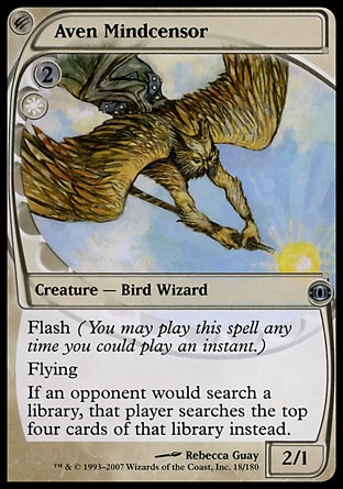
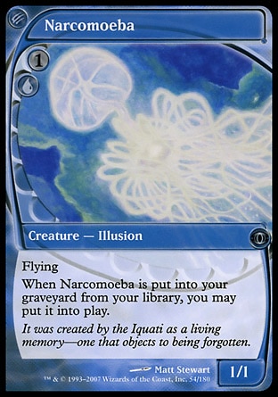
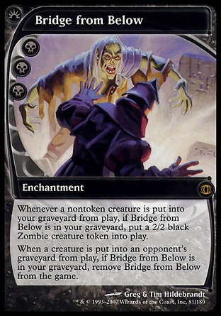
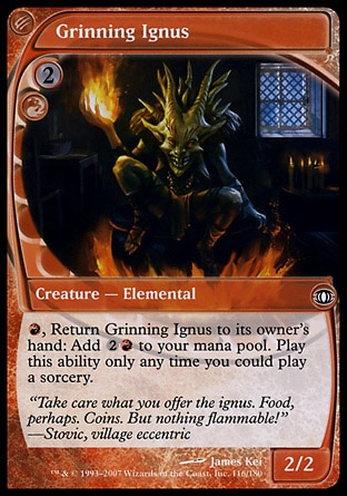
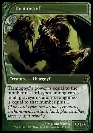
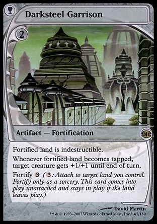
So I was talking on a different forum about new card frames, and someone had the entirely reasonable opinion that the planar chaos frames were the best, so I made this for discussion:


Dom Harvey

Contributor
nah son, Planar Chaos frames are fugly

this is where it's at:

18.jpg
54.jpg
81.jpg
116.jpg
153.jpg
167.jpg
 
Oh sure, the future ones are the best designed, clearly. They fan so well! Look at the curves! The mana cost is super clear! The P/T box is genuinely part of the frame! The art is bigger than the art box! So good. And, to be fair, they could've made the bit under the text box black on that and switched to them and everything would be objectively better.

But you know, these are magic players who hate change, so lets baby step a bit here.
 

James Stevenson

Steamflogger Boss
Staff member
Meh, this kind of thing is pretty arbitrary. Actually, I know I'm in the minority here, but I like lots of different looking cards together. I like to see cube packs brimming with different eras of cards. I keep all my cube lands unique as well.

p.s. My stupid "Sun Tzu said..." joke above is paraphrased from Fitzthistlewits, the greatest youtuber to ever produce videos. Here's the first one I saw:
 
I mean, I understand why they're conservative with these changes, but I wish they weren't and they were just making the best frames they could design-wise, rather than catering to the change is scary crowd.

Also! Another thing I noticed from that article:
We have been burned in the past slapping "10th Anniversary" and "15th Anniversary" on every product we made during those years, and we believe they cost us potential customers as new players worried that they were hopelessly behind; this was at a time when we were losing customers to begin with and didn't need any additional help doing so!
So that's 5-10 years ago, which is approximately Mirrodin through Alara. I stopped playing between Llorwyn and Innistrad, so I guess I'm part of the problem there, but I wonder a) why there was a downswing there, and b) what brought it back up again.
 

James Stevenson

Steamflogger Boss
Staff member
I'm thinking about making a +1/+1 counter theme in my cube, and I just looked through every card in magic that mentions +1/+1 counters. Looks like some cool things could be going on! And before you say it, Jason, I have already taken a look at the Eldrazi Domain Cube.
 

Jason Waddell

Administrator
Staff member
Future Sight frames are where it's at and I feel sorry for anybody that has new school Goyfs.

I've never been around for any of the frame changes, but I always have liked the newer versions better. The only exception being that old-timey artifact cards really have the "feel" of an artifact.

I wonder if I would have hated the changes as they happened though. Probably not. I like the crazy Theros frames. And the crazy Eldrazi frames.
 
i'm surprised y'all like future sight frames nearly everyone i know hates them. i don't really mind them one way or another. the only thing i dislike is how w/ pre-modern white cards its hard to see P/T
 
Another one for the future sight frames here. The new borders are not fantastic, but I guess I'll get used to them, as usual.
 

Jason Waddell

Administrator
Staff member
Christ, you guys do not know terror until you face down this combination:


It got online and the game got hard. I couldn't race. I couldn't trade profitably. Combat math became increasingly impossible as my life-total dwindled. Blood Artist continues to do better than seems possible for a two-mana 0/1. I used to wish he had a beefier body... oops.
 

Chris Taylor

Contributor

Seriously?
Oh, you know how everything in the developed world is rectangles? Lets make the illustration A CIRCLE! BECAUSE WE'RE QUIRKY!!!
Also, let's make sure the mana cost blends into the card, and stack all the information in the bottom right of the card, leaving the bottom left empty and the text box smaller! GENIUS!!!!

Also, maybe we can work in an otherwise useless symbol above the mana cost to demonstrate information that's in the typeline already!!! Most people won't even notice or understand, but whatever. That means they're just worse players than you guys, amirite?

OH! Can we make it so that mana costs are limited to 6 symbols just to make things super awkward? I'm sure that will help alleviate the fact that human beings in the western world (Where this game is produced) are bad at reading vertically :D

It's fucking awful :p
 

Eric Chan

Hyalopterous Lemure
Staff member
Blood Artist is the single most underrated cube card, bar none. You heard it here first!

For those people hopelessly trying to make Kalastria Highborn work, JUST USE BLOOD ARTIST. It:
  • is easier to cast
  • doesn't require you to hold mana up to trigger
  • works on all creatures on both sides of the board
  • is fantastic Wrath insurance
  • lets you Wrath for fun and profit
  • and let's be serious, you weren't going to endanger your Highborn by pushing it into the red zone anyways.
On Monday I was getting complaints that my doubling up on Blood Artist was completely bonkers. I initially waved off those concerns, but.. come to think of it, my players may have a point.
 

CML

Contributor
Christ, you guys do not know terror until you face down this combination:


It got online and the game got hard. I couldn't race. I couldn't trade profitably. Combat math became increasingly impossible as my life-total dwindled. Blood Artist continues to do better than seems possible for a two-mana 0/1. I used to wish he had a beefier body... oops.

Let us listen to the infallible LSV:


Constructed: 1.0
There will be blood...in Limited. In Constructed, this just isn't Disciple of the Vault, for which I am thankful.
 

FlowerSunRain

Contributor
While Blood Artist is indeed better then Kalastria Highborn, Kalastria Highborn is still extremely competitive and worth running. As anyone who has tried to make an aggro deck will tell you, two damage is more then twice as a good as one damage and being able to swing isn't at all irrelevant. If they block it with something that kills it, they lose 2 life which is an absolutely huge advantage to the card. If you aren't endangering her by pushing her into the red zone relatively often, you are probably doing something wrong. If you have a non-gravecrawler loop set up, its a much better clock. She is a more proactive/narrow/intense blood artist. I love the card.

On grave pact: its probably a less depressing alternative to attrition that I should consider at some point.
 
Top