There is something as double block. This is painful, but better to lose two critters than your whole board slowlyThe only real problem I saw with provoke is that if one guy has the biggest creature it will more likely stay this way than the average game. But there are many solutions to this problem if you ask me.
You are using an out of date browser. It may not display this or other websites correctly.
You should upgrade or use an alternative browser.
You should upgrade or use an alternative browser.
General Custom Cards: The Lab
- Thread starter anotak
- Start date
There is something as double block. This is painful, but better to lose two critters than your whole board slowly
I am just sharing Wizards of the Coast’s own experiences with provoke. But I agree that there are ways to work around this problem. Both from a design perspective and from the players’ perspective.
Onderzeeboot
Ecstatic Orb
I know that provoke has some mechanical pitfalls (instant speed removal turning a great attack into a massacre being the main one), but I love the mechanic a lot. I wish WotC would bring it back, or maybe an updated version (When ~ attacks, you may untap up to one target creature an opponent controls. That creature must block if able and can block only ~ this combat.)
Onderzeeboot
Ecstatic Orb
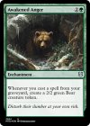
With some good flashback options available in Temur, I was wondering whether I could shape casting spells from the graveyard into an archetype with some customs. First up, the green Burning Vengeance!
As previously noted, Temur has some seriously lackluster spells. Kess, Dissident Mage has always been one of my favorite cards in my cube, but I don't run Grixis anymore. Enter Ssek, the Temur variant, but with prowess, so it survives Wildfire, and the ability to play lands from the yard as well, so... it goes well with Wildfire!
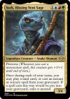

As previously noted, Temur has some seriously lackluster spells. Kess, Dissident Mage has always been one of my favorite cards in my cube, but I don't run Grixis anymore. Enter Ssek, the Temur variant, but with prowess, so it survives Wildfire, and the ability to play lands from the yard as well, so... it goes well with Wildfire!

Last edited:
Onderzeeboot
Ecstatic Orb
So close. Just remove the “Creatures you control have” and the quotes, and change “this creature” to “a creature you control”, and you’re there!
Make it a 3/3 and “once each turn” and we’re there!
I decided to do classes for my custom Pokémagic cube. They look like this:
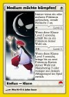
That's a lot of photoshop work to have these 2003 frame versions with all the customized elements as classes. So I want to make sure I am close to a well balanced card design before I do the work.
So please help me balancing these. They should feel like a really good uncommon buildaround from retail.
The missing white one first:
Teenager wants to fight!
Enchantment — Class
I - When this class enters, you may put a Pokémon with mana value 1 onto the battlefield.

 : II - Whenever a Pokémon you control attacks alone, it gets first strike until end of turn.

 : III - Whenever a Pokémon you control attacks alone, it gets double strike until end of turn.
It's supposed to push the exalted style deck and for flavor reasons work with the three Ratatas in the cube, which are alls 1-mana 2/1s.

That's a lot of photoshop work to have these 2003 frame versions with all the customized elements as classes. So I want to make sure I am close to a well balanced card design before I do the work.
So please help me balancing these. They should feel like a really good uncommon buildaround from retail.
The missing white one first:
Teenager wants to fight!
Enchantment — Class
I - When this class enters, you may put a Pokémon with mana value 1 onto the battlefield.
It's supposed to push the exalted style deck and for flavor reasons work with the three Ratatas in the cube, which are alls 1-mana 2/1s.
Last edited:
And I would also like some feedback on these two bue classes:
Fisher wants to fight!
Enchantment — Class
I - When this class enters, create a Magikarp (0/1 blue water type)

 : II - Whenever you discard a card, put a +1/+1 counter on up to one target water Pokémon.

 : III - At the beginning of your endstep, draw a card then discard a card.
Mechanic wants to fight!
Enchantment — Class
I - When this class enters, you get ee (two energy).

 : II - Whenever an electric or steel Pokémon enters under your control, draw a card. This ability triggers only once each turn.

 : III - You can pay eee instead of paying the mana cost of electric or steel Pokémon spells you cast.
Fisher wants to fight!
Enchantment — Class
I - When this class enters, create a Magikarp (0/1 blue water type)
Mechanic wants to fight!
Enchantment — Class
I - When this class enters, you get ee (two energy).
Last edited:
Okay here comes the first batch
Thank you once again to @Schafkurai and @Onderzeeboot for helping me getting started with Card Conjurer variant.
Bloomburrow gave us this card.

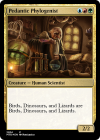
It is not laughing at you. It is laughing as you. Some of you know that I am all about public service. So when I cast this card in my Aragorn, King of Gondor Duel Commander deck I like to give my opponent and spectators an easier board state to comprehend. Hence I wanted to make custom cards to replace the Mockingbird so it could actually laugh as you.
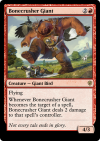
As you can see, I gave them flying and made them Birds.
And of course, gave them Mockingbird's wings.
Here's some more. I'll only share very very few of them to not spam up the forum. But I have one for each creature I can copy with the bird.
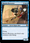
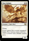
We remove the useless text that can never come into effect with Mockingbird. But we keep any flavor text the card might have.
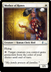
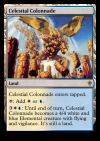
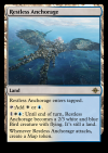
Oh and did you know that you can actually copy a man-land if it has been animated?
If you do, it will become a non-creature even though you copied it as creature.
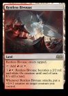
But you can get an additional Celestial Colonnade, Hall of Storm Giants or Restless Bivouac for one mana if they are already animated.
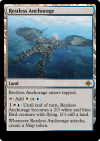
I didn't know how to give the colored lands the correct colors on Card Conjurer. Feel free to pitch in with help if you know how to <3
Thank you once again to @Schafkurai and @Onderzeeboot for helping me getting started with Card Conjurer variant.
Bloomburrow gave us this card.
It is not laughing at you. It is laughing as you. Some of you know that I am all about public service. So when I cast this card in my Aragorn, King of Gondor Duel Commander deck I like to give my opponent and spectators an easier board state to comprehend. Hence I wanted to make custom cards to replace the Mockingbird so it could actually laugh as you.

As you can see, I gave them flying and made them Birds.
And of course, gave them Mockingbird's wings.
Here's some more. I'll only share very very few of them to not spam up the forum. But I have one for each creature I can copy with the bird.


We remove the useless text that can never come into effect with Mockingbird. But we keep any flavor text the card might have.

Oh and did you know that you can actually copy a man-land if it has been animated?
If you do, it will become a non-creature even though you copied it as creature.
But you can get an additional Celestial Colonnade, Hall of Storm Giants or Restless Bivouac for one mana if they are already animated.

I didn't know how to give the colored lands the correct colors on Card Conjurer. Feel free to pitch in with help if you know how to <3
Chris Taylor
Contributor
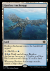
Okay, here's the target:
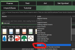
So in the "regular" menu for card frames, you scroll down until you hit "lands":
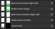
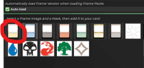
To do a multicolor land like this, you'll want to have the base frame of the card be the white land
And to add the blue stuff on the right, you want to select the blue land, and on the right add the "Pinlines" and the "Rules" to the right half of the card:

That should give you the multicolor land frame. You can also do this with the typeline and title bar, but looking at the printing LCI Restless Anchorage, it looks like they don't do that.

So in the "regular" menu for card frames, you scroll down until you hit "lands":

To do a multicolor land like this, you'll want to have the base frame of the card be the white land

And to add the blue stuff on the right, you want to select the blue land, and on the right add the "Pinlines" and the "Rules" to the right half of the card:

That should give you the multicolor land frame. You can also do this with the typeline and title bar, but looking at the printing LCI Restless Anchorage, it looks like they don't do that.
Onderzeeboot
Ecstatic Orb
Actually, if you do the white frame as the base, you get a white title and type bar, which you don't want. I always start with a colorless land as the base, then add (in this case) the full white rules and pin lines, and then only the right half for the blue rules and pin lines. Alternatively you can start with a white base, but then you have to add the colorless title and type bar.To do a multicolor land like this, you'll want to have the base frame of the card be the white land
View attachment 9940
Last edited:
Instants and sorceries in graveyard are not spells. They are cards.
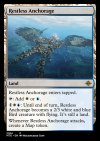
@Chris Taylor @Onderzeeboot
See I already started with that strat.
1. I added land card frame.
2. I added white pinline.
3. I added white rules text box.
4. I added blue right side pinline.
5. I added blue right side rules text box.
This is the result I got. So I chose to go with the more colorless version because I honestly think this results look like poop
What do you think?
To get the same color as Chris you have to adjust the subcategory to "lands". I think you used Regular -> Regular Frames and those have less strong colors. Regular -> Lands should look nicer
I request further assistance
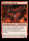
I am trying to create the back side of Fable of the Mirror-Breaker with added Mockingbird wings.
Scryfall link here:
https://scryfall.com/card/neo/141/fable-of-the-mirror-breaker-reflection-of-kiki-jiki?back
Problems I have:
I don't know how to: add power/toughness bar and I do not know why not. I have chosen the Nyx card frame.
I don't know how to: change the card type text to white instead of black.
I don't know how to: add the red dot in the left side of the card type.
I don't know how to: add that transform symbol in the upper left corner.
Last edited:
Onderzeeboot
Ecstatic Orb
I got you!I request further assistance
View attachment 9953
I am trying to create the back side of Fable of the Mirror-Breaker with added Mockingbird wings.
Scryfall link here:
https://scryfall.com/card/neo/141/fable-of-the-mirror-breaker-reflection-of-kiki-jiki?back
Problems I have:
I don't know how to: add power/toughness bar and I do not know why not. I have chosen the Nyx card frame.
I don't know how to: change the card type text to white instead of black.
I don't know how to: add the red dot in the left side of the card type.
I don't know how to: add that transform symbol in the upper left corner.
First add the red Transform (Back) frame (both frame and P/T box)
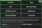
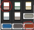
Now go to Text > Power/Toughness, and you will see that the font color is automatically set to the right color. You can also enter the other stuff at this step, name, card text, artwork, etc.
Also, don't forget to add the correct Transform Icon!
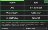
Finally, you want to go back to the Regular - Nyx (Theros) frame and add only the red Frame.
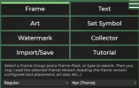

That's it, you should have the card you like now! Except, you'll notice that the P/T is reset to black. Bummer! Easy fix though! Just head back into the Transform Back frame without adding anything!

There! Now you're really done!


Now go to Text > Power/Toughness, and you will see that the font color is automatically set to the right color. You can also enter the other stuff at this step, name, card text, artwork, etc.
Also, don't forget to add the correct Transform Icon!

Finally, you want to go back to the Regular - Nyx (Theros) frame and add only the red Frame.


That's it, you should have the card you like now! Except, you'll notice that the P/T is reset to black. Bummer! Easy fix though! Just head back into the Transform Back frame without adding anything!

There! Now you're really done!
I think this is the right way to go (and would have taken me much longer to find out, since there is no kamigawa saga back template).I got you!
First add the red Transform (Back) frame (both frame and P/T box)
View attachment 9954
View attachment 9955
Now go to Text > Power/Toughness, and you will see that the font color is automatically set to the right color. You can also enter the other stuff at this step, name, card text, artwork, etc.
Also, don't forget to add the correct Transform Icon!
View attachment 9958
Finally, you want to go back to the Regular - Nyx (Theros) frame and add only the red Frame.
View attachment 9956
View attachment 9957
That's it, you should have the card you like now! Except, you'll notice that the P/T is reset to black. Bummer! Easy fix though! Just head back into the Transform Back frame without adding anything!
View attachment 9954
There! Now you're really done!
To add to your work:
You can find the red dot under "Transform" -> "Color Identity Pips" and in the text portion you need to add "{right100}" before the types to remove overlap with the pip.
All the colors are slightly off, I think, but I would not know how to adjust them.
Also, your fonts might be black now, since that's the standard for the nyx frame. You can either go to frames -> transform -> transform (back) and it should change fonts to white without having to add anything (easy way).
Or you can adjust font colors manually, but that can be a bit tricky since some white fonts have shadows. (Difficult way).
Update
@Onderzeeboot @Schafkurai
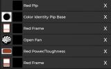
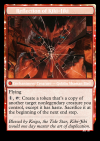
I could have made a mistake. But I believe I followed Onde's guide step by step. Everything worked perfect until I got to this step "That's it, you should have the card you like now! Except, you'll notice that the P/T is reset to black. Bummer! Easy fix though! Just head back into the Transform Back frame without adding anything!". Text went back to white but the power/toughness bar was removed, card name is moved and something about the frame is too bright. And the open fan transform icon is hiding which possibly explains the moved card name.
I then continued to follow Schaf's guide step by step which added the red dot before I put back Transform -> Transform (back).
@Onderzeeboot @Schafkurai


I could have made a mistake. But I believe I followed Onde's guide step by step. Everything worked perfect until I got to this step "That's it, you should have the card you like now! Except, you'll notice that the P/T is reset to black. Bummer! Easy fix though! Just head back into the Transform Back frame without adding anything!". Text went back to white but the power/toughness bar was removed, card name is moved and something about the frame is too bright. And the open fan transform icon is hiding which possibly explains the moved card name.
I then continued to follow Schaf's guide step by step which added the red dot before I put back Transform -> Transform (back).
Last edited:
Chris Taylor
Contributor
Okay part of this I think is an issue of where the layers are in the stack.
You see how you've got one of the red frames above the p/t box? If you drag it above both red frames it should show up.
In general you want frames at the bottom, stuff you add to frames nearer to the top
You see how you've got one of the red frames above the p/t box? If you drag it above both red frames it should show up.
In general you want frames at the bottom, stuff you add to frames nearer to the top
Onderzeeboot
Ecstatic Orb
I think my instructions were unclear. You accidentally added the complete Nyx frame, instead of just the "Frame". It's confusing, but you want to add only the blue part for the Nyx frame.Update
@Onderzeeboot @Schafkurai
View attachment 9959
View attachment 9960
I could have made a mistake. But I believe I followed Onde's guide step by step. Everything worked perfect until I got to this step "That's it, you should have the card you like now! Except, you'll notice that the P/T is reset to black. Bummer! Easy fix though! Just head back into the Transform Back frame without adding anything!". Text went back to white but the power/toughness bar was removed, card name is moved and something about the frame is too bright. And the open fan transform icon is hiding which possibly explains the moved card name.
I then continued to follow Schaf's guide step by step which added the red dot before I put back Transform -> Transform (back).
Edit: You can see the complete red Nyx frame sitting between the Color Identity Pip Base and the Open Fan. That should only show the frame outline.


