Train
The M15 frame came out with M15 which was released in 2014.
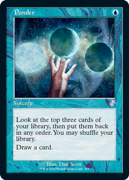
Ponder was banned in Modern in september 2011 along with
Preordain
Public service
Based on above logic, shouldn’t you run
Ponder in its original card frame, the Modern card frame, which is Lorwyn from 2007?
Ponder may have been printed and banned in the 2003-14 era, but it's now only able to be played competitively in legacy and vintage, which are the two formats which naturally include all black-border cards printed with the 1993-2003 frame. Since
Ponder is now known for it's time in Legacy, I think giving it the old frame is rather fitting.
I appreciate some things about the 8th Ed card frame but the new, 'thinner' iteration of that is a real downgrade for me. People said in 2014 that we'd all get used to the new frame but I've only become more ardent about wanting the thicker border back. Compare this MM1 Gifts Ungiven to the MM3 version:
The MM1 version does such a better job at framing the card properly without distractions.
I think the issue there is that whoever was in charge of the art department for MM3 went through decreased the contrast on the art a bit, making it less vibrant and hiding a lot of detail. The pattern on the moonfolk's dress, the details behind her head, and texture on the floor all run together on the MM3 version of the art. The MM1 version, by contrast, has sharper lines, and allows for many details to be more easily discerned.
There are several cards which have been improved by the new border treatment when the art is left unchanged or minimally changed. For example, take a look at Young Pyromancer:
The Eternal Masters and other later prints of young pyromancers are a little bluer than the original, however, the contrast of the piece remains largely the same. The newer versions of the pyromancer look a little bit cleaner than the original.
Now, look at Stoneforge Mystic:
The art for the double masters version of the mystic appears to have been brightened a tiny bit, but otherwise remains unchanged. The biggest change here is that the text size has been increased on the double masters variant, making it a bit easier to read than the original.
I'm not necessarily trying to say that the M15 frame looks better than the 8th Edition frame, but rather that certain prints look better based on how the cards have been formatted within said frame. I too prefer the Modern Masters 2013 Gifts Ungiven to the Modern Masters 2017 Version, but that's not the fault of the frame so much as the art director who decided to mess with the lighting. As we've seen, the new frame can have a neutral or improving effect on cards where the art is either not changed or minimally altered.
What card looks better in what frame depends on how each card was edited after the fact, and is not intrinsically linked to the frame itself.

") Generally find the new wording to be much easier to read.
Generally find the new wording to be much easier to read.