General Timespiral Remastered Timeshifts

I started playing in 1994, so I had a bad attitude about the 8th Edition frames when I first saw them. I hated the color change for artifact borders, and I'm still on the fence about it. I remember particularly disliking the blue frame. I came around, though, and now I prefer the newer style for the most part. Readability and contrast and minimizing wasted space are good. I still wish they had made the blue one a little more similar to the original, and I miss the parchment background on the original black frame. It was cool how each color had its own text background style. The M15 frame's asymmetry on the bottom edge is irksome, and the rounding on the bottom looks out of place. The hologram is a wart. But I buy M15 frames when possible, because I'd rather have all the cards match, and that's the frame that's possible to find for the highest percentage of cards. Also, having up to date rules wording overrides aesthetics for me. The differences between M15 and 8ED frames aren't enormous, so it doesn't amount to a huge deal.

So, I know some people are pretty excited about getting certain cards in old frame. I can't fault them. I'm more excited when something gets printed in the newest frame for the first time, like Mana Tithe. Ditching alternate frames is nice for consistency. I'm reminded of this article about frame graphic design. He has a graphic of seven MTG cards with different frame styles with a random LoTR card stuck in there, and you don't even notice at first glance.

Now, if they would just get rid of that hideous legendary frame, I'd be happy. That sticks out in a bad way.
 
That's a great article! Frankly, I wish there was a frame with the clarity and brightness of the M15 frame, as well as the artist info, and yet the heft of the lines of the 8th edition frame. There's definitely something I don't like about the rounded lower corners, and I'd rather just have them squared off. I think.

If I could get something like this mockup (excuse my Paint skills, or rather the lack thereof) with the weighting of text boxes the way Dom describes, I'd be a happy camper. I actually first tried what Onderzeeboot described, and I'm attaching it here. I thought I'd like it, but the fact that we have two distinctly different curvatures in such close proximity (the inside and outside edges of the outermost border) is wigging me out.

My preference is on the left, minus the added weight. The middle still has the curved bottom that I feel leaves the card feeling top-heavy and therefore unbalance, but waaaaaay better than what we have. The rightmost mockup is a bonus with the rounded corners but with the holostamp tucked away. I could get used to it!

small square corners.jpgwwr.pngsmallRoundCornersandHiddenStamp.png


C:\Users\wemar\Downloads\smallRoundCornersandHiddenStamp.png
 
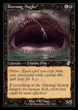
Ponder may have been printed and banned in the 2003-14 era, but it's now only able to be played competitively in legacy and vintage, which are the two formats which naturally include all black-border cards printed with the 1993-2003 frame. Since Ponder is now known for it's time in Legacy, I think giving it the old frame is rather fitting.

Bullshit :)

1. This logic only works if you assume people to have goldfish memory. It was played in Modern.
2. This logic only works if cards (Ponder) never gets unbanned in Modern.
3. This logic only works if Old Frame cards weren't reprinted in new sets with new frames like Brainstorm, Lightning Bolt and Demonic Tutor.
4. This logic only works if Legacy and Vintage were the only formats where Ponder is legal but we can also play Ponder in Commander and Cube.
 

Onderzeeboot

Ecstatic Orb
Bullshit :)

1. This logic only works if you assume people to have goldfish memory. It was played in Modern.
2. This logic only works if cards (Ponder) never gets unbanned in Modern.
3. This logic only works if Old Frame cards weren't reprinted in new sets with new frames like Brainstorm, Lightning Bolt and Demonic Tutor.
4. This logic only works if Legacy and Vintage were the only formats where Ponder is legal but we can also play Ponder in Commander and Cube.

I don't think your counterpoints are very fitting in this case. There are obviously people who prefer the old frame, as witnessed in this very thread, and Ponder sees a lot of play in formats where old frames see a lot of play, therefore it is a good choice for the timeshifted treatment. It's as simple as that. For anyone preferring the modern border, it's already available in both the 8E and the M15 border. Time Spiral Remastered simply adds another option to the table, and that's going to be appreciated by Legacy and Vintage (and yes, Commander and Cube) players who prefer the old border.
 

Onderzeeboot

Ecstatic Orb
I'm reminded of this article about frame graphic design. He has a graphic of seven MTG cards with different frame styles with a random LoTR card stuck in there, and you don't even notice at first glance.

Now, if they would just get rid of that hideous legendary frame, I'd be happy. That sticks out in a bad way.

I think the article is a bit disingenuous.

SpotTheIntruder01.jpeg

Here's the first image, and ignoring the LotR card, the only two frames that are different by necessity are The Flame of Keld and Dusk // Dawn. Itlimoc uses a different frame only on the backside, and will never appear this way in your hand. It uses the transform frame on the front side, which hews close to the standard frame. Including Aven Mindcensor in the future shifted frame, Mountain in the Unglued full art frame, and Blood Moon in the Amonkhet invocation frame is also questionable, since all of these are available in the modern frame. Sure, a new player could come into contact with these frames, but they're not the versions they are most likely to encounter. In the modern day, Wizards is actually very conscious of its frame, I feel, and alternate frames are all based in the standard frame. Farm// Market, Avalanche Caller, Depose // Deploy, Curious Homunculus, Jwari Disruption, Inga Rune-Eyes; all of these are immediately recognizable as a Magic card due to their connection to the standard frame. It's only when you go into the universe of alternative frames in Secret Lairs, Invocations, etc that you start seeing frames that really deviate. That means the base game is in fact recognizable and consistent. I personally think the effect of alternate frames is overstated by the writer of the article, but who knows, maybe I'll be proven wrong in a couple of years after playing against a Ronald McDonald commander deck featuring the likes of Katy Perry, Bugs Bunny, Legolas, and Frieza, each with their own frame, but as you can probably tell I'm more worried about the cross-franchise thing than alternate frames :p
 
To each their own, but the M15 frame was in fact exactly created to fit its needs. They didn't want to do another massive overhaul because they liked the 8E border, but they adopted a new digitized printing method that required computer readable card information. You'll notice that the M15 frame has a consistent and readable footer that, compared to the 8E frame, now also includes the abbreviated set code, the language, and the rarity. In addition, counterfeiting was a rising problem at that moment in time, so they introduced a holofoil, that, while ugly, made it harder to create forgeries. I, in fact, like the rounder frame, as it fits the round corners of the cardboard much better. I do wonder if the frame would have looked slightly better if they had extended the side border to the bottom of the text box, but that's the only nitpick I have.


No, what I meat was, it wasn't desgined from scratch (what you also state there basically). It was an "evolution" of the 2003 frame. And this is very visible imo. If wizards would create a new frame fitting all those needs without any knowledge of previous looks, they would create something really different. I hopefully think they'd create something with more color and more harmony, but here we are again drifting into personal opinion territory.

I am well aware that the 2014 frame has it's practical upsides over the 93 frame. I see the following:

- Game play text is easier to read (although I think that mostly counts for white cards and maybe gold ones)
- Collector numbers are easier to read (although that doesn't count that much for red and artifacts imo)
- They have the holo foil stamp

And here comes my personal reasoning why I mostly really care for these upsides

- Everything nonwhite seems to cause absolutely no problems in readability. However, I wish they would have allowed white to have black letters on an actual white ground back in 93. Gold could've also been brighter with black text then.
- Neither I nor (as far as I know) anyone I have played with in person in my whole life cares for that information at all. They are just as ignored on 2014 frames as they were before. Sure, there are people who care, but as I said this is my personal reasoning why I opt for older frames when possible.
- If counterfeits are such a big problem, I just wish they would've find a better way to put a holographic element on the cards. Something more subtil that doesn't hurt my eyes even after almost 7 years.

I have these big downsides opposing them as well:

- They lack color (even a blue or green card today has mostly black and white on it)
- They lack harmony and look top heavy because of the many different roundings and edges and the fact, that the color dowsn't go all around
- They fail to evoke a feeling of fantasy (where the old frames really feel like part of the artwork)

And I say all of that even though I started playing in 2005 and it took me two years or so to even see an old frame card, so it's not nostalgia speaking. I honestly think the current frames are an aesthetically bad design. Practical but ugly.
 
I don't think your counterpoints are very fitting in this case. There are obviously people who prefer the old frame, as witnessed in this very thread, and Ponder sees a lot of play in formats where old frames see a lot of play, therefore it is a good choice for the timeshifted treatment. It's as simple as that. For anyone preferring the modern border, it's already available in both the 8E and the M15 border. Time Spiral Remastered simply adds another option to the table, and that's going to be appreciated by Legacy and Vintage (and yes, Commander and Cube) players who prefer the old border.

Yes yes more options are always good!
Another reason why I love cube format above all other formats. We are not restricted by anything.
 
No it's not, we'll get to why in a second.

1. This logic only works if you assume people to have goldfish memory. It was played in Modern.
For 5 weeks. Ponder was legal in sanctioned modern tournaments for 5 weeks. It was banned in the first B&R announcement following Pro Tour Philadelphia. It's been banned in Modern for the decade since that event. It's not "goldfish memory" for people to not associate a card with a format that it wasn't even legal in for more than one major tournament.

For reference, Oko, Thief of Crowns was legal in sanctioned Modern for longer than Ponder. Heck, Oko was legal in Standard for longer than Ponder was legal in Modern!
4. This logic only works if Legacy and Vintage were the only formats where Ponder is legal but we can also play Ponder in Commander and Cube.
Commander uses the same card pool as Legacy and Vintage, just with a different banned list.
2. This logic only works if cards (Ponder) never gets unbanned in Modern.
3. This logic only works if Old Frame cards weren't reprinted in new sets with new frames like Brainstorm, Lightning Bolt and Demonic Tutor.
These arguments seem to be missing the reason for why I want to use an old-border Ponder. If you'd read this recent series from my cube thread, you would see that my goal is to make my cube feel like constructed when I first started playing competitively following an extended period of casual play. My method to achieve this goal is designing archetypes based on different decks that I enjoyed during that era. I need a certain density of cantrips for Delver and Prowess style decks. As I already mentioned, I have a Mercadian Masques Brainstorm in my cube as one of my cantrip effects, and I also wish to include Ponder at some point. Since Ponder was primarily a Legacy staple in the era I'm trying to capture, I think it would be cool to match the borders of my two Legacy cantrips. Matching my Ponder and Brainstorm has nothing to do with the aesthetic choices for the rest of the cube. The extremely unlikely event of Ponder being unbanned in modern is also unimportant, because it was still not Modern legal in the era I wish to emulate.
 
You say Ponder is only able to be competitively played in Legacy and Vintage. When I point out that other formats have access to the card, you say that this other format uses the same card pool. Well of course, that’s why I corrected you in the first place!! Commander has been a sanctioned format since 2015.
 

Dom Harvey

Contributor
That's not a 'correction', it's tiresome pedantry. Commander is not a competitive format outside of a niche subformat that's specifically segregated as cEDH. He said what he meant and was clear about it, why bother with an argument that adds nothing?
 
That's not a 'correction', it's tiresome pedantry. Commander is not a competitive format outside of a niche subformat that's specifically segregated as cEDH. He said what he meant and was clear about it, why bother with an argument that adds nothing?

I don’t know what to say to that. I ‘bothered him with an argument’ by asking him if he used that logic, shouldn’t he run the Lorwyn Ponder. I feel like that was an honest question. A help. It becomes arguing when both parties (and Onde) go back and forth. Not when one party go back and forth. It takes two to tango.
 

Jason Waddell

Administrator
Staff member
I think it's more of an issue of trying to hyperanalyze somebody's choice of which card frame to use. It's not an area one usually needs 'help' with.
 
I guess I had to write it so here comes:

Train, run whatever card in your cube you want :) If you put an argument onto the forum about the reasoning why you're running a certain card, I assume it is because you want someone else to comment on that argument or choice. I am very, very happy that you now have more options to choose from :) This set is particularly win-win for everyone since it's 100 % reprints which means it is very easy to opt out of buying into this set because it doesn't offer anything new except skins. And now you have more skin options, great! :D
 
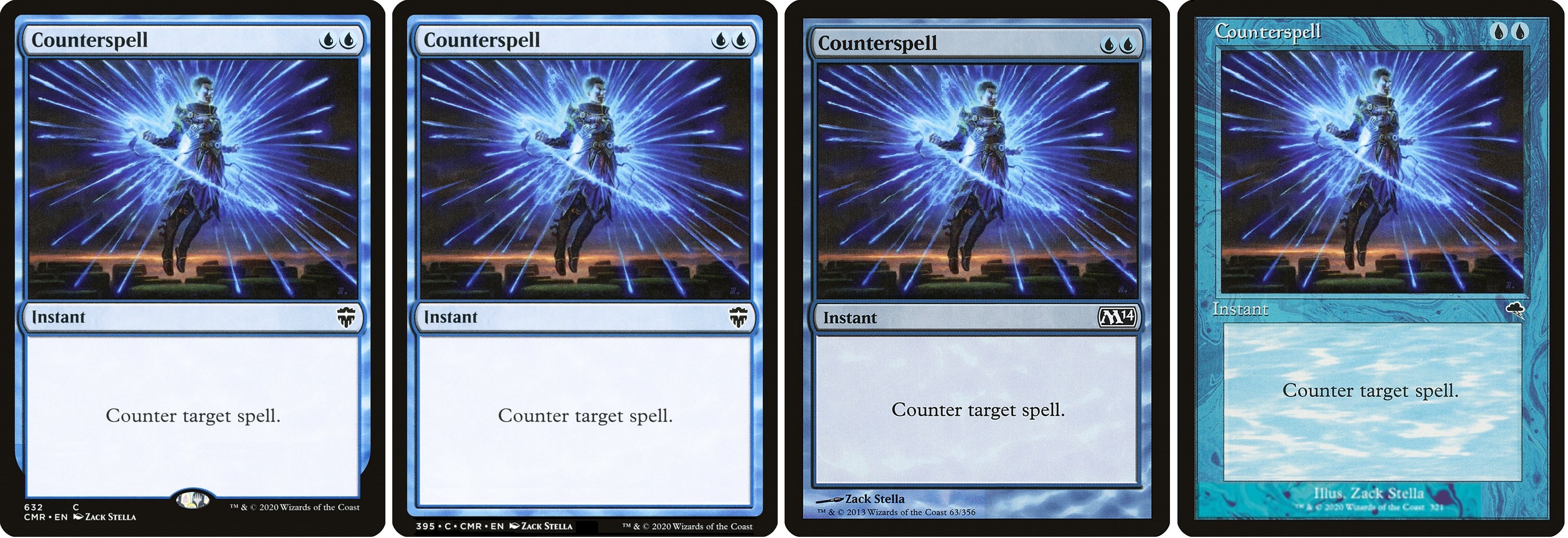
I enjoyed Zoss's tinkering with the M15 frame, so I decided to play around, too. I chose Counterspell since it has lots of real versions to compare.

The first one is CMR except with the hologram added for comparison's sake. Next is my attempt to declutter the M15 frame. Then we have comparisons to the 8ED and 1990s frames.

csframes.jpg


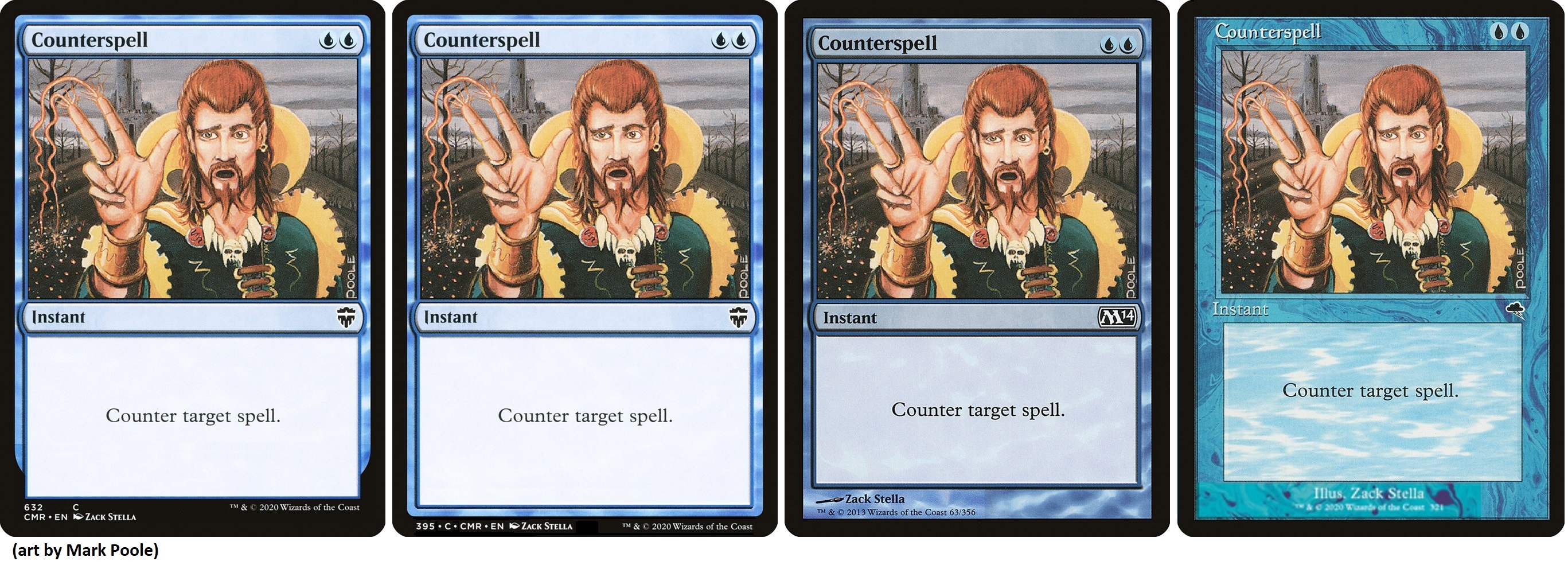
If an original art Counterspell was available in one of these forms, that would be pretty cool:

csframes_Poole.jpg
 
Hey, Nemo, that's a gorgeous mockup, so much better than my copy-and-paste monstrosity! What program did you use to make that? I especially like how the frame is uniform all the way around. If it's a custom frame for MSE, would you mind sharing it with me, please? I'm thinking about proxying some cards, and I may as well make them more aesthetically pleasing/obviously not real magic cards without making them stick out, you know?

@Onderzeeboot's point, I'd compromise by tucking the copyright info into the margin between the text box and the border, as it's the same on every card. That should leave enough room for artist names and maybe even a story spotlight tag or a holo stamp, if it's really necessary.


I just used Paint and combined bits of different card images. Adding the copyright into the bottom border is a good idea. I like that. Then any artist would be able to fit across the bottom. I think it would be fine if the bottom border was a little thicker to accomodate that. Of course, Hasbro prioritizes the prominence of that copyright text more than I do.
 

Onderzeeboot

Ecstatic Orb
Another point of attention with that mock-up is that it's the only one printing text in the 'margins', so to say. You'll notice that the other three frames have a pristine black border. Even the M15 frame has a black, actual, border under the collector's information. In addition, while people may think it's butt ugly, the holofoil stamp is not going anywhere, and the mock-up doesn't leave room for it. It's not that I'm trying to be negative, but I do think those are 'givens' when designing an alternate frame. I have some additional ideas for a proper redesign, but I'm on my iPad, so it's kind of hard for me to make a mock-up here :) I think the future-shifted frame from Future Sight actually is the most useful design while playing, because you can actually see the mana costs while fanning out your hand.
 

Onderzeeboot

Ecstatic Orb
Other options.


(Yeah, the Emrakul is unlikely, since we don't have a colorless option in the old frame as far as I know, but it would be a cool surprise ;) )
 
Another point of attention with that mock-up is that it's the only one printing text in the 'margins', so to say. You'll notice that the other three frames have a pristine black border. Even the M15 frame has a black, actual, border under the collector's information. In addition, while people may think it's butt ugly, the holofoil stamp is not going anywhere, and the mock-up doesn't leave room for it. It's not that I'm trying to be negative, but I do think those are 'givens' when designing an alternate frame. I have some additional ideas for a proper redesign, but I'm on my iPad, so it's kind of hard for me to make a mock-up here :) I think the future-shifted frame from Future Sight actually is the most useful design while playing, because you can actually see the mana costs while fanning out your hand.

How are you fanning your hand? Unless I'm holding a monstrous number of cards, I can see both some of the name and the mana cost when I look at my hand. I can certainly fan it to see just mana costs if I don't care about names. I am left-handed, so that might be playing into it a bit.
 

Onderzeeboot

Ecstatic Orb
How are you fanning your hand? Unless I'm holding a monstrous number of cards, I can see both some of the name and the mana cost when I look at my hand. I can certainly fan it to see just mana costs if I don't care about names. I am left-handed, so that might be playing into it a bit.
 

Attachments

  • 9CF7B5FD-84F9-4C26-B153-F794591F9F55.jpeg
    9CF7B5FD-84F9-4C26-B153-F794591F9F55.jpeg
    305.6 KB · Views: 26
Why are you not just fanning them the other way round? It always felt more natural to me to do it that way.
 
Top